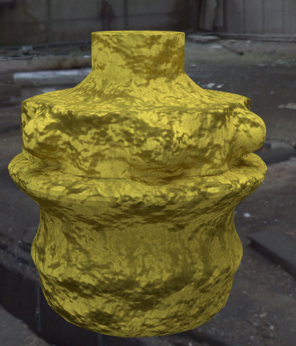
Procedural wear from A to Z in Blender
Reaching edges, faces and corners
Soft type A, the internal soft textures
Soft type B. The bleeding/blurred edge
The simplest version, Texture against texture
Wave – musgrave using subtract.
Wave – musgrave using linear light
Voronoi edges from Vector mapping and subtract.
Make the straight line curved.
Using musgrave as scale, the simple way.
Using musgrave as scale, the “correct” way.
Using Greater than, to sharpen thing.
Working with three or more materials
Start with the largest material
Then work on the material that will interact with the base material the most.
Finally “Fine tune material” (could be a lot of materials)
Why is there a need to use an earlier calculation for one material to a new one?
Mix/Soft edges between materials
Displacement (The “Supported version”)
Displacement (“The experimental version”)
Vertex paint “Dirty Vertex Colors”
Concentrate material on certain places
Object (with no reference object)
Object (With reference object)
Creating Node Groups (avoid getting lost in too large node trees.)
Step 2) Look at the reference images. What do we actually have?
Step 3) Find a good environment
Step 4) Add the basic “new” material
Step 5) Add the major breaks between materials
Step 7) Place Base Material on Objects.
Step 8) Start Fine tuning the rust.
Add “Rust Material” inside “Metal And Rust”
Step 9) Involve the other metallic parts.
Creating the black, burned top on glass
Overview of what we have accomplished
Be prepared for the next project!
Procedural wear from A to Z in Blender
When working with procedural textures, one of the most wanted things is to produce wear and tear of the surface, like paint that fall off or rust that breaks through.
Another sought area is to catch dust particles or/and places that has been bleached by the sun.
Finally you have scratches as well.
These three things I’d try to cover in this documentation. It will be some pages, but it’s worth it I believe :D.
NB!
If you are total noob or a beginner that wants to learn deeper about nodes, I’m now also finished with my writing about “Beginners guide to cycles nodes, the procedural way”. Link:
https://docs.google.com/document/d/1zk2mWLxdRZmNLi6uww32LvGUJUQimrPFFKaoFbZ7_Jc/edit?usp=sharing
Reaching edges, faces and corners
The most vital thing to create wear is to find the objects edges, faces and corners. Then you know the areas that need to be affected. How they should be affected will be the step after that.
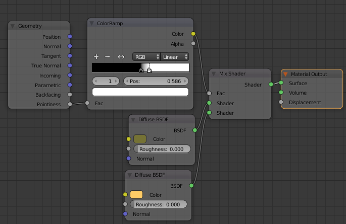
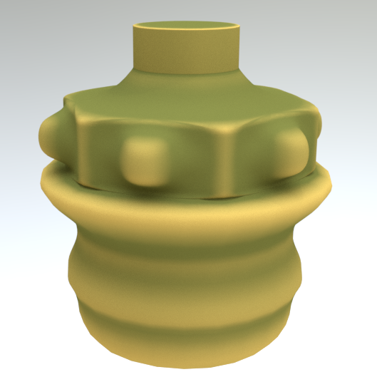
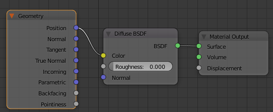
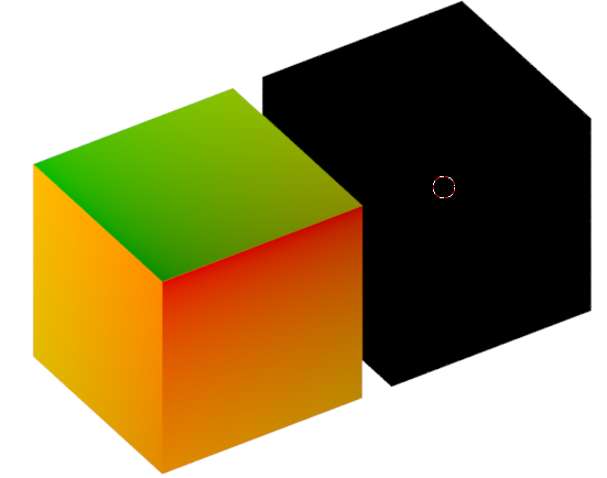
Basic “Pointiness”
Pointiness is used to get the supposed wear more visible.
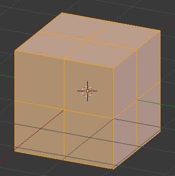
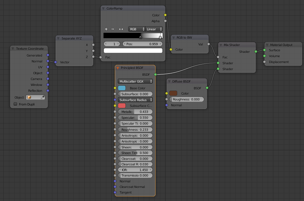
Pointiness always has the same basic setting. You add an input node of type Geometry and then you connect the “Pointiness” to a black and white “ColorRamp”, connect it to some kind of mix node between two shaders and finally fine tune the ColorRamp so that you see both colors.
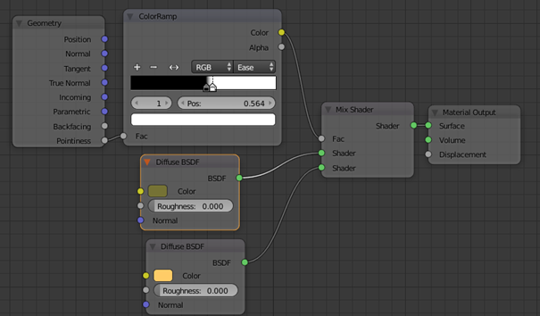
Result:
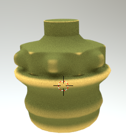
As you can see some areas are now brighter and that is connected to the edges. However it’s not so easy that all edges will be affected. The mathematic behind “Pointiness” is an approximation between concave and convex angles. This will give the wear a more “natural” look, but can sometimes make it a little bit harder to work with.
Advanced “Pointiness”
For those that plans to use pointiness in a node group later on, I thought it could be good to go a little deeper in to how “pointiness” really works.
Pointiness is built around comparing two edges between each other. The angle gives a basevalue. This value is then “blurred” or changed a bit according to those edges that are neighbours.
This means that if you have a higher value of the angle between those edges the end value is raised a bit and if you have lower angle around the end value will be a bit lower.
A totally flat area has the value of 0.5, then it goes up (positive angle) or down (negative angle) depending on the calculations described above.
The value it changes with is the (1/degrees change)/2 according to my own investigations (so it could be wrong…but looks like this in my experiments)
However that gives us a rather easy to use setup without the need of using the ColorRamp, which is great if we want to use it inside Node Groups.
Setup
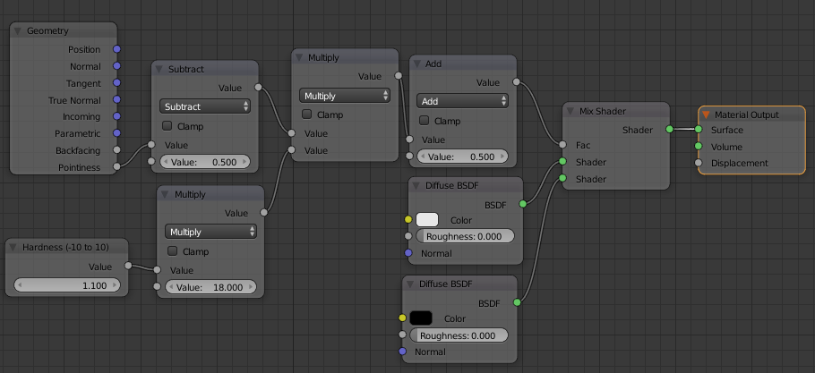
This setup will allow you to go from -10 to 10 on the input node (I’m using the input node “value” to set a start value like 1.1 in above example). 0 will give no change between black and white and you will get everything just grey, but if you go negative or positive you will see that the edges sharpens.
The value 18 may seem random, but there is a thought on that one as well. Pointiness value is based of degrees. Total value can then be 360, but since it should both negative and positive angles it’s divided by 2 (+180 to -180) and thus I use 18 as a value (18 x 10 = 180).
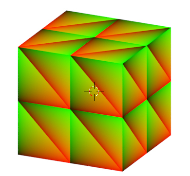
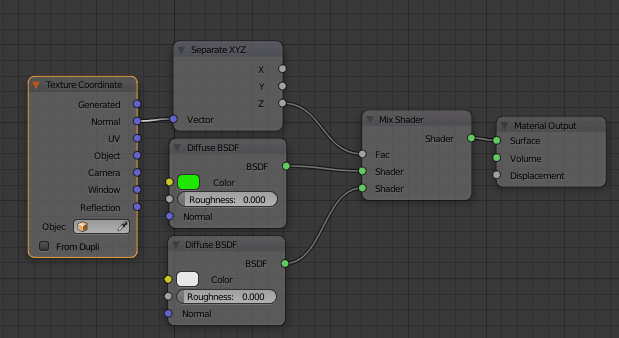
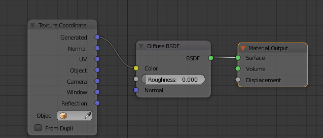
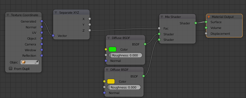
Basic “Normal”
I will not go in to the definition of “normal”, but it’s about the direction of the faces of your object. In a “wear situation”, you normally want to add dust or bleached parts on everything that has a flat face towards the top.
The basic setting for this is an input texture coordinate that uses “normal” output. That is separated through a converter node “Separate XYZ” and the “Z-axis” is then connected to a colorramp which output can control the difference between two shaders.
It will look like this:
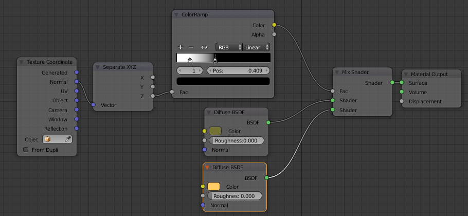
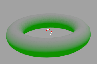
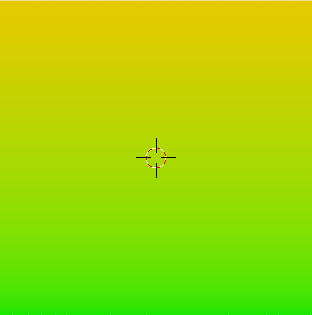
The result:
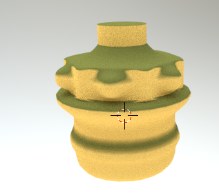
Here you can see that everything on top will be affected while the rest is untouched. With the colorramp you can control the softness.
Instead of using the input “Texture coordinates” you could also use the input node “Geometry” where “Normal” also exists and get the same result.
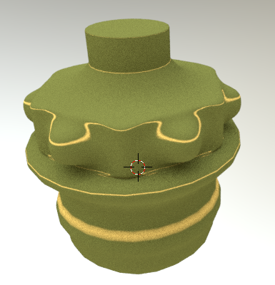
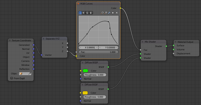
“Normal + Normal = Edge”
If you think about the colorramp as a filter you can easily see that we could use the colorramp to make differences in the normal, so that the edge will be visible. On the colorramp, Just start with black, some white where you will find the edge, and then some black in the end again. It will look like this:
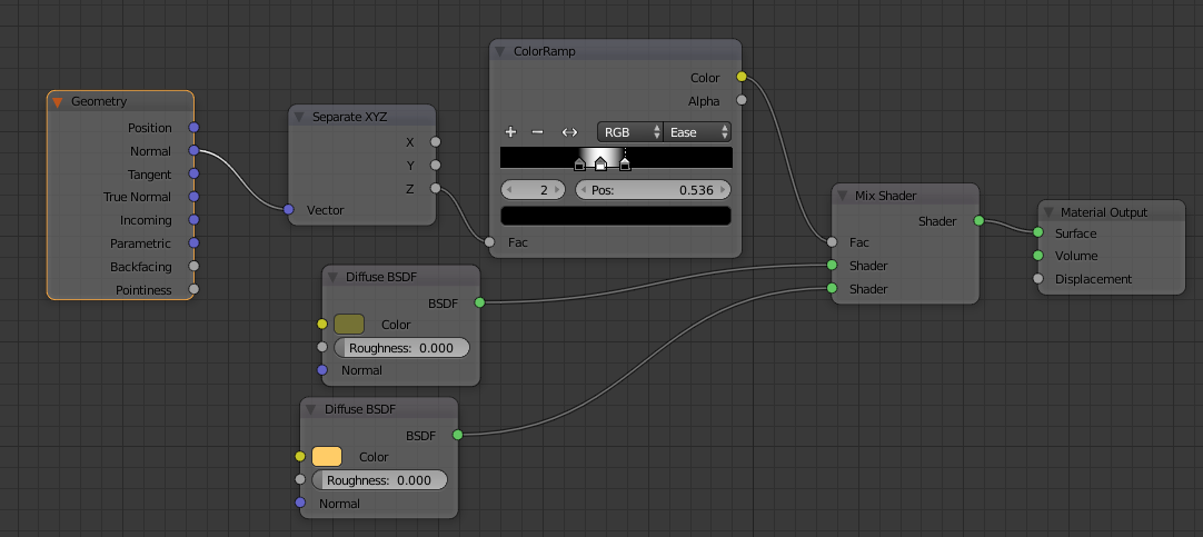
Result:
Random “soft” wear and tear
To be able to make a wear look realistic you must also know how to apply scratches or wear on the surface that are more on random.
There are typical two types:
· Softer wear. Years of weather, wind and such have made the surface old. This type is presented using the softer textures.
· Hard scratches. Long, deep and narrow scratches made by sharp objects that have touched the object.
To create the types mentioned above we need at least two textures (in rare cases one texture will be enough… but it’s better to see them as building blocks). These will be combined using one or several of the things below:
· MixRGB from Color Node Set.
· ColorRamp from Converter Node Set.
· Math Node from Converter Node Set.
Soft type A, the internal soft textures
When creating wear, you’ll need to know which textures are “soft” so here is a short presentation:
Voronoi
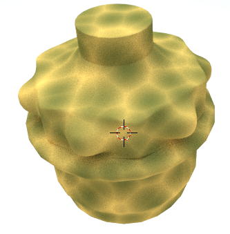
Voronoi has two textures. The soft one is created by using “intensity” as parameter. This will give almost round shapes that are fuzzy / blurry at the edges and then more and more color towards the center.
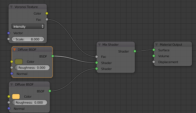
Result:
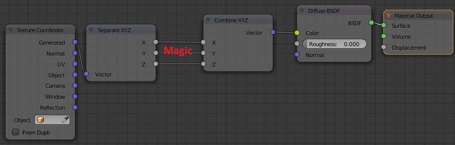
Magic
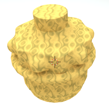
The Magic texture has a soft pattern that repeats over and over again. The pattern can be changed using the depth parameter and you can also distort it a bit using distortion.
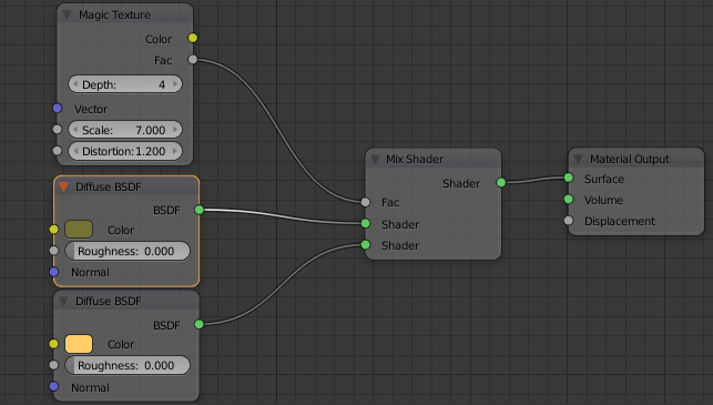
Result:
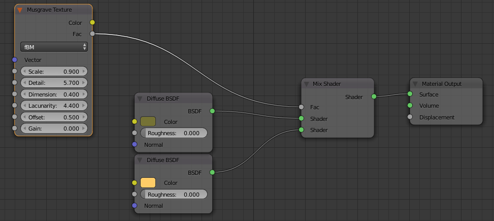
Musgrave
Musgrave is a really flexible texture, but one must know its parameters.
Scale is rather easy. Low scale = Big pattern, High scale = smaller and more advanced pattern.
When you get the default values Musgrave looks rather boring and may not look suitable for wear. In reality it’s the opposite!!
The trick with Musgrave is to work it correctly.
1) Start by setting the scale to just 1.
2) Set “Lacunarity” to 5. Lacunarity is the magic in Musgrave.
3) Now start dragging the “Detail” up. You will see how the pattern changes! Just go all the way up and then down again until you get the hang of it. Stop where it feels “nice”.
4) Now you can fine adjust the “Lacunarity” a bit. You’ll see how the pattern moves around.
5) It’s time for “Dimension”. Use it gently. It will blur the edges around your pattern and often you just have it in the interval 0-1.
6) Now you can add the “scale” factor if you want to. Often it’s not needed… but still.
7) “Gain” and “Offset”, you will seldom use in this workflow. They don’t add anything at all.
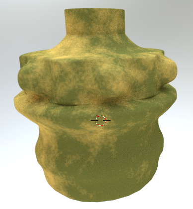
Here is an example of “dirt” using Musgrave:
Result:
Soft type B. The bleeding/blurred edge
To achieve this you will often work with soft textures like voronoi (intensity), noise, magic and musgrave.
The idea behind it is to have one main texture and then blur/bleed using the other texture.
I’ll start with using Voronoi against noise putting voronoi at a low scale (the main) and noise at high scale (the edge blur)
Linear Light
Mixing with the MixRGB “Linear Light” . When using “Linear Light” the top texture will be moved towards the bottom texture as FAC reaches 1.
So to achieve a blurred edge with the two textures above, I’ll put the noise at the top and the voronoi at the bottom. Then the noise will go closer to the voronoi instead of the opposite.
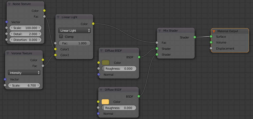
Result:
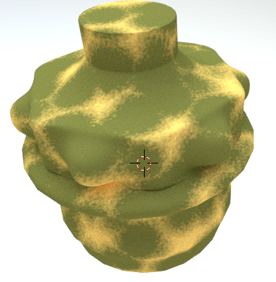
As you can see all that noise are now collected on the edges around the voronoi.
Burn
Here we will use “Burn” (Still MixRGB), instead of linear light. Same setting as previous example (Voronoi as main, noise as edge)
When using Burn the bottom texture will be “burned” using the top texture as FAC goes towards 1. This means that you will get more color if both the top and bottom pattern is on the same place.
However, the top texture will not be removed, so you will still see the noise as well.
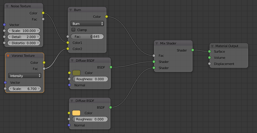
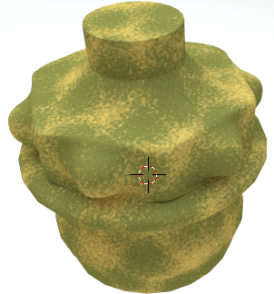
Result:
Overlay
By using “Overlay” you are using the same logic as for “Burn”, but with one small difference. In burn it get colored if one or two of the textures are present, but overlay demands both textures to be active on that dot to color. If the two textures don’t meet exactly it will be an empty void. This how it looks:
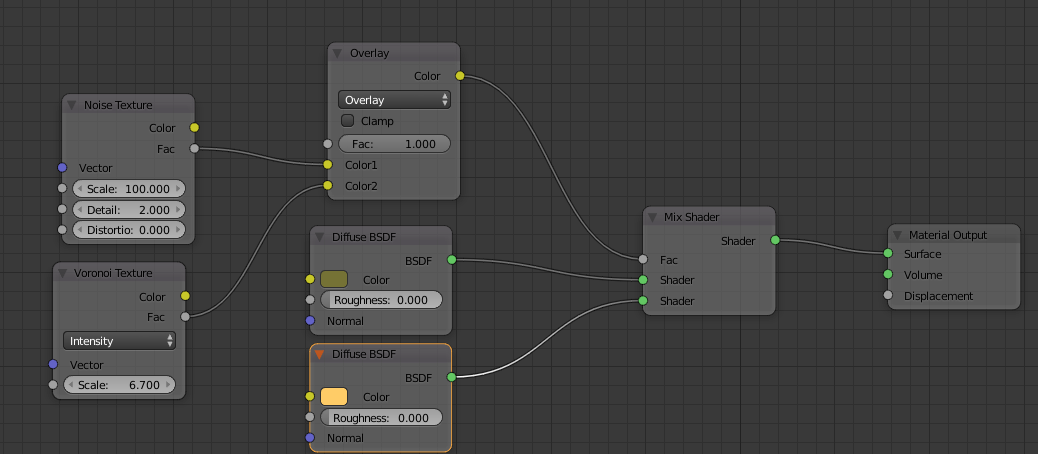
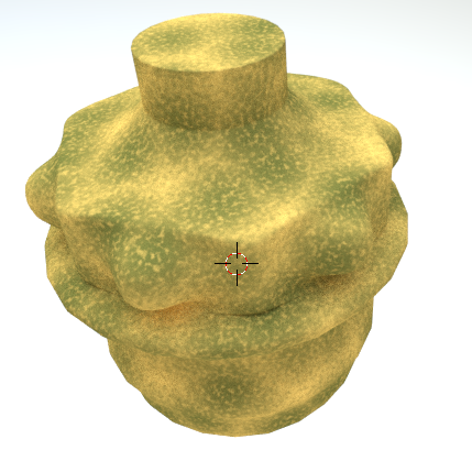
Result:
This is very good to use if you want to “wash away dots” in one texture by using the other.
Random “hard” wear and tear
Most people find it difficult to create scratches procedural. The soft ones is more just to “put on a texture”, but scratches are just on different places, narrow with hard edges and also have endings… which is annoying since most pattern are repeated over and over again.
So is it possible?
Of course :D!
I will start going through the “hard” textures, so you know where to look. However. These are rarely used by them self. You should combine them with other things as well.
The internal hard textures
Wave
This is the most common lines when it comes to textures. You can get them straight using “bands” or bend using “Rings”. Most commonly used when making wood material or water waves, but could be used when making scratches as well if used properly.
One thing about the “wave” texture is that it’s very good to work with together with math since that mathematic and logic behind will show directly on the lines.
Example
Result
Voronoi
Once again we can use Voronoi, but this time for hard edges. To gain hard edges from Voronoi you use the parameter “Cells”.
The good thing with Voronoi texture is that it has endings. It’s not a long line like the wave texture, but ngon patterns. Since the pattern has “faces” you’ll need to do some work to get rid of the faces and just keep the edges, but once that is donce you are left with a lot of useful lines.
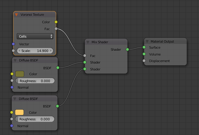
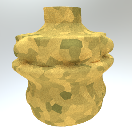
Result:
The simplest version, Texture against texture
When working with hard scratches, you don’t have that many options when it comes to making them using textures only. It’s often just a combination of Waves (or voronoi cells, if you have made edges from the faces) and Musgrave.
The thing is to cover or show things that are unpredictable, but most textures are so predictable.
In most cases you will have to add one or more levels of complexity to get realistic scratches.
I will do two simple examples here, but after that we have to go deeper in to the labyrinth :).
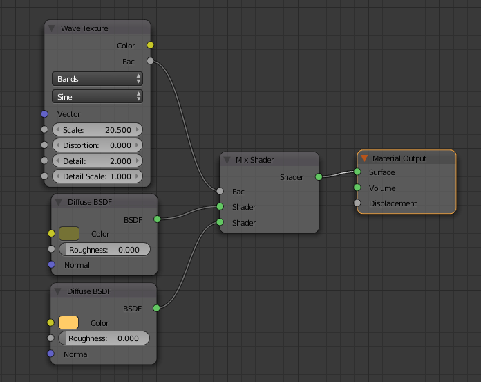
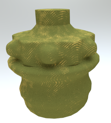
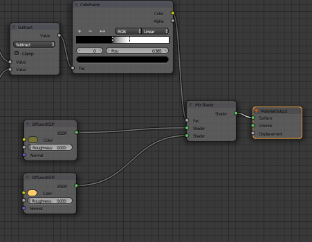
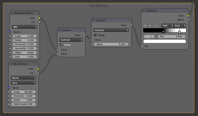
Wave – musgrave using subtract.
Just as you did the soft wear and tear, you could also use musgrave when making scratches, in this case to hide the waves (or voronoi edges), so that they end. Here I use subtract to take away the wave pattern:
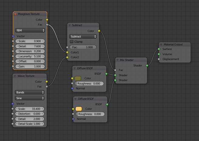
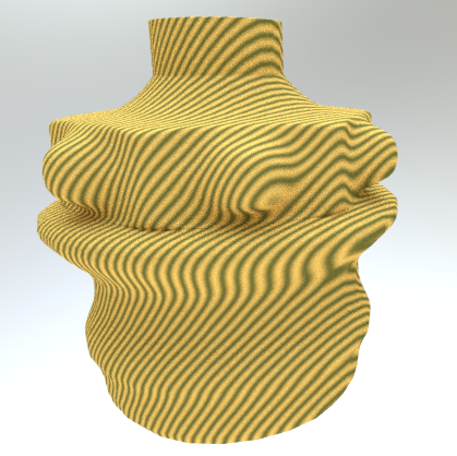
The Result:
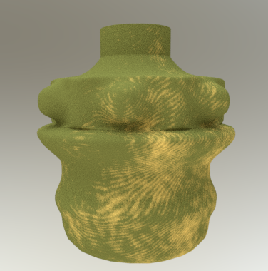
Wave – musgrave using linear light
We can use “Linear light” exactly the same way as we did when making soft variations. Here we will attract the lines towards the musgrave.
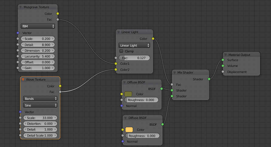
Result:
Voronoi magic
I have earlier said that we can using Voronoi for scratches… if we can make it look like edges instead of faces.
In Blender there is no “edges only” in Voronoi however. There are only faces!
You can not even track or find the edges in a pure way since the voronoi cells also overlap each other.
So, the only way to find the edges in voronoi is to compare one voronoi with another, slightly distorted, and save the differences as they then will be the edges.
There are several of ways in doing this. I will first go through the simple ones and then I raise the complexity a bit.
A simple subtract of scale
If you just want a few lines it could be that a simple subtract will work for you.
The idea is that you take two voronoi textures, but you change the scale just a tiny bit on one of them. Then you get some difference. These differences will be your lines.
In this exercise I will add a new node to make the subtract. The Math node! You can find it in the “converter” part of the node menu. This I will use to make a subtract. If both values from the textures are the same, the result will be 0… and in the other situations it will not, meaning that we have a difference.
This is how you set it up:
The result:
As you can see this give a lot fewer lines than waves, and they also go on different directions. Great!
The only drawback is that they are rather random in width. You will notice that some will be larger than others and even if that is not noticeable in my example above it will be very annoying when using this method on a flat surface like a plane for instance.
Since the faces are overlapping we will not easily get away from it, but we could use different methods to achieve different results and perhaps find one that suits your need for the moment on that particular object. Let’s go to next level!
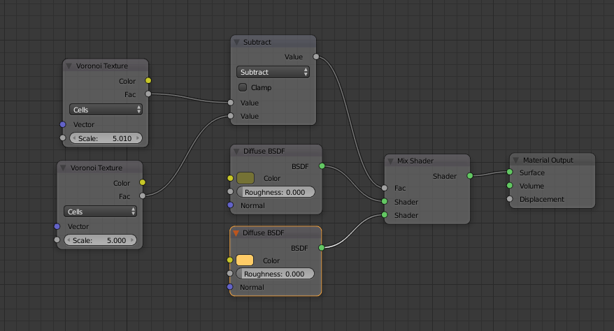
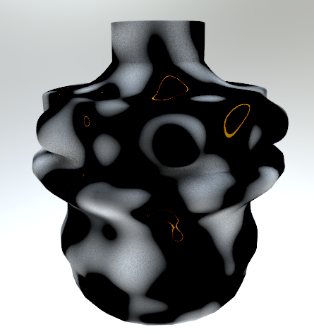
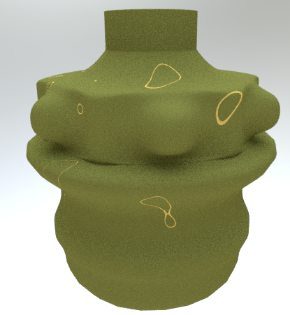
Voronoi edges from Vector mapping and subtract.
Next level is to add a vector mapping node. With this you can do several things that you can’t do with a single scale parameter in the Voronoi texture.
With vector mapping you can select to change scale in only one direction or to move or rotate the object slightly. In short… you now have several options to distort the “original” Voronoi.
The setup looks like this:
The input node “Texture Coordinate” with output node “Generated” is the default value when using textures, but when you use a “Vector mapping node”, you lose this and are forced to add the input node to describe how the vector will look.
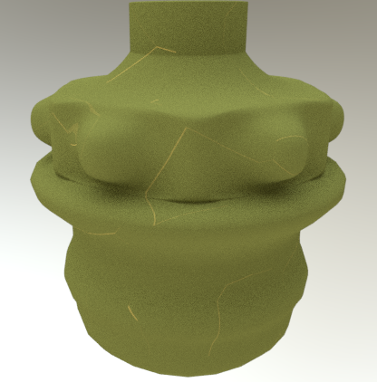
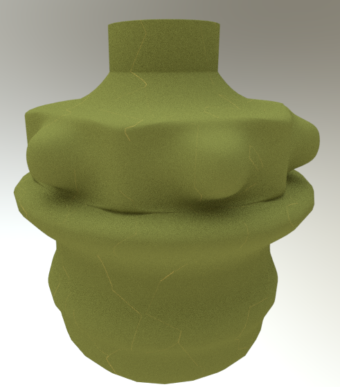
In the example above I have just rotated X to 0.1 degrees. This will create a small change and then we have an edge result:
Since it’s a mapping node you can do other things at well. For instance, if I just change the location a tiny bit I can do that like this:
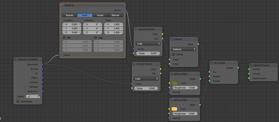
Now I have shifted location just 0.001 on the X axis and then I get this result:
Make the straight line curved.
Now when we have found out different options on how to make scratches or edges using voronoi, we could think that we now are done. It’s just to combine some textures and those lines and we are good to go, right? Wrong! Yes, there are situations where a straight line is enough, but in most cases we need the line to be curved as well.
As with most things there are several approaches on how to curve the lines and will go through them one by one.
Using musgrave as scale, the simple way.
One of the simpler one is to bend the scale a bit on the value that pops out from the vector node. We can do that by just adding the musgrave texture right in to the scale of the voronoi texture.
Since we are bending the scale here we also need a little more difference from the mapping output.. Or the lines will be changed so much of the scale that they vanish.
Another thing is that we would like to use the musgrave opposite from before, meaning we would like it to bend just slightly and not with all those detail smudges… so it should be as simple as possible.
Look at this picture to understand how the lines behave:
Anyway a setup can look like this.
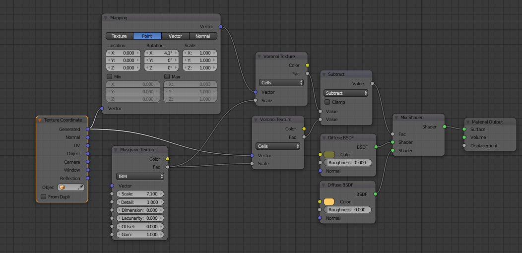
Result:
Using musgrave as scale, the “correct” way.
In the previous example you noticed how we could bend the lines using musgrave. However, to bend the lines after you have done the comparison is not the most effective way to do it.
The best way is instead to play with the vector input, changing the straight input pattern to something more unpredictable.
This gives also a lot of more options. You can use almost any texture to “bump” the straight lines in any directions, so even if I use Musgrave in this example, you can easily exchange it to noise, magic or something else.
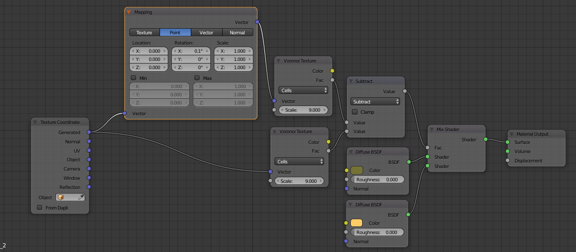
Now I will introduce two more converter nodes. The “Separate XYZ” and “Combine XYZ”. Total setup is like below (and now hard to see in total), but I will go through the details on it:
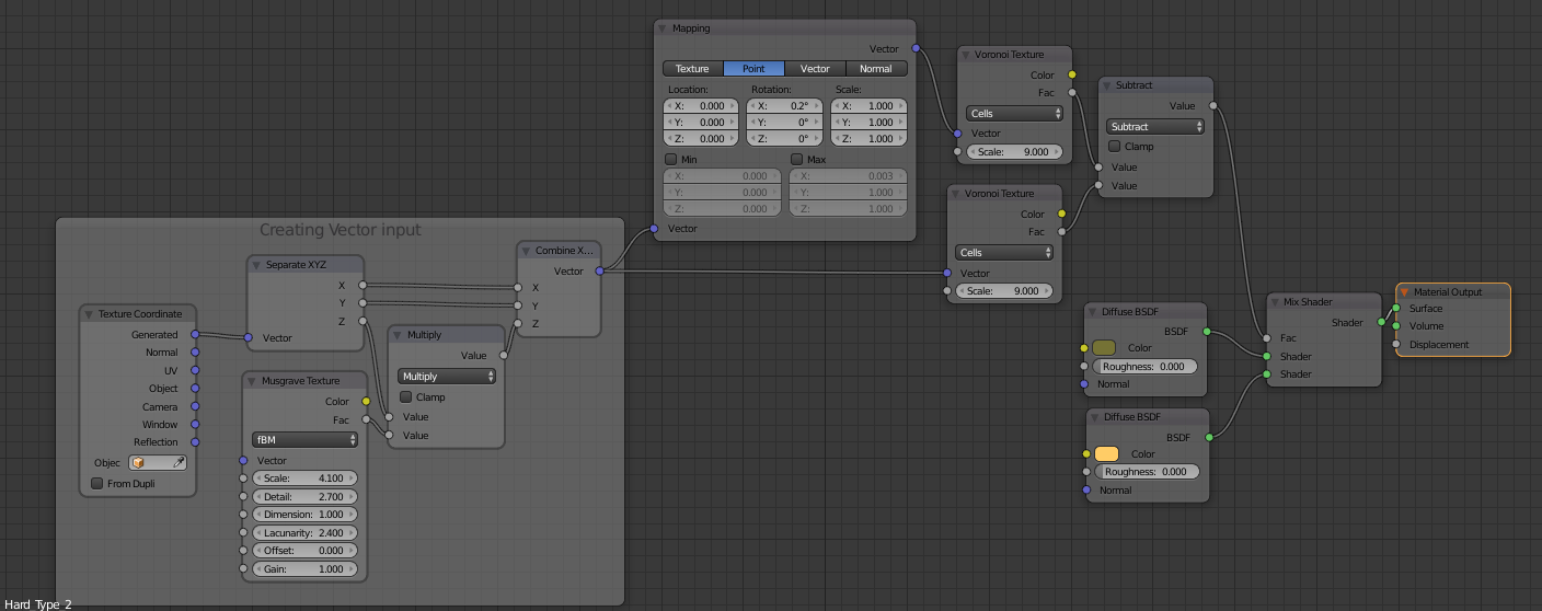
The interesting part is this:
As I described earlier, the input default value for vector is “Texture Coordinate” with output generated. That will create like a “cube” around your object (Bounding box) with the range of zero to one in all directions, 0-1 on X-axis, 0-1 on Y-axis and the same on Z.
If we can fiddle a little with these numbers… it will not be a straight line from 0 to 1 any longer. There are infinite ways of doing it and here I will show a rather simple way.
First we need to have some control of the directions. That we get by separating the vector in to each direction, thus we use “Separate XYZ”.
Then we do some math to change the value that comes out from generated. It can be pure manual calculations using just math nodes or it can be vector curves (and then we don’t even have to separate X, Y and Z before, because it is separated in that node) or we can add textures that do the math for us.
In the above example I have used a math node to multiply the outcome from the Z-axis with what I get from a musgrave factor. That will screw up the Z axis totally (I could use this on any axis or a combination of them). Just remember that this method of using multiply takes over totally if using too high scale of the texture. Then it will just be the texture shape on that axis, so start with small variations… using small scale if you don’t want to much variations or add an “add math” after to even it a bit.
Well, after I have done this, I’ll need to put the pieces back again. Then the converter node “Combine XYZ” is used… and back is the vector that now can be used by the mapping node as usual.
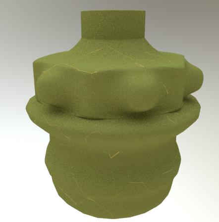
The result will look like this:
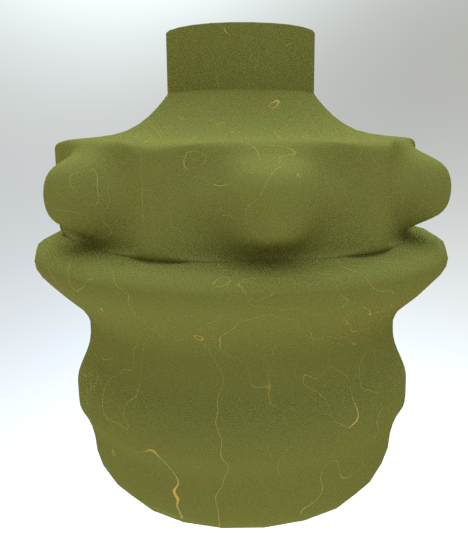
More lines than the previous “after mapping solution”, and above that also curved and with infinite variations to select from. This is the way to go!
Making the edges sharper.
Using Colorramp
The most common way to filter things away or make the lines between two colors more sharp is to use the node “Colorramp”. We used it when searching for edges together with “pointiness” and we can of course also use it together with our Voronoi scratches to make them sharper and shorter.
If we take the setting above and just add a colorramp just before the shaders get the factor, we can easily control the end result. If you put your colorramp values like this:
You get a result like this:
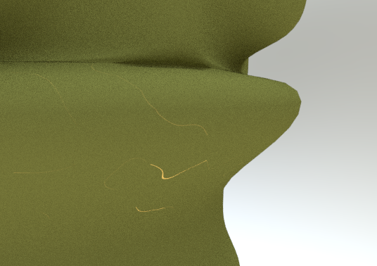
As you can see, we have now scaled away a lot of the lines and in the same time made those lines that was left sharper.
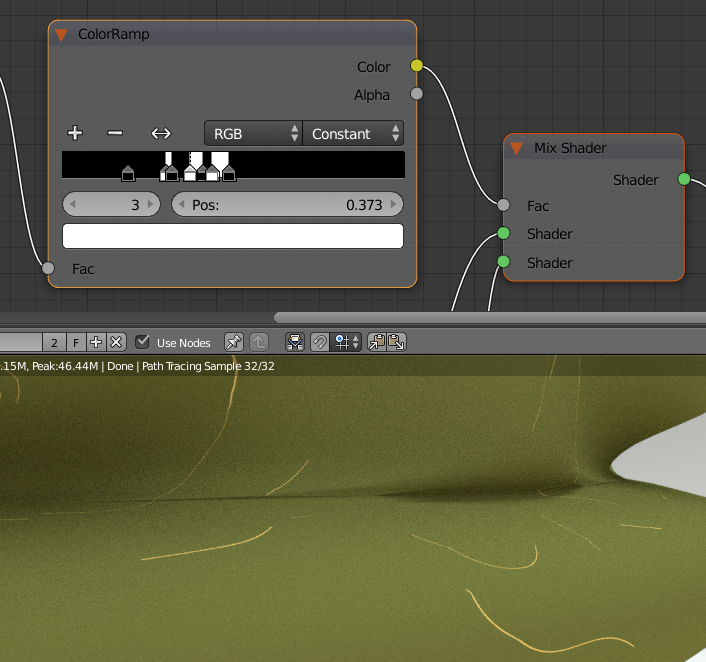
If you want even sharper using colorramp, you could change the type to be “constant” and in that case it’s either white or black…nothing exists between and the result will look like this:
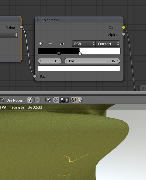
If you want more lines, then you have basically three ways of doing it rather simple without adding more textures. One is changing the vector input, another is to change the scale of the texture and the last one is to use more delimiters in the colorramp. If I add in a few extra I get this result:
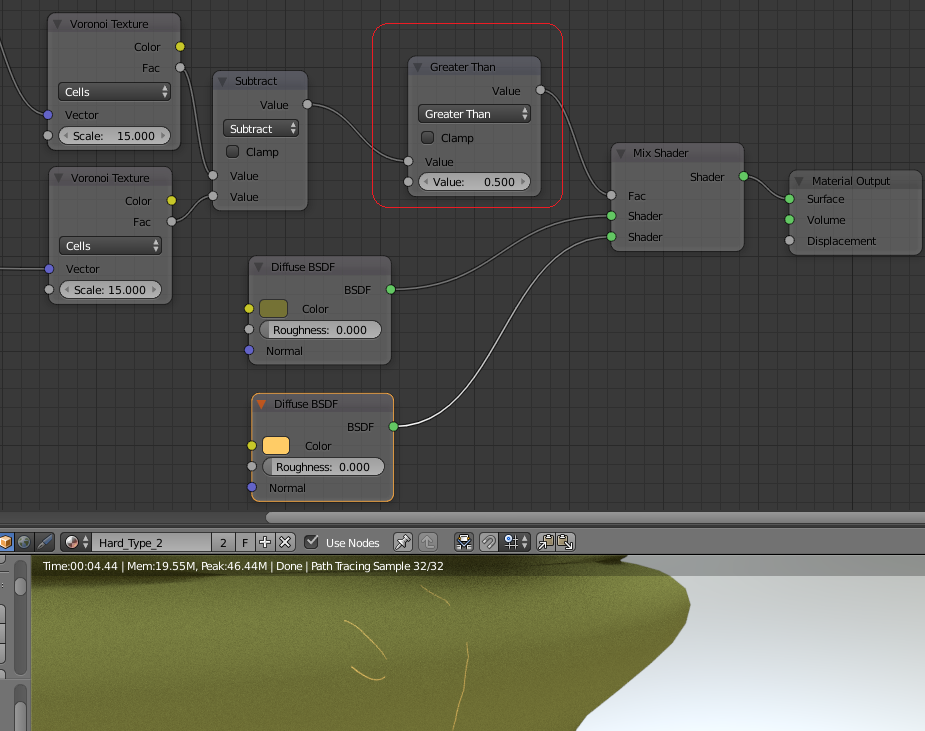
Using Greater than, to sharpen thing.
Using a colorramp is good, because its dynamic and you can add a lot of filters and decide how to go between colors. Sometimes however you just want the edge to be sharp without any great fine tuning.
Then you replace the colorramp with a simple math node and use the type “Greater Than” (or in some cases “less than”).
What it does is that it compares the input value with your written value. If the input value really is greater than what you have written, the output will be “true” or in blender 1.
That means that you as a result can only get two answers 0 or 1, which gives you a perfect sharp line. However. It also means that you looses all values in between, which could be good to have for later on in certain circumstances.
Below you can see how the setting would look if exchanging the colorramp to a “Greater Than”
Create parallel scratches
Unfortunately Blender doesn’t have any “loop” node in cycles. That would be great, because then you could get through the same texture several times just changing the scale a little or some other input parameter.
If you want a loop node, yes there are AddOn’s that people built, but now I’m just going through what you can do with what Blender has as a “standard”.
This means that if we want two different lines in parallel or more, then we have to copy the texture setting for each. Since the texture is a “box of patterns” that only give a certain dot scrambled with this pattern as output for a given time, we can’t duplicate that dot to any other place… at least not in any way that I know of.
So, how does it look in practise?
Well, I will use the same setting as before, but add two more sets of voronoi to get three lines that goes close to each other.
This is how it looks:
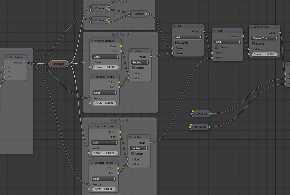
I have minimized some things here to make it viewable but in short I now have three sets of Voronoi. Each Voronoi is exactly as the other, just with a tiny change on the scale. In my example above the first set has a scale of 15, the next 14 and the last 13. This gives three slightly different, but parallel patterns.
Then I just use the math node for “add” to put the three texture together. The result looks like this:
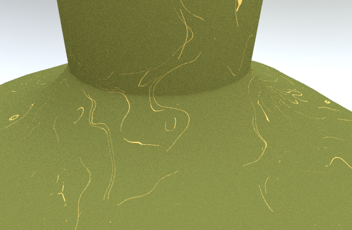
Depending on the “Greater Than” value you can get more or less line, given the end result a slight touch of random which is nice.
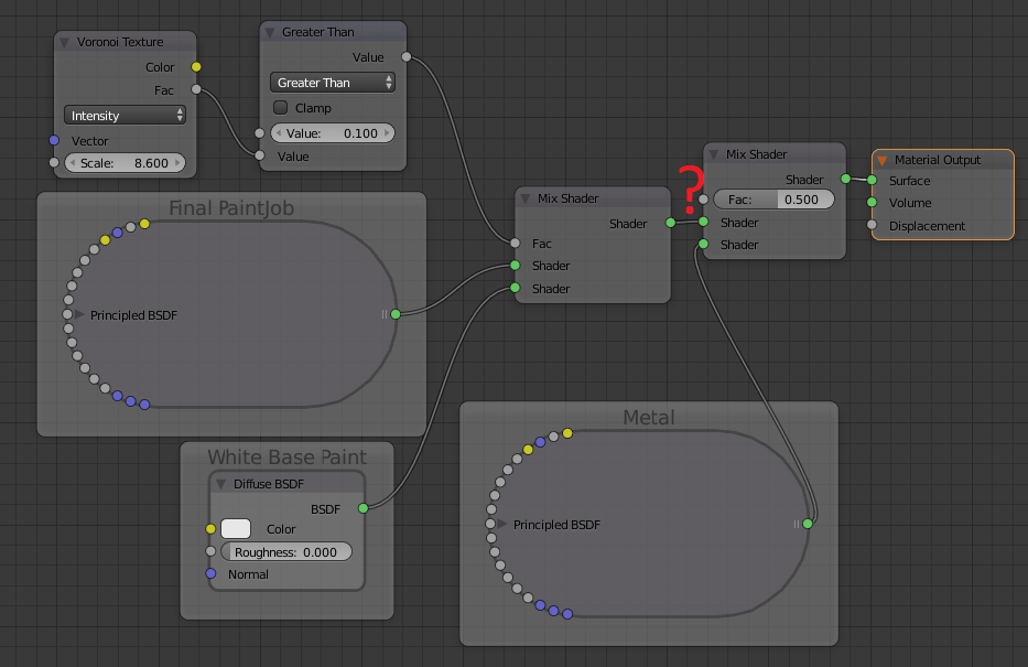
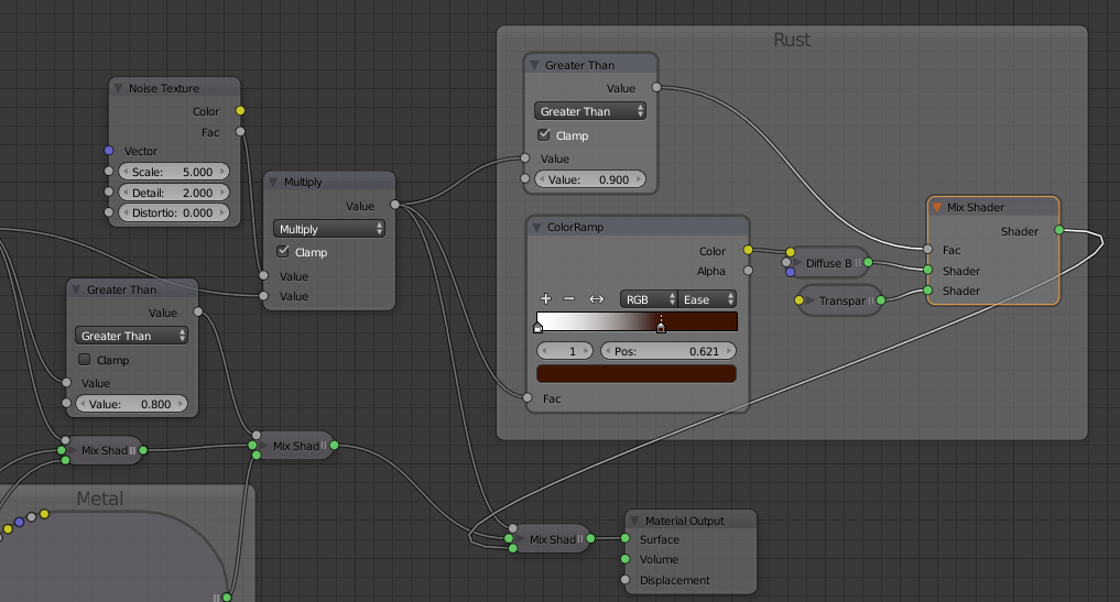
Working with three or more materials
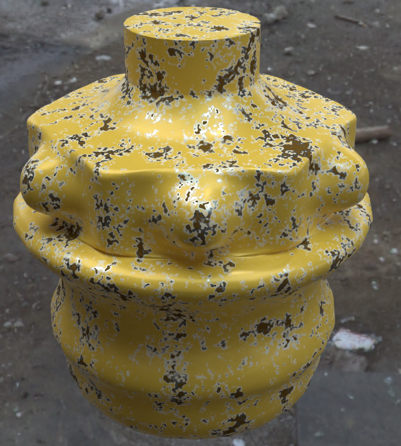
When doing things like rust or dust, we often need more than two materials. So far we have been working with just green and yellow, but that is not enough. Say that we have a part that has rust. What happens with a very old part that has rust?
Yes, it wears down and it get holes. How do you create holes? Well you need to have the transparent shader. That means one shader for color, one for rust and one for holes, which is three different materials or shaders.
Often, if working with handmade things, you have more than that. You have first the base material, which could be metal. Then you have a basic color as a layer under the final color. If you then has the rust, the holes, some dust, some paint or other stuff… well suddenly there are a lot of shaders and materials!
However. Don’t be alarmed. It’s rather easy.
Start with the largest material
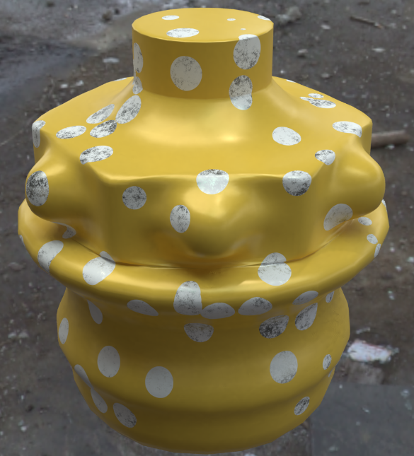
Concentrate on one material at the time. Say that we will make a yellow rather shiny thing, with white basic color beneath that yellow. In some places it got scratches as well. There we see some shiny metal.
Ok, so what do we see the most of?
It should be the yellow color. Then we start with that.
The setup is like this:
(I select those nodes I want to name and then press CTRL+J and write the name I want in the label)
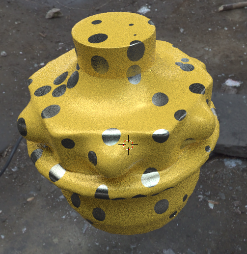
The Result (depending on background)
See, that was easy :). Now we will have some soft wear and tear on it. The white will show through and the white is not shiny at all.
Then work on the material that will interact with the base material the most.
Next step is to concentrate on the white. Disconnect the Yellow from the output and just put it aside while creating the new material.
Setup:
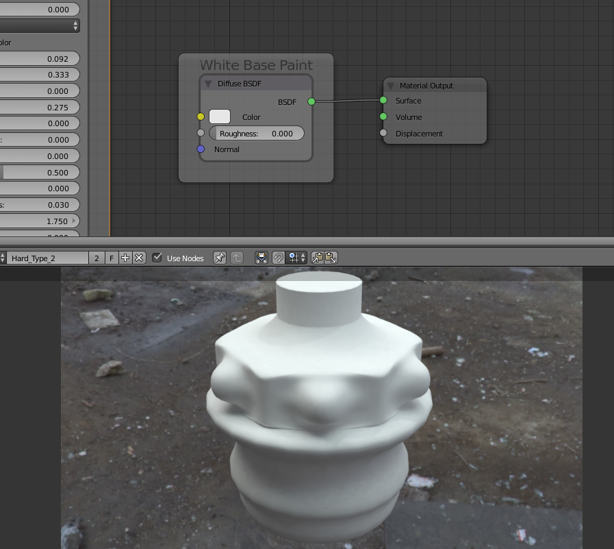
That was even simpler. Just one diffuse white and now finished.
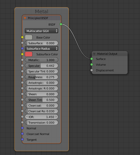
Finally “Fine tune material” (could be a lot of materials)
Ok, so the shiny white metal is left. Same procedure again. Disconnect the base color and start doing the metal.
Setup:
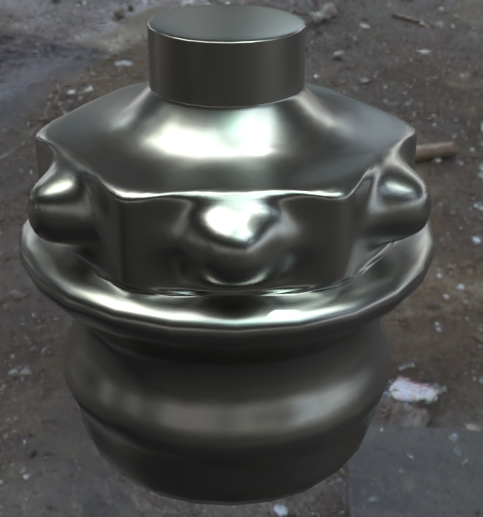
…and the result:
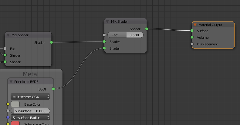
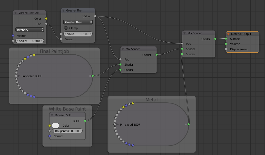
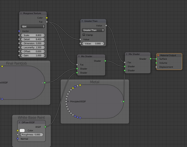
Ok, so now we have all three shaders ready… and the only thing left is to mix them together.
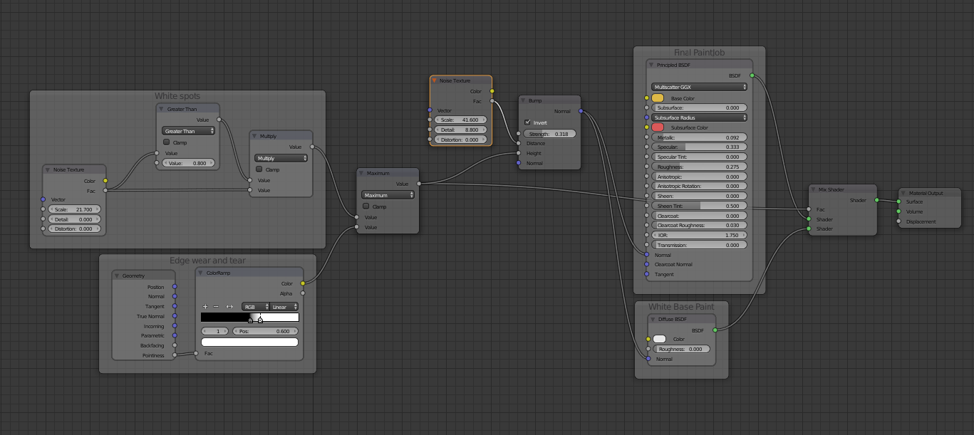
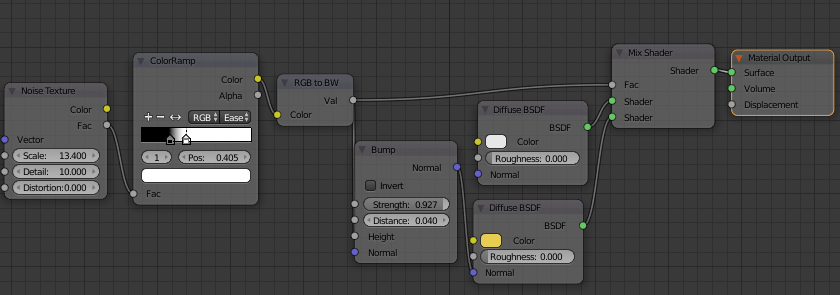
Start with the biggest parts. That would be the yellow and white. Use one of the “soft” wear and tear techniques from above.
Setup could be like this:
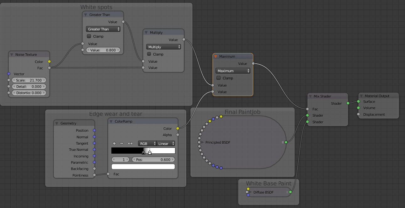
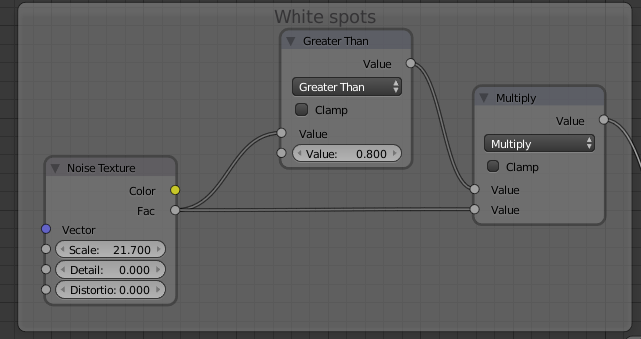
I added some white spots (Close up). This is noise and if value is larger 0.8 I show it… otherways it’s 0 as result. This gives a rather harsh ending on the spots as you will see on the result.
.
And some edge wear and tear
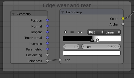
Then I just combine them with a maximum math node, so it takes the maximum value from both.
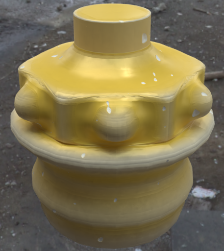
The result (with a bump vector as well):
…so it’s starting to look ok. I could have done a lot more to make it more uneven on the soft part around the edges, but then the node tree had been to big for tutorial purposes.
To get the bumps as well, in the way you see in the result above, I just connected the vector node for bumps after the maximum math node and drove the “normal” output in to the normal “input” on both shaders. I also inverted the vector.
It looks like this:
The noise I use to get uneven height on the white holes, which make it look more realistic.
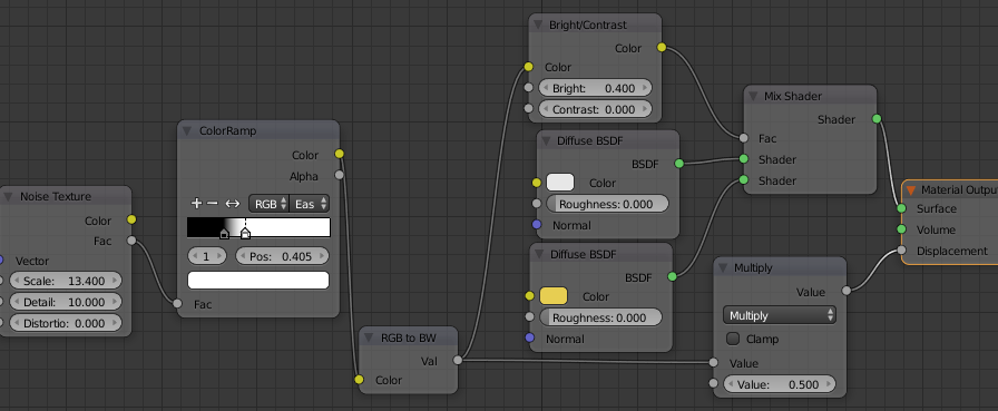
Now the total node tree looks like this:
…and it can be hard to see, but every part has been explained above it, so you should be able to put the pieces together.
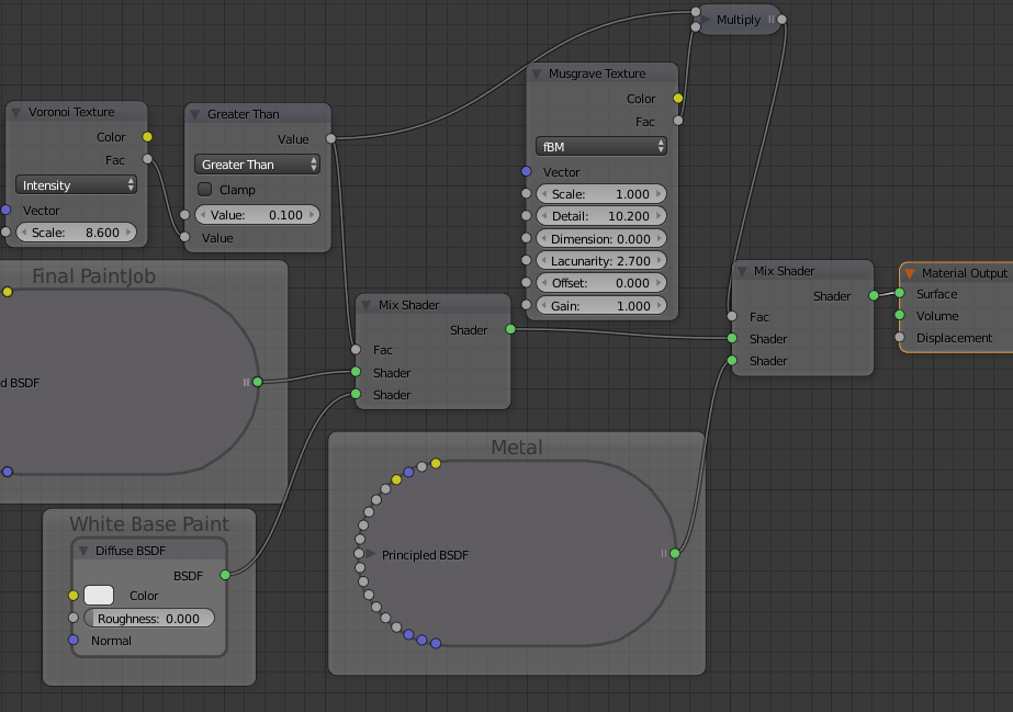
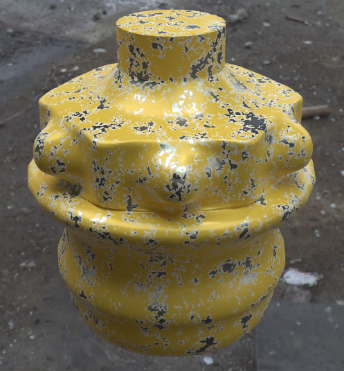
Finally we have the third material. That would be scratches showing the metal. As you know by now, scratches will use some nodes before it looks good, so I will use a simplified version here… just so you understand the concept.
The first thing is to add metal in to the scope. That you do by adding a new mix shader like this and connect the metal to it:
After that you’ll need to start thinking about how to make the scratches. As I said, I will not put too much work on this since I have described in earlier chapters on how you do it. In this case it will be a combination of soft wear + a few scratches.
The soft part looks like this:
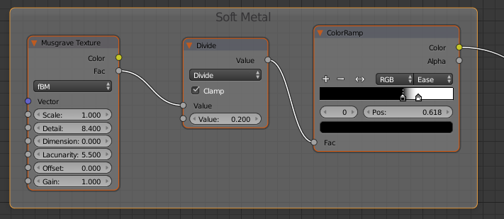
I’ll just use the pattern of musgrave and then divide it to get a smoother (less) amount. NB! See that I check “Clamp” when using the math node. This is because a pure math node can give any possible number, but using clamp you will always guarantee an output between 0 to 1.
Then I also have a hard (scratch) part. This is just a simple wave and it had been better to use the voronoi technique described in earlier chapters. However, it looks like this:
In this case I’ll remove parts of the wave texture using the musgrave. To lower the effect a little I also do a subtract on everything and connect it all to a colorramp to filter out the part I wants to be visible.
Finally I’ll just add the both values:
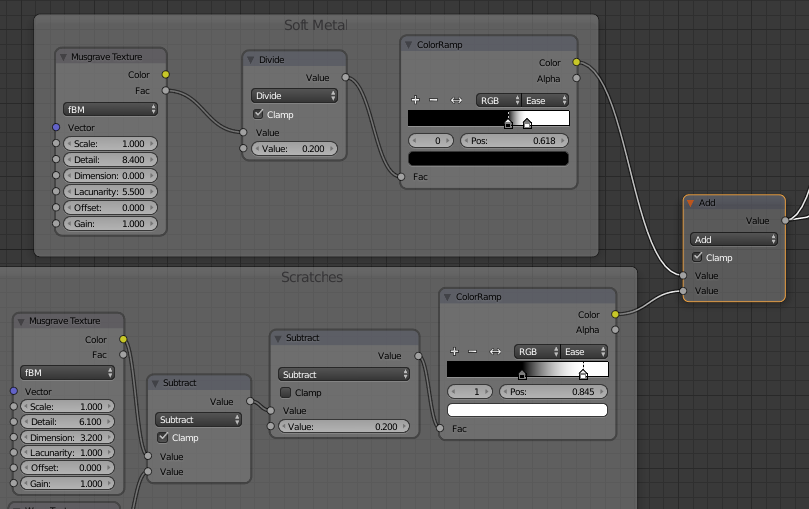
Here I also use the clamp “on” since I would like to be sure that the final value will be a legal value as output.
The Add I then connect to Fac on the last mix shader and “voila!”, now we can see the metal as well!!
To make the last fine tune I add a new bump vector to this fac as well. In the end the total node tree will look like this:
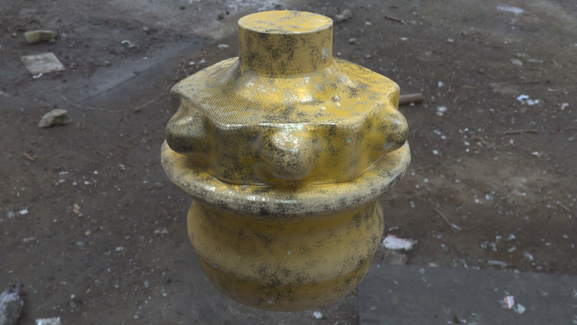
…and the result is not bad at all, even I have cheated in my effort of wear and tear in this chapter to reduce the node amount. Better scratches and it would have been great :).
You can continue with material after material. Of course the node tree will be large at the end, but the technique is the same regardless if it’s three or seventy three.
It helps to think that every new material is a new layer that covers the previous material… that is why you should start with the big and then work on the smaller parts.
Let the Fac’s work together!
In the previous chapter I added three materials, but they didn’t really interact with each other. They just popped up randomly and I didn’t care what material was on that place before adding another one. In many cases it’s not needed to think it matters either since most things in nature looks random, but in some cases it is really necessary that one material continuous where the other ended.
Why is there a need to use an earlier calculation for one material to a new one?
When you go from blue waves to the white foam, when the metal becomes brown of rust and then tears apart and it creates holes or perhaps in a stone like gneiss, then it’s good to know what material surrounds the new one.
Let’s look at some images (real photos!)
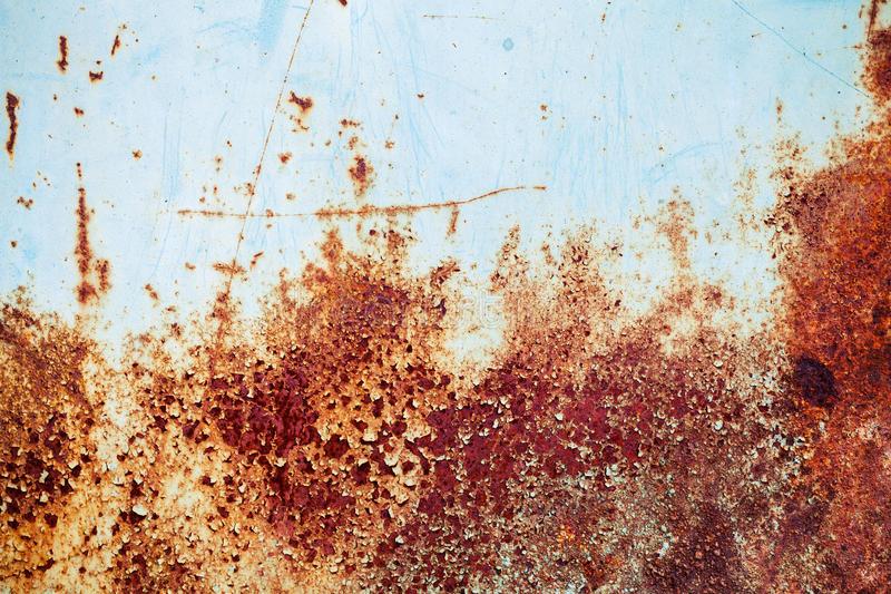
In the image above you can see that first we have the white and blue stuff. When the rust attacks it, it first becomes light brown. The light brown then becomes darker brown. It had not looked good if the darker brown popped up directly on the blue, without having the lighter brown around. It can even be hole in the rust, but that should then only be in the darker brown areas.
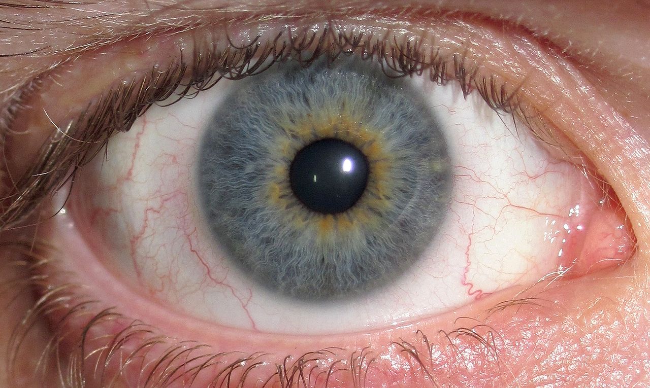
In this picture of the iris the different material placements are also very specific. The white should be outside of the iris, there should be a softer shade on the edge between the blue and the white and it doesn’t look so good if the brown is scattered all over. It’s better to place it near the center of the eye. You can of course calculate the places to put these things, but you can also take advantages of earlier calculations, so you don’t have to do it all over for every material.
Let’s make this happen!
Test and practise!
We keep the three materials from our earlier chapter here as well. I keep the Yellow as top layer and I let the white show as round dots.
Setup:
Result:
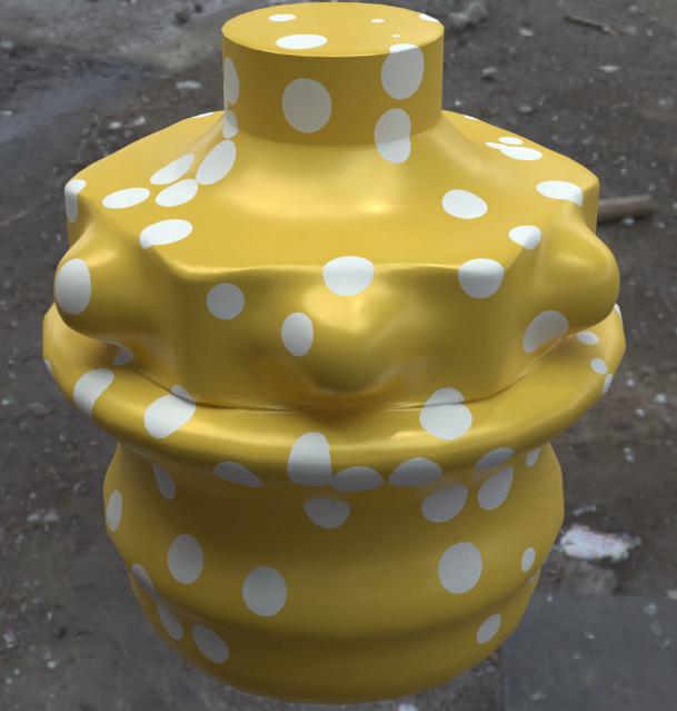
Looks like some type of toy :)! Well, now I want the metal to show inside of the dots. How do I do that?
I have two options. Either I do the math from the beginning or I continue on what was already done using the calculated Fac that we have.
We will use the old Fac and just continue.
The easy part is to add the third material, so that we can do directly. The fac is still a question though.
Setup:
Ok, so how to use the old value?
A simple sanity check will be to just take the last calculated value and put it directly in to fac, then we see how it looks:
Result:
Looks perfect…this means that the part we would like to manipulate, the white dots, is the part that is changeable while the yellow remains so we are on the right track.
I will now mix the white material with the metallic using some Musgrave. All I have to do is to add a multiply (math) node that mixes the two materials using that Musgrave. White is 1 here since we created a hard edge using. We could use a softer edge, but this is a start anyway. Now we have 0 for yellow and 1 for white.
Here is the setup:
Result:
Some remarks here.
- It could be easy to think that the circled dots are borders… they are NOT! They are more like small windows opened around the yellow “wall”. That means that if I add a texture like noise, wave, voronoi or whatever… it’s still calculated for the complete object and not just in the circles.
- In the example I used above, the outcome will be a hard edge around the dots since I used a “Greater than”. That can always be just 0 or 1 as output… never between. So, any calculation there you would like to use “a little of both” around the edge should not be built like this. It needs a soft edge. I will do some example of that as well later on.
Mix/Soft edges between materials
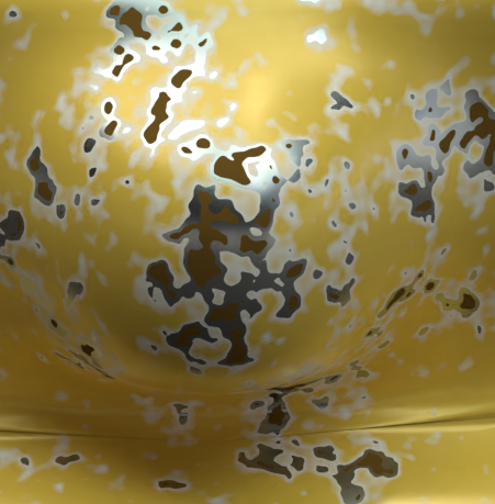
I will come back to rust again, since that is the ultimate wear and tear. To make rust I must first have basic material, then light brown, then dark brown, then (in some parts) hole as well.
The most important thing is to make this soft change between materials, so I will show that too.
Still we use the materials above (Yellow, white and metal).. But I will add transparency also.
I will show you the most easy way to work in layers using several materials when it comes to wear and tear.
As you might remember I wrote about the musgrave texture in the beginning and how flexible it is for just this purpose. The thing is that it works like the voronoi intensity a bit. Meaning that It starts soft in the edges and gets a higher value towards the center of every pattern it produces. That we can take advantage of. Let’s look at this simple setup:
Just one Musgrave, but all three materials are using it. The first two is in the image until the value reaches over 0.9… then we connect the highest values (center) with metal.
Result:
Neat :)! Now it feels natural. You start with the top color… it wears off, then the white bottom color and finally when there is no color left it’s the metal.
Could we add more materials in to this?
After metal rust…after rust… hole :).
Let’s see. Now I make a very simplified version of rust. Plain brown diffuse and add that as well. Using two different “greater than” I can control the edges on when things should change.
Setup:
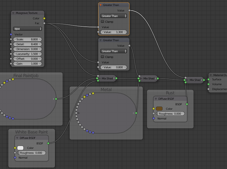
As you can see… the value from musgrave center is higher than 1.0! If using the “principled” shader you can get in to problems here, because it tends to go black on the material if the factor is higher than 1… but if using the ordinary diffuse, there is no problem.
Result from this:
Looks like it works! First we have yellow, then white, then metal and now rust.
However… the edge between metal and rust is too sharp. This does not look good at all. Let’s take a closer look at the image:
Does it look good? No, it doesn’t. We need som mix/blend between the materials here.
Between white and yellow we have automatically. Between white and metal will not be noticed that it’s a hard edge… but the rust we must fix.
The easiest thing is to just add some noise in to this. I still would like to keep it so it get higher value towards the center, so I’ll multiply the noise with the original musgrave.
The node setting (NB! I check “Clamp” to avoid values over 1. If I’m not using clamp the musgrave together with noise will generate values so high that the “principled” will not handle it… leaving black areas in the image.):
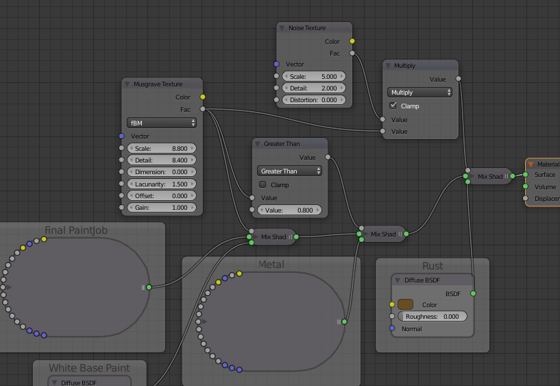
The result:
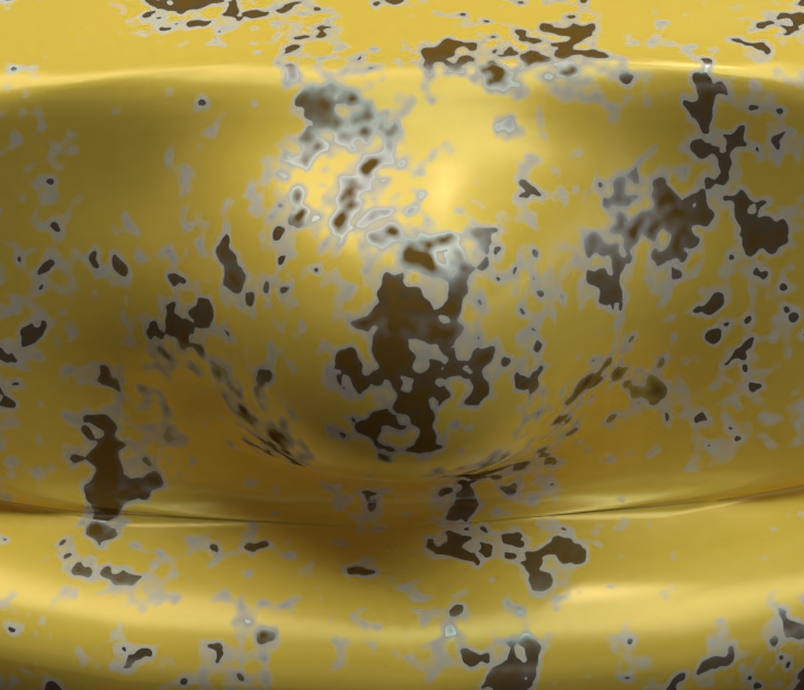
Wow! Look at this smooth transfer between yellow, white, metal and brown. Now we are getting somewhere.
Next thing is to fix the rust, so it has some variations and even hole where it’s really bad.
Since we already using noise to get out the brown color, the factors are different, even if the color is the same. We should be able to change the color just using a colorramp.
We also should add that hole. A hole can’t be “mixed” with anything else. A hole is a hole so it’s vital that we have the value exactly 1 and nothing less when using it.
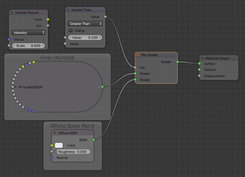
Well, what I do now is connect the factor value as I use as input for the metal/rust mix to the rust. It looks like this:
As you can see I use one output to gain rust color through the colorramp. I can’t use that however to get the transparency as that needs to be 1. So, my solution is to have a “Greater than” and if the value is greater than 0.9 then we get that this is true… and the output will be 1 = total transparency.
Result looks like this:
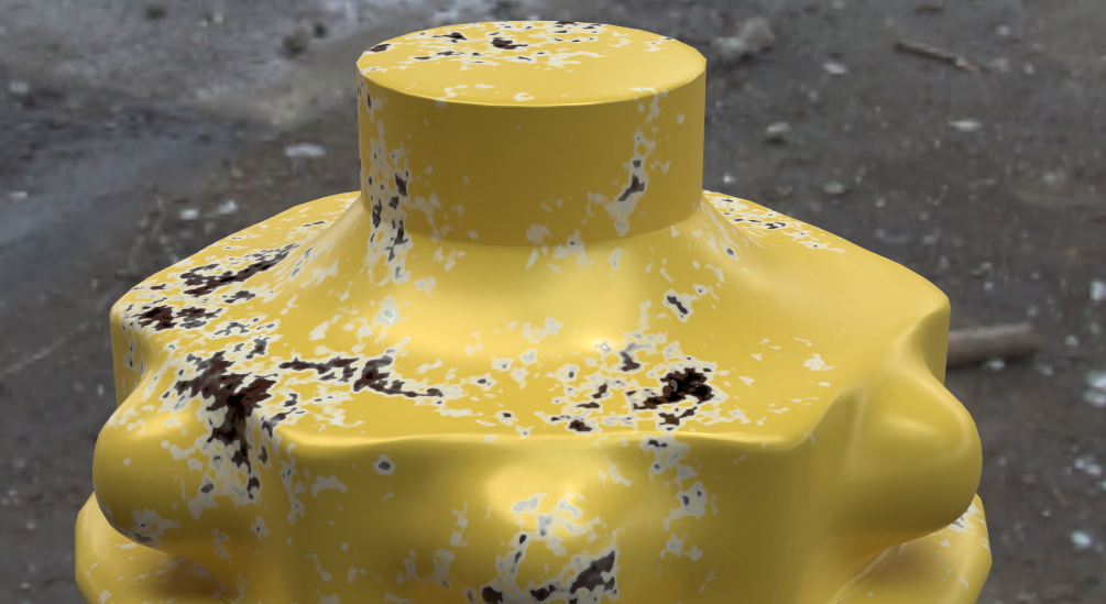
Perfect! We now have a nice transition from yellow color all the way to we get hole in the object. We have various colors on the rust and the only thing left is to add scratches, bumps and wear on those places that is most likely to be touched often. Some of this we already know and some I will explain in later chapter. Now this part is solved anyway.
After attached bumps, scratches and other things as I will go through you can easily go from the picture above to this below:
Bumps
Vector bump
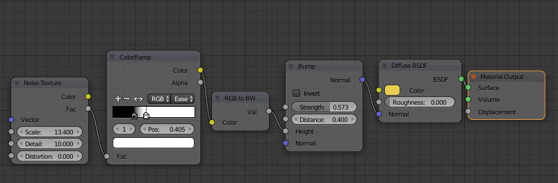
I have already touched it earlier, but to make a thing look ok, we need to add some type of bumps to it.
The most common way to create bumps is to use the vector node “Bump”. It reads a WB color scale, where white is up and black is down. The bumps can correspond with the color changes of the material, but doesn’t have to. You can have bumps wherever you’ll need them.
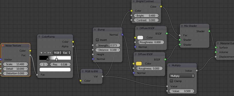
A standard setup for bumps is like this:
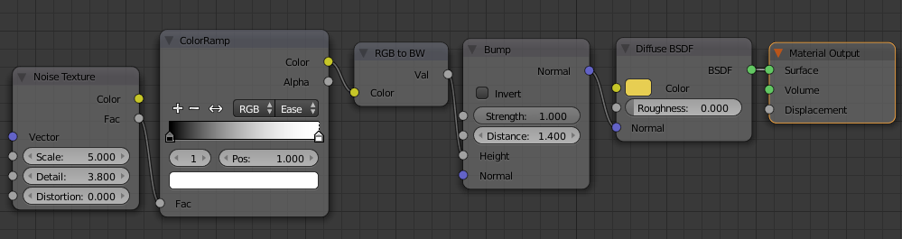
Here you get some kind of noise/texture that will generate the bump, a colorramp to filter some bumps out, a converter so that you are sure that you work with black and white.
All of this goes to the vector node “Bump”, which controls the height. As output you get a “normal” that you connect with your diffuse.
The parameter “distance” is to create a perceived distance between the bumps. Just see it as a multiplicator of the “height” parameter. The “strength” is how visible the bumps should be.
What you’ll need to know is that these bumps are “fake”. They don’t exists physically on your object. It’s just a play with shadows to make it look bumpy.
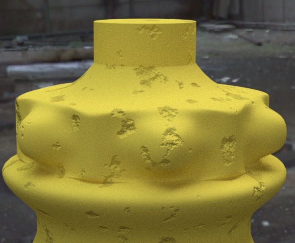
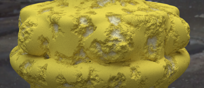
The result for the setup looks like this:
Rather bumpy, right? Well, if you look at the edges of the object you’ll see that these still are straight.
However. It could be convincing in most cases. Let’s play with the colorramp a little.
I’ll now have this setting:
Changed the noise a bit, lowered the value on the colorramp… in short smaller and fewer bumps.
This will now look like this:
Since none of the bumps is possible to compare against the edges of the object, they now appear more real.
If you now imagine that you have some color wear here in the bumps, so you see partly white then it will be even more convincing.
So, try this:
Result:
Now you really see the bumps, but as I mentioned before… the color changes does not need to meet the bumps entirely. It makes it too clean! Let us adjust it a tiny bit.
Try this:
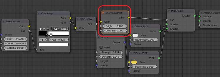
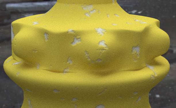
What I have done is just that I added a color node “Bright/Contrast”. This allow the factor to get little higher value and by that more yellow will be visible. The result looks like this:
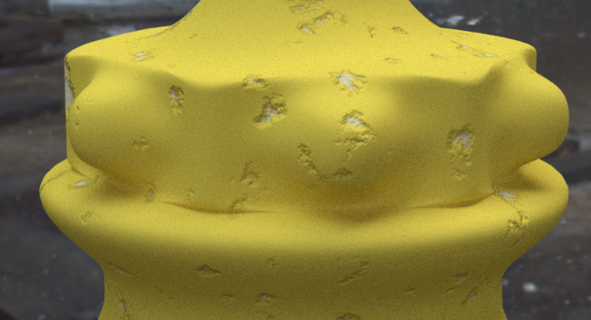
Now we don’t see white until we reach the lower parts of the bump. This is much more convincing then just following the bump exactly.
Always remember to add those tiny extra changes to get closer to a realistic end result.
Also don’t overdo the bumps. As you can see of my setup, I use a rather low value on my distance and still I get a very visible height result. Too much and you’ll notice its fake.
Some important points!
- When using a vector bump… all “normal” inputs of that material should use the output from the vector bump. This means that if you have added glossy shader for instance and a fresnel input, those two should also be connected to the vector bump. In my case above I didn’t connect the normal to the white color, but was because I didn’t want any bumps or changes on the white surface. It should be unaffected here.
- Using the “principle shader” ease the point above a little since it has all built in. Here you often just need to connect one input of the “normal”
- When adding a height parameter to the bump vector, always be sure to use black and white. If using image texture as input for height turn that to “non color data”.
- Bump Vectors, as well as normal maps, displacement input and even that thing called “micro displacement” is not affected of physical height changes in your material. Sometimes you want to control the area on where the changes should be by using the Z-axis. That will work for the original object and bumps (regardless of method to create them), will not change anything in this at all. You will understand this point more when I go through how to use the height for material changes.
- Since this is just a visual appearance, it will not affect the model and render time goes faster than using actual changes on your object. If you can handle a thing using bumps in your material instead of change things by sculpting you will save yourself a lot of problems :). (Yes, if you do characters or game assets you will start by sculpting and then reduce the model’s polygons and on the low poly add bumps… but that is another story.)
Another thing you can use to create bumps is of course “normal maps” as well, but I will not go through that in this document since I don’t consider that to be 100% procedural since you are using some kind of image to create the heights on your object.
Displacement (The “Supported version”)
Instead of using the “vector bump” you could use the displacement in the material output node. The drawback of it is that it controls the complete material/node output, while you can add several “bump vectors” to control different materials in your node tree.
We now have two versions of the “displacement node”. In “supported mode” of Blender it works a little like the “bump vector”. In the “experimental mode” of Blender it is a completely different story. There it actually change the object’s surface instead of creating fake shadows.
I will go through that in the next chapter. Here I will take the “supported version”.
A standard setup for the displacement node is to add a texture that adds bumps to the output, but also to put a math node between the texture and the node output, so you have some possibility to control the height.
It looks like this:
As you can see it is not that much difference from using the vector Bump. I just removed the bump vector and took the converted BW colorramp output value to a multiply and then connected in to “displacement” input. I also tooks down the value by 0.5 in the multiplayer node to not get a too strong effect. The result looks like this:
As you can see it’s almost identical. However, there is one small difference. In my “vector bump” example I did not connect the Vector bump to the white… leaving that without any “bump effect” by purpose because I did not want to have it too bumpy.
Here I’m forced to put a bump on everything since I can’t easily filter away those parts I don’t want bump on.
As a “quick and dirty” option, this works however fine in most situations.
Displacement (“The experimental version”)
In Blender we have an “experimental mode” as most of you know. By selecting that you can get some pretty neat features, but it could also be a bit more unstable. However, I have not noticed it to be more unstable running in experimental mode… so I see no reason not to do it.
When using displacement in the “experimental” mode, you have a huge difference comparing to the other methods that I have mentioned before. It actually changes the object!!
The changes are “viewing sensitive”, so if you view the surface close, it will change a lot… but on distance it will just change a little. Convenient and it saves memory.
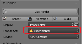
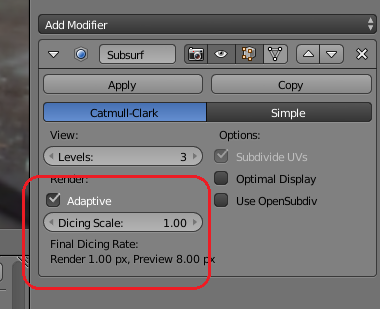
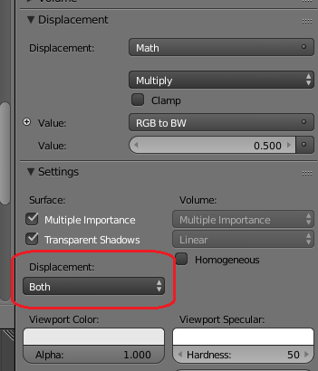
The setup is a little more than usual. These things need to be correct:
Render should be in “experimental” mode;
You should add a subsurface modifier and select it to be in adaptive mode;
On your material, you should in the parameter setting change the displacement to “both” (if you want to use vector bump as well) or “true” (if you just want to use the displacement).
Now you are good to go.
When looking at the changes that happens on your image when changing the node tree you’ll have to jump between “edit mode” and “object Mode” (using the “Tab” -key). Otherways it will not be refreshed.
The material setup is almost the same as for the “old” displacement and looks like this:
…In short no changes here (I increased the colorramp a bit to show the changes more clear) if comparing to the old setup (in the simple mode. You can add bump vectors as well together with this… but they still will work as described before).
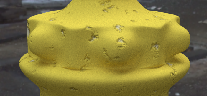
The result:
If we look on the selected edges here now, we can see that they actually have changed! They are not flat anymore. This means that if we really need something “real” then, this opportunity exists.
However it takes a lot time to render and a lot more memory when rendering.
To make it less “clean” we could now add that extra vector bump as well. It’s just to combine the two settings above so we get this:
Here as just added the “bump vector” again and connected it to the yellow. The result looks like this:
Now you can see the small details of the cracks more clearly and by that we get an even more realistic image. Neat! (As usual…do not overdo it. Here is a “little” too much, but it is more to show the changes.)
Fake shadows (AO)
Ambient Occlusion is a quick way to make shadows around crevices and cracks. This is totally fake compared to what it should be according to the light source, but could still increase the visual impact.
The easiest way to explain it is by saying that it behaves like a diffuse shader with shadows around sharp corners/edges.
In our goal to get wear and tear on the object this works great since it will add some “dirt” or smudge in to all those small parts.
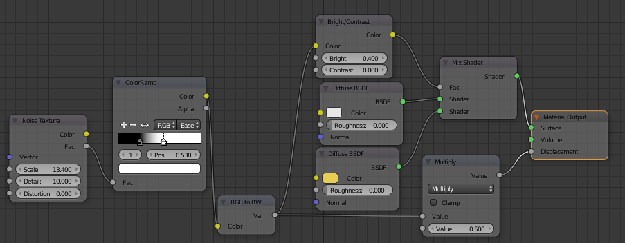
I’ll start with a simple “pointiness” setup using diffuse only. You have seen the setup before, but it looks like this:
The result for it:
Now I will change one of the diffuse to an AO shader instead. The setup will now look like this:
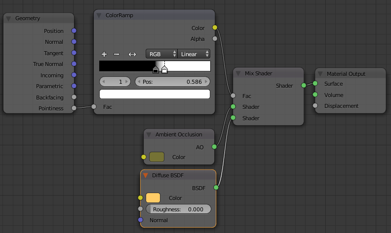
As you can see… only one shader is exchanged. The dark green is now “Ambient Occlusion”. The result:
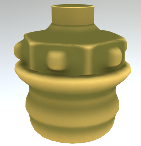
The difference is very subtle. Still it will make an impact.
Side by side:
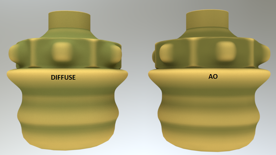
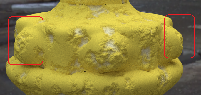
The effect will be higher if you have lot of crevices, but even here, where most of the bendings are “soft”, you can see that the right one looks darker and more used.
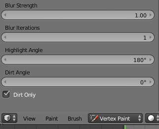
Vertex paint “Dirty Vertex Colors”
Overview
I hesitated a little to take this in to my document, since I don’t think you can tell it 100% procedural (could be that I’m little off here about the definition around “procedural”). However it’s an easy way to add additional wear and tear, so I can as well explain this technique. It’s the end result that counts… right?
Easily explained “vertex color” is color information on every vertex of a mesh. It means that high poly gives better result than low poly.
Before you can use this in your node tree, you’ll have to create the vertex data.
Setup
This is easily done:
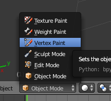
First have your object loaded and selected. Then change from “Object mode” to “Vertex Paint”.
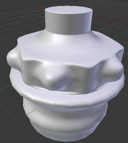
When you are in “Vertex Paint”, your object will be a little lighter in color.
Here you can start to paint away if you want to, but an easy way to find all edges, crevices and cracks are to go to the “Paint” menu and select “Dirty Vertex Color”.
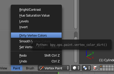
Now just wait a little and suddenly your picture will change. It now looks like this:
The parts that are less flat and have more crevices are darker, while the flat areas remains white.
Your “Dirty parts” has been found :)!
Often this picture is a little too dark, but that is easily fixed. Just use the shortcut Key “T”. This will give you an additional menu with more options to the left (if something disappears, then you already had the menu…just press “T” again).
In the lower left you have the following parameters:
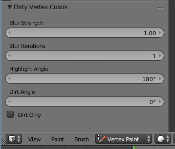
Those two that could be of the most interest (even if you can try and change all of them to get different effects) is “Highlight Angle” and/or the checkbox “Dirt Only”.
The easiest is to just check “Dirt Only” box. That will estimate those places that normally will get Dirt. If using it, you will see that your object gets lighter again with only a few parts darker. This is what we want to have.
Another option is to change the Highlight angle to about 90 degrees instead of 180. It will leave a little more areas dark. It all comes down to how your object looks and what you want to achieve.
I will for this just check the Dirt Only, so now I have this settings:
The last step is to give the Vertex Color a suitable Name.
Go to the “Data Object” tab:
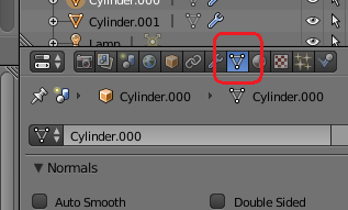
Go down until you Find the “Vertex Color” and there you will find “Col”, which you now can double click on to change the name.
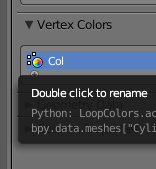
We call it “Dirt” (Think that will be simple to remember)
Add it to the nodes
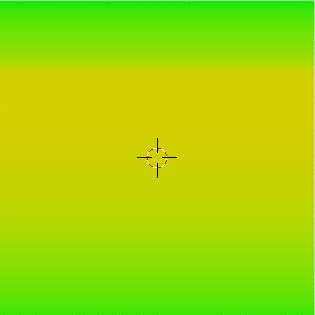
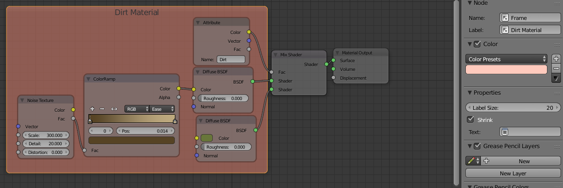
Now we can use it in out nodes. As Input we need to call this “Dirt”, which we do by using the “Attribute” Input node. The name will of course be “Dirt”. This can then be used to control the FAC between two shaders or in a colorramp.
One easy setup could be:
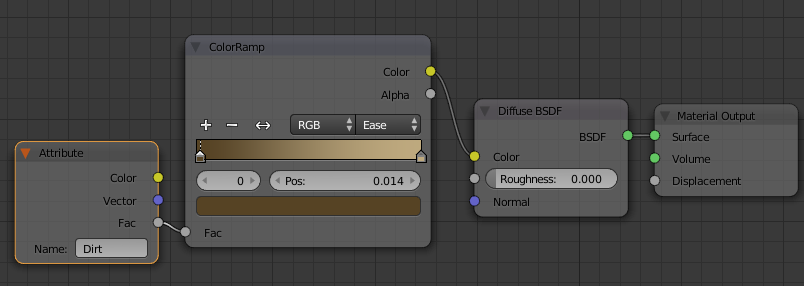
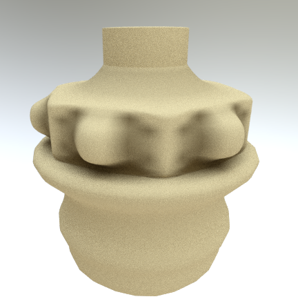
Which will give the result:
A slightly more complex, but nicer looking setup, would be to use the fac to control two shaders. Then one shader could be a “dirt” shader while the other is just the objects ordinary surface.
This setup looks like this:
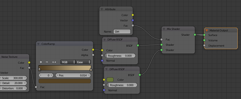
Here I’ll just make a high valued noise texture to scramble the dirt colors in the colorramp, while I use the attribute “Dirt” to control the factor between the dirt and the green. Result:
Now the dirt is more differentiated in the color which makes it look more natural and real.
Concentrate material on certain places
I have touched this subject just in the beginning of this document, but one important thing about creating stuff on the object is to be able to add material on certain places.
Pointiness to get edges, ColorRamp to filter away things unwanted or using “normal” to get the flat surfaces faces upwards I have mentioned, but there is more and there are combinations of the above as well.
Vector output
Blender needs some type of coordinate system to be able to put any textures or material at all on the object. To make it easy for us that uses Blender, the textures in the nodes (including images) has default coordinate systems.
Generated
All the internal textures like noise and voronoi, uses “Generated”. This is what you get when using the input node “Texture Coordinates” and selects the output “Generated”.
Generated works like a bounding box around your object where all directions (X, Y and Z) starts at 0 and then goes to 1.
Let’s try an example:
Use this setup on an ordinary box:

Yes, I know. I have put the blue dot to the yellow…hmm..is that OK? Don’t bother…just look at the result ;).
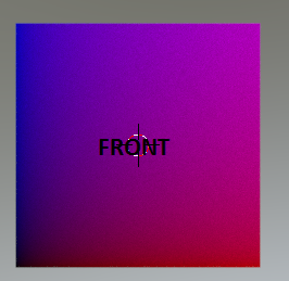
Ok, so do you know your color scheme?
If you do, then you know that a black RGB is (0,0,0), which means that all coordinates are zero. That you can see in the bottom left corner. This is where generated starts.
On the right top corner (left on the picture since I turned the box to take the image), the color is white. White is the maximum of all colors and in RGB for Blender node tree this is expressed as (1,1,1).
So, we have now proven that Generated starts at the left bottom and then goes to the far top right!
What about the other coordinate systems?
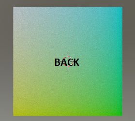
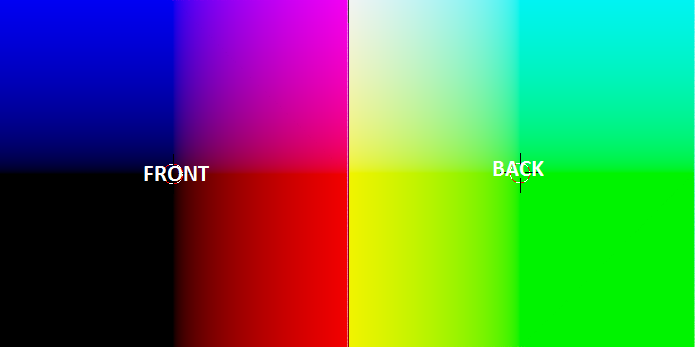
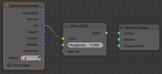
Object (with no reference object)
For fun, we do the same setup for output object.
This will give you:
(Nicer cut & paste, compared to the previous one 🙂 )
Ok, how do we explain this?
It’s rather simple… but can’t be shown 100% in these colors. Object (if having the text field empty) always have 0 at origo. It starts at -1 and ends at 1. That is why the colors look solid black at start. Negative numbers don’t produce any color. So at the lower left we have -1,-1,-1 and in the top right we have 1,1,1.
Object (With reference object)
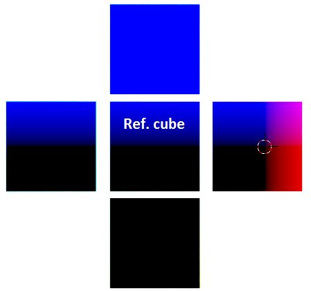
Armed with knowledge from previous chapter, I think it will be rather easy to explain this thing as well. You have perhaps seen this field in the texture coordinate?
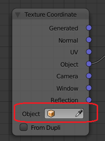
This is connected to the “object” output. What it does is set the origo to use for the object output.
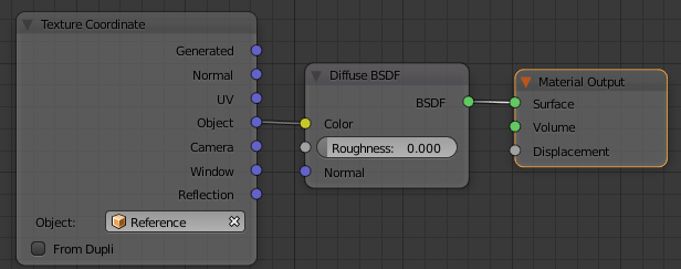
Let me show you. I will create FIVE boxes now. One will be reference object and the others will be using the reference.
Ok, below I have the following setup. “Reference” is the name of the cube that I will use as a reference object. All cubes will use the same material
The result:
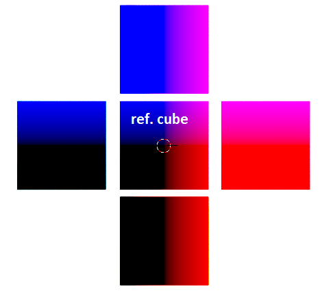
This picture clearly shows how the origin from the reference cube is used for the other cubes as well. This is a way to create a coordinate system and relations between different objects when it comes to material and could be very useful and effective.
Position
We also have other output nodes as well to use when placing out texture. One is in the input node “Geometry”. I will now use the five cubes I did in previous chapter.
I will change the setup to this:
If I now render I will get this:

The same image!
However, there is a difference. I will now move all my cubes to another position by dragging them in the X-direction. Then the result will look like this:
Now it’s changed!
What we see is that “position” works as the object using a reference. The difference is that “position” always use the center of the world as origo.
Both the “Object with reference” and “position” is great for texturing “randomize” patterns. The placement of the objects can change the input for everything and by that creating different result using the same material on different objects.
UV
Most of you that have worked with images knows that you need to UV unwrap the object to place the image on it.
The UV output is default on the image texture node, but can be reached from the input node “Texture coordinate” as well using the output “UV”.
Setup s simple:
I do two boxes. One I UV Unwrap using the pattern below and one I don’t UV unwrap.
How will this look? Result:
As you have guessed, the cube that I didn’t unwrap is black. This means that we have no coordinate system that is guiding anything and no material will be visible regardless if it’s an image texture or an internal texture like voronoi.
The other cube has colors. Since it’s the UV that decides the coordinate system it will not go straight from 0 to 1. I will show more clearly how it works.
I reset my UV unwrap, so I get this UV:
The cube then looks like this:
Every side had got the equal amount of colors. Now you perhaps wonder why we lacks white and black?
Well, that is because we are not working with X, Y and Z anymore. Right now we are working with U and V… only two dimensions instead of three.
We are placing a two dimensional texture on a three dimensional object and all Blender wants to know is what pixel or dot on that texture should I use on a specific place on the faces.
Parametric
When I’m talking about “Faces” and “UV”, I must also write about the “mysterious” “Parametric” output. You will find it in the input node “Geometry”. What it does (in a more non technical and understandable way) is that it finds every face on your object and create a coordinate system in that area. The coordinate system is tris, meaning that if you have quads or ngons it will divide that face in to tris (triangles).
With this setup:
..and using a cube subdivided once so it looks like this:
I get this result:
With fantasy and imagination you could use this output to get small textures all over.
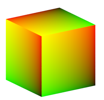
Normal & True Normal
You can reach the “Normal” output from two places. Both the “Geometry” input and the “Texture Coordinate” input has it.
If we look at this setup:
It will look like this on an icosphere:
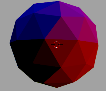
So, what we can see here is that this coordinate system looks like its faced based, just as the parametric input. That is however not a correct conclusion. The normal is instead build on angles and that’s why all faces has different colors.
The colors are connected to what the 3D world calls normals. I will explain a little more after a few more experiments. Now subdivide this 2 times using the subdivider modifier and add “smooth” on it. Check it using the same setup as before:
Change the setup from “Normal” to “True Normal”
Now check the result:
Did you notice the difference? Yes, the “normal” considers smooth and also things like Bump maps and such while “True Normal” still shows the original faces. Good to know if doing procedural math :).
Other than that, they are similar.
So, what is normals and how do I know the value of the angles?
If we again look at the sphere, but now from top,
You might recognize the colors?
Seen a “normal map”?
Yes, it’s the same :). So while the vector bump map using grey scale to describe height only, the normal map describes the angles and can then have a more intricate pattern.
When talking about normal, it’s better to think of it in colors, but the mapping between axis and colors are like this:
X: -1 to +1 : Red: 0 to 255
Y: -1 to +1 : Green: 0 to 255
Z: 0 to -1 : Blue: 128 to 255
(Yes, it’s a bit strange that Z is 0 to -1 and colors 128 to 255)
You should look at it from top. I will now take the wikipedia information right of:
- A normal pointing directly towards the viewer (0,0,-1) is mapped to (128,128,255). Hence the parts of object directly facing the viewer are light blue. The most common color in a normal map. (In Blender that means the color in Input RGB Node is R=0.5, G=0.5, B=1)
- A normal pointing to top right corner of the texture (1,1,0) is mapped to (255,255,128). Hence the top-right corner of an object is usually light yellow. The brightest part of a color map.
- A normal pointing to right of the texture (1,0,0) is mapped to (255,128,128). Hence the right edge of an object is usually light red.
- A normal pointing to top of the texture (0,1,0) is mapped to (128,255,128). Hence the top edge of an object is usually light green.
- A normal pointing to left of the texture (-1,0,0) is mapped to (0,128,128). Hence the left edge of an object is usually dark cyan.
- A normal pointing to bottom of the texture (0,-1,0) is mapped to (128,0,128). Hence the bottom edge of an object is usually dark magenta.
- A normal pointing to bottom left corner of the texture (-1,-1,0) is mapped to (0,0,128). Hence the bottom-left corner of an object is usually dark blue. The darkest part of a color map.
In procedural texturing we can use this information in many ways. One of the most common is to concentrate on just the Z-axis on the normal. If it’s a flat area (on Z-axis) the value will be 1 in Blender and if it’s 90 degrees or more it will be 0 and then we have everything between.
This means that things like dust, rain, snow or in some cases rust (depending on environment) is perfectly adapted for normals. Look at this simple setup:
If using that on a torus it will look like this:
Snow at the top and grass below :).
More advanced is to use all directions of course, like snow on top of trees, moss only on one side of the trees and son… or use it as a base for creating procedural height maps.
Separate XYZ
Now when we know about the coordinate system, we can continue by learning how to change them a little.
The first thing we should learn is how to separate a vector into it separate parts. This we do by the convert node “Separate XYZ”. Sooner or later the texture probably wants its vector back, so we also have a corresponding “Combine XYZ”. Between those two we can create magic.
Let’s look at this setup:
(You remember? The same as I used to explain “generated” earlier)
This is exactly the same as:
The difference is that we now can make some magic on the coordinates in that “magic space” by using things like math nodes and colorramps.
I will not go through all those things you can do in that “magic space” right now, but one thing worth mention is that you don’t need to create an end vector all the time. In some cases you may just want the Z-axis for instance to separate two different shaders.
Look at this:
Here I’ll just take the Z axis directly to the Fac and it works like wonder. The result will be:
The Fac magically knows that we are using the Z-axis, and changes the color accordingly.
It’s very useful for many, many, many things :). One example would be a snowy mountain, where you have grass and trees at ground level, then mostly stone and at the top snow. If we are talking about wear and tear, it’s often rust at the bottom of things (since the water stays on the bottom edges longer) and then it gets better and better higher up.
Between the Separate XYZ and the Fac you could as usual put in colorRamps, math nodes or curves to change the outcome.
This:
Will for instance give this:
Creating Node Groups (avoid getting lost in too large node trees.)
When you get a hang of how the nodes work you’ll start experiment a bit and before you know it you have created this fantastic node tree that does it all.
A few days later you go back to your project and looks at the surface of your object. You see something you want to change and enters the node tree again…and now you notice it…. Wow, that is a huge one! Did I create all that? Where should I change things, because I don’t remember.
Frames (The simple grouping)
The first thing you should know about when your tree or node forest is getting bigger is how to visually group them together using frames. This will simplify for you when revisit your project later on.
The workflow for it is very easy. Just select those nodes you want to have in one frame. Then press Ctrl + J. Now they have a frame!
You can change the size of the frame, but if you press the “Shrink” option in the “Properties” (as default its already on) its automatically adjusted according to the size and placement of the nodes inside the frame.
You can also change color and add explanatory names to it. Just look to the options on the right.
Here is a simple example that builds on the last “Dirt material”:
What you can see above is that I have changed the frame color to easily see it. I have also changed the label to “Dirt Material”. This will not shrink your node tree, but it will visually aid you in your efforts to find things after it has been growing.
Node Groups
To actually shrink your group tree or perhaps save a very useful combination of nodes, then you can create a “Node Group”.
“Node groups” are rather easy to work with, but there are some things to keep in mind.
- ColorRamps does not work well together with Node groups, or at least not if you want it to be dynamic. This because they can’t be reached directly from the outside.
- You should not include input nodes that you would like to be able to change in the node group.
- You should not put output nodes inside the node group.
- There are not any easy property selection for type of visible look on the input field. However it always copies the first node you connect, so if you connect a color node to a group input, it will look like a color selection… even if you then remove the connection between the color node and the group input.
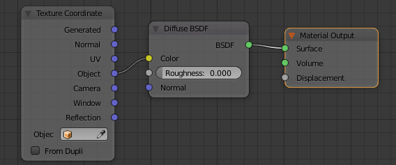
Let’s start simple:
Create this setup:
So, how would you make this a “Node group”? Easy, just select everything except the “Material Output” and press Ctrl+G. You will then get this:
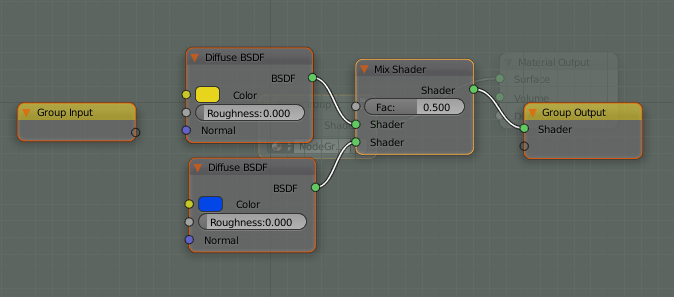
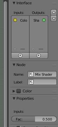
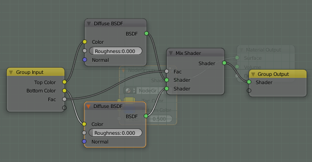
This is your group Node! You have your selection, but also a “Group Input” and a “Group Output”. In both these new nodes you have empty circles. These are there so that you can connect all the inside stuff to the outer world (Outside Node Group). Let’s start with connecting the Yellow color to the Group Input.
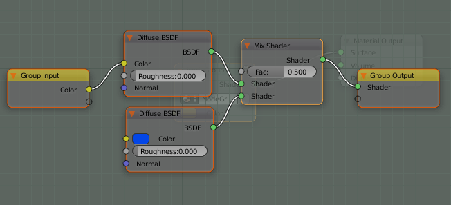
As You can see you now got it connected and a new empty circle waits for next input. We also got some changes in the right tool Window. It looks like this now:
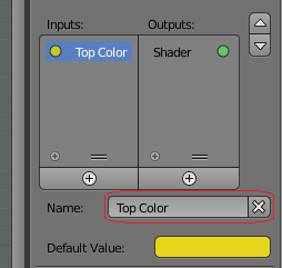
So, before adding the other color, we should change the name on out first color input. Let’s call it “Top Color” instead.
Select the “Color” in Tool Window to the right and then go in to the Name and change it to “Top Color”. Like this:
Now you can other the other color as well, so once again… drag from the diffuse shader (with blue color) to the empty circle you have on the “input group” node.
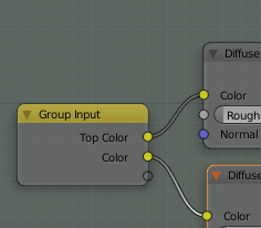
Then change the name for “Color” to “Bottom Color” exactly the same way as you did for “Top Color”. Finally add the “Fac” from the mix node as well to the “Group Input”, so that also is included.
It should like this when you are finished:
Now we should go back to the “normal” view and that you do just by pressing the “TAB” key. Just as “Object mode” and “Edit mode” you can go back and forth between “Edit Node group” and the “normal” group view using the “Tab”.
Well, if you now have pressed “Tab”, then you should see this:
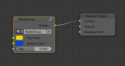
..and on the tool Window to the right you see this:
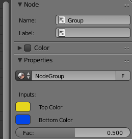
In the “Properties” panel you can change the description of the NodeGroup so its more understandable. Let’s call it “Mix Colors”. Just go the field with text “NodeGroup” and replace it:
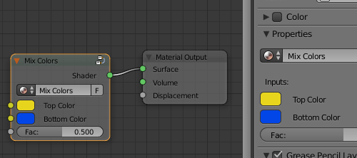
Perfect! Now this will work just as any node. You can input or change colors or slide the fac back and forth and things will change on your object.
Whenever you want to use it on any material in this project just press Shift + A and then select “Group” in the menu. There you will see “Mix Colors”:
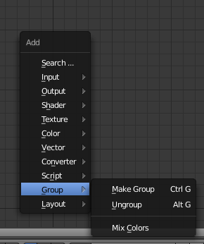
Wherever you have used this, you can always just press “Tab” and go in and edit. It will then ALTER ALL OTHER PLACES as well.
There is a lot more to talk about when it comes to best practises and so on when using the Group Nodes, but for this document I think this will be sufficient. You should at least have got the basic knowledge by now on how to use the node groups.
Putting things together!
Now we know the theory behind it, but how to use it in practise?
Our FB Group member “Saul Cruzz” has gracefully “donated” the lamp model to me, so I can use it in this documentation.
For those that have reached this document outside the FB Group “Blender Procedural Textures” are more than welcome to join. The model of the lamp below, you will find in the “Files” section and its called “lamp.blend”
The link to FB group is: https://www.facebook.com/groups/388923314889254/
There you also has the finished textured lamp if you just want to have that when you read through. Also in the Files section and that on is called “lamp_Textured.blend”
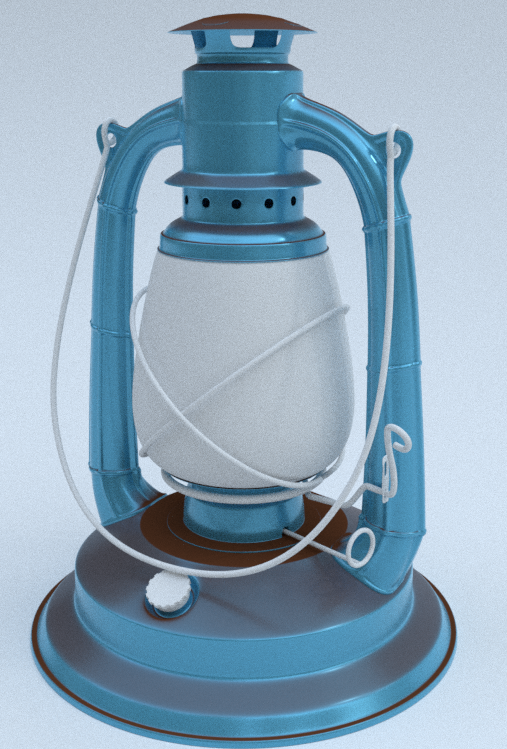
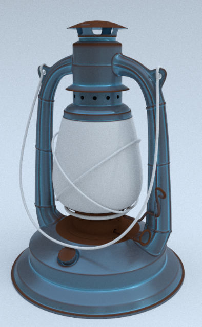
From start the lamp will look like this:
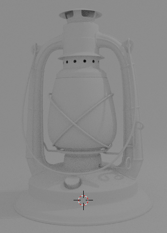
This means that we have some job to do :).
Step 1) Reference images!
The most important, but often forgotten, thing is to gather reference images. Many reference images! It could also be that you gather images of a similar, but not the exact same thing because you need to look more closely on how a specific material behaves.
One thing that is also of good use is to find images on how it looked when it was new! This is the base material that we then “destroy” using layers of wear and tear.
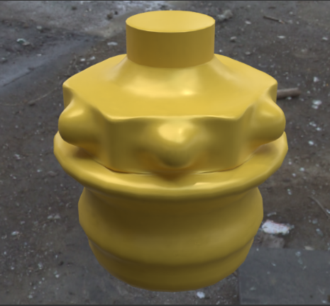
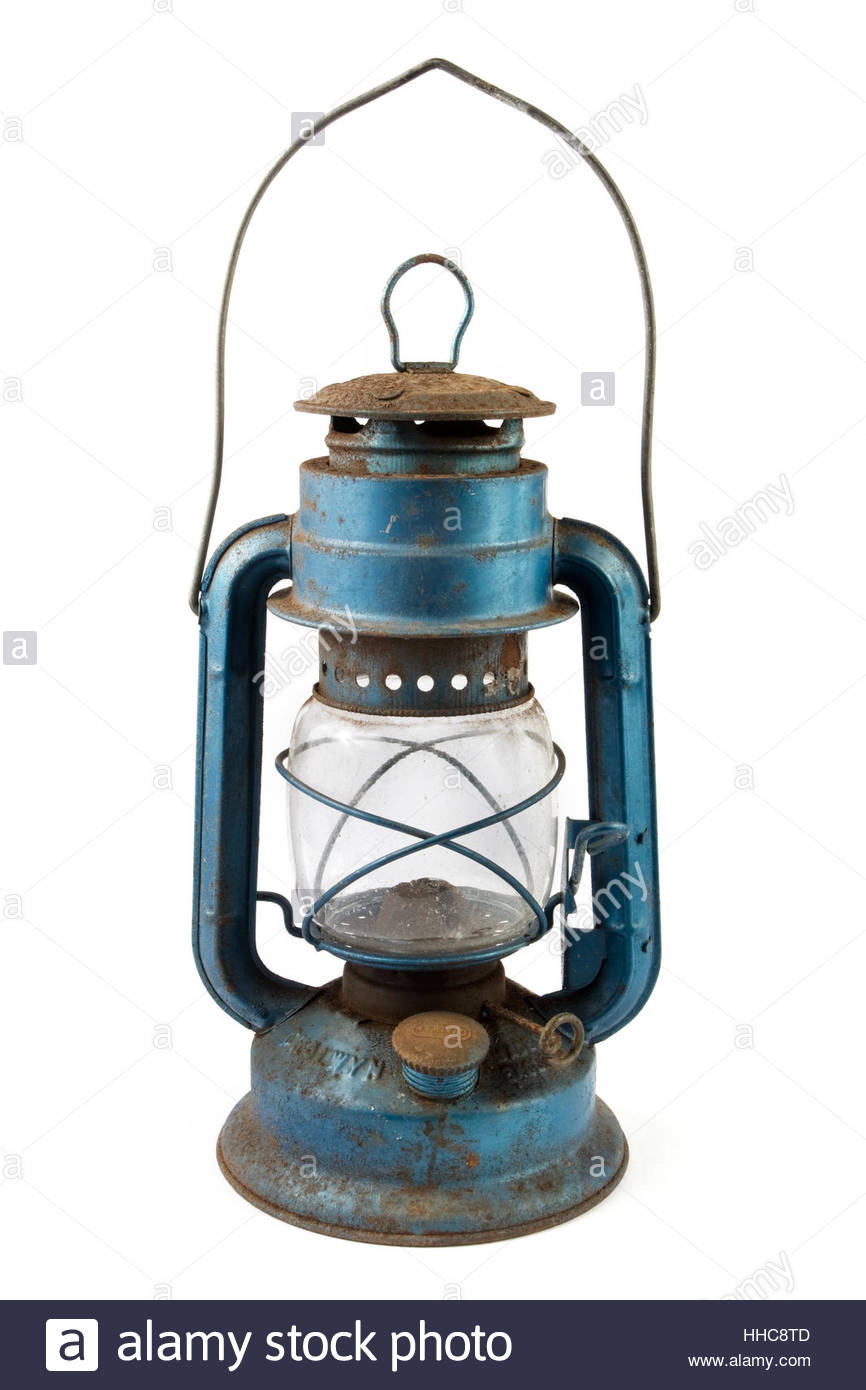
I have selected one image that I should try to get close to and I will add it here as reference, but as I said…use several to get a perfect end result:
Step 2) Look at the reference images. What do we actually have?
If we look closely to our reference images we will see similarities in all of them. We find patterns that we could use. The rust always comes on about the same place, the reflection… or lack of reflection is similar, some parts seems to get more affected than others and so on.
If we specifically look at this lantern we will see all these things as well. The top is full of rust since it’s the first place where rain hits it. Same with the lid for the oil refill, the lower edges and some other parts that easily could be reached by the rain.
More and more details appear as we look and if something is unclear we collect more reference images on that specific area.
Step 3) Find a good environment
Before starting with your shaders and materials it could be good to have a surrounding that will be used for the light and reflection. If chosen before starting with the material, you directly get the shades correct.
I will use, as I often do on YouTube as well, the “winter forest” HDRI. This is so I can get a clear resembles between what I do in the nodes and the output on the image. However, it could be that this is totally off in some cases. If you want to show and old lantern stored in the attic, you should of course go for a completely different surrounding. All depends on the topic… what you want to achieve.
The link to the “winter forest” is:
http://www.hdrlabs.com/sibl/archive.html
Step 4) Add the basic “new” material
Ok, so first thing first. We should add the blue color. We should add it as “new”, meaning that it should look like it was newly bought from the store.
Even so, we have to do a little more than just add blue color. If we look closely at the surface, we will see that it has small bumps below the surface evenly spread. These we must include as well. However…it is the “small” stuff, so we save it until later.
Work from big to smaller!
After some comparisons I get this setup:
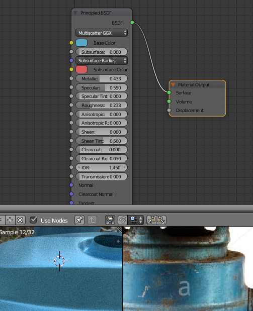
This is my basic first try. It will probably be changed later on.
Step 5) Add the major breaks between materials
Now we go back and look at the ref image again. Where are the major changes when it comes to changes between shaders/material?
I would say those parts where rain has hit the lantern. This should get us to think “Aha, then we should use the ‘normal’ output.”
So, then I’ll do that.
My new setup (brown diffuse is just a representation for future “rust”):
The result so far:
Step 6) Stop, think, group!
On a first glance this looks super! You may be tempted to just go on from here, expanding the tree more and more.
However, it’s now you’ll need to stop and think a bit. Yes, it looks great at the top, but what about the rust at the bottom? This should be less than the top… and what about that part below the glass? This is just rust on the image… but has no rust in our model.
To sum it up… it worked ok on some instances and less ok on others :).
Fortunately this model is built really good with a lots of objects of its own. That ease things up, because then we can paint each object separately. The drawback will be that we have a lot of places to change things when we fine tune.
It’s now that we go for the node groups. A Node group can contain a lot of nodes that is named properly, like “metal and rust”. I have described it in earlier chapters. The nice things here with using node groups are mainly two.
- If changing the group it will be changed on all materials using this group.
- We can have group within groups. This means that we can start directly with what I have built and then break it to smaller parts later on.
So, let’s create a node group!
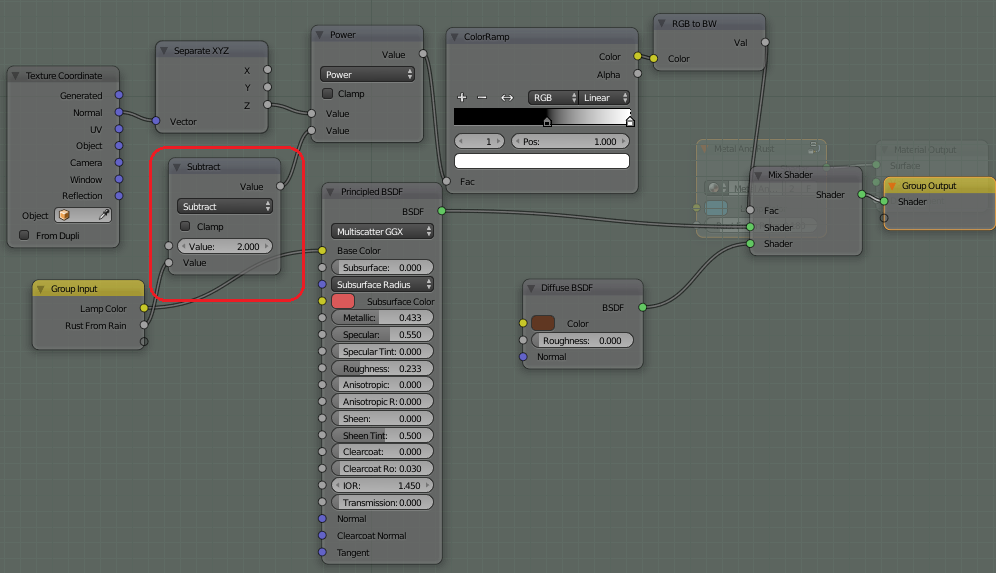
Since a node group has some inputs and outputs, we will think a little here. If making a “metal And Rust” group. What do we need to have as input?
One thing for sure is the amount of rust on each part. Some parts will have all “rust” and some will have all “metal”. The drawback is that we right now is using a colorRamp to change it and we can’t access a colorRamp directly from an input node, so we need to think about how to solve that.
Then we will certainly like to change the color of the metal, so that should also be an input. We will find more input later on.. But we start with this.
Next thing to think about is where we should put this node group.
The most common thing, if using node groups a lot, is to create a new .blend project that you fill with all your new fantastic creations. In this case we will not do that.
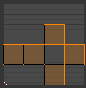
I will instead use the base of the lamp for my node group. So I’ll start by removing every material except for the object called “Lámpara-Base”, (which I guess is the base of the lamp).
Then I select everything in that, except the output. Like this:
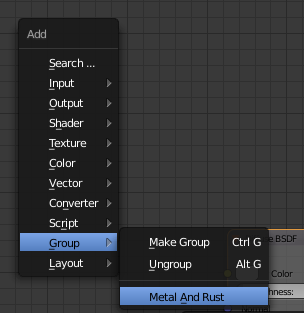
To make a group out of it I’ll press CTRL+G
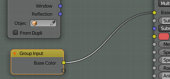
The Window pops in to “Group mode” and now we need to connect things to the “Group input”. We start with the simple Base Color.
Connect base Color with Group Input shown below:
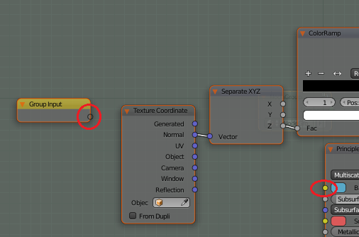
..and it’s then get like this:
Then we have fixed that. Next thing to fix is the ColorRamp. We need to be able to control the amount of rust. We can’t connect directly to the ColorRamp, but we can come close.
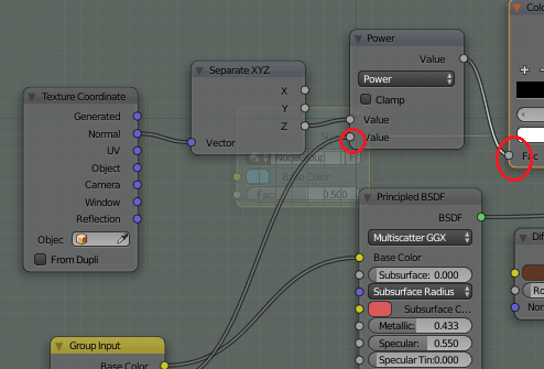
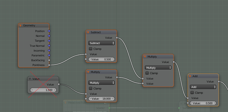
Start by adding a math node with “Power” as property between the Separate and ColorRamp like this:
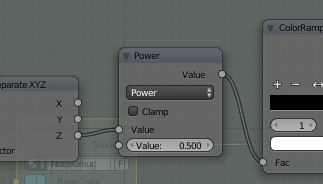
Now Connect the group Input to the ColorRamp Fac:
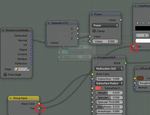
The only reason we do this is to get a slider in the “Group Input”. Every time we create a new node connection in the “Group Input” it copies the behaviour from the things we connect. Since the fac ColorRamp is a slider we get a slider in “Group Input”. However, we will not see it until we exit “Group Node Edit Mode”.
Now move the fac connection in ColorRamp to the lower part of the power Math and reconnect Power to ColorRamp;
Fine. Now we just need to change the labels a bit. Look on your right side and you’ll see the Group Node Menu.
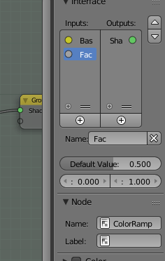
Here we have two Inputs and one Outputs. Click on the yellow “Bas…” first. Then Change the name to “Lamp Color”
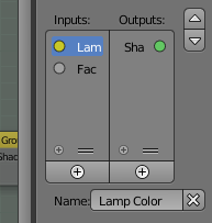
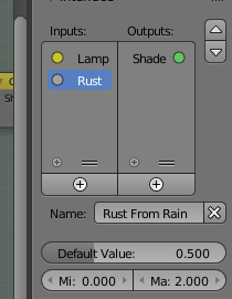
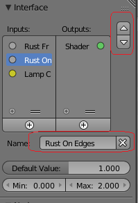
Now click on the input “fac” and change the name to “Rust From Rain” and min value to 0 and max value to 2.
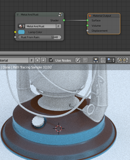
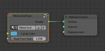
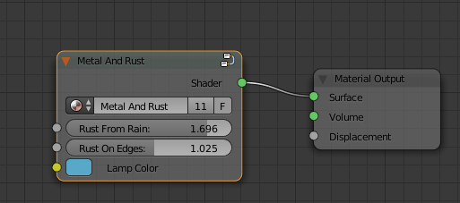
The basic stuff is now done so when you are in the node tree, press “Tab” and you will come back to the “normal” node mode. Here you select the nodegroup and change the name to “Metal And Rust”
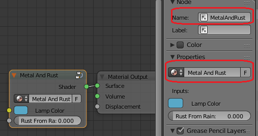
Now it’s just to test it. In my case I think it works fine… except that I have to turned the values. If I put it to 0 I get all the rust and on 2 I get none, so back to edit mode by selecting the “Metal And Rust” node and press “Tab”
I’ll simply add a subtract of 2 to reverse direction;
Finished! “Tab” again and out!
Test that it works and then we can continue :).
Step 7) Place Base Material on Objects.
Now when we have the node group “Metal And Rust”, we can start implement it. Go through the node tree and every object/part of lamp that should have metal and rust, you’ll apply a new material on and call it the same as the part with a “Mat_” Prefix.
Example:
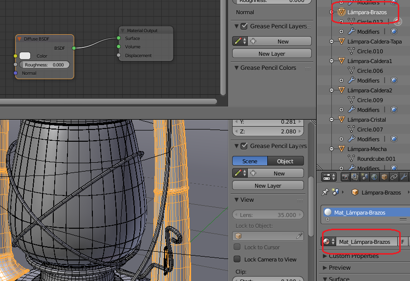
On each new material add the Node Group “Metal And Rust”;
..replace the white diffuse with it:
NB! Press “New” each time. Do not select an already created material in this step.
When you are finished then you can through each part and adjust according to ref image. When you are done you may end up with something that looks like this:
Step 8) Start Fine tuning the rust.
Now we have a basic ground to work with and it’s time to finetune stuff.
Pointiness
I suggest to start with some “pointiness”.
We go to our Base component, select the group Node “Metal and Rust” and press “Tab”. We are now inside the node group again and can add pointiness as well, so we do that.
We use exactly the same setup as I have done in the chapter “Advanced Pointiness”:
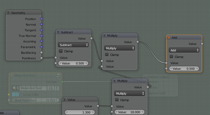
However, we must connect the last “Add” to something as well. The easiest is to combine it with the already existing Fac. The problem is that we already have something in it, so we must combine the existing with this new one. That I will do using the math “Maximum”, because Maximum will take the highest value of those two that comes in… which means… most rust wins :).
It will look like this:
I also check “clamp”, so I don’t get too high value out.
If I do a little test render it looks something like this now:
It looks fine. We can now control the edges with rust as well. Next thing will be to connect the input value for edges in Pointiness to the “Group Input” node, so that we can control it better.
We could also create a “node Group” out of the Pointiness part.
So, select everything except the input node “value” and the math “Maximum”, so it looks like this:
Then Press Ctrl+G
Now, everything comes exactly as we want it. The only thing I do now is changing the name on the input to “Sharpness Factor” with min val = -10 and max val = 10, with default = 1. I also change Output name to “Edge value”.
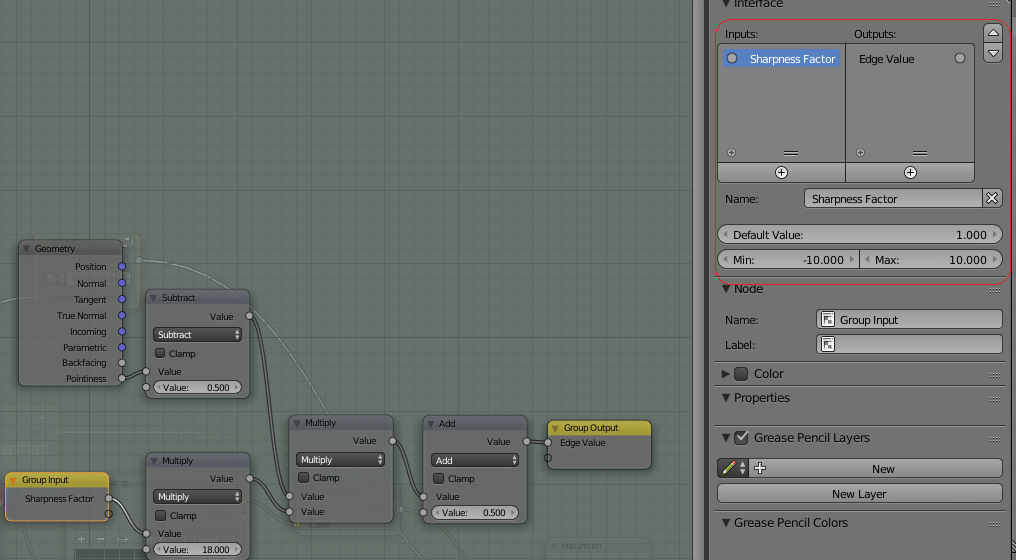
When you are finished, just press “Tab” to go back one step.
You are back to the other node group. Here you should change the “NodeGroup” name in Properties to “Rust on Edges”.
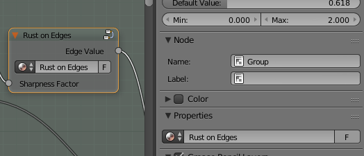
Then we should connect the “Sharpness Factor” to the Group Input.
The total Node group “Metal and Rust” now looks like this:
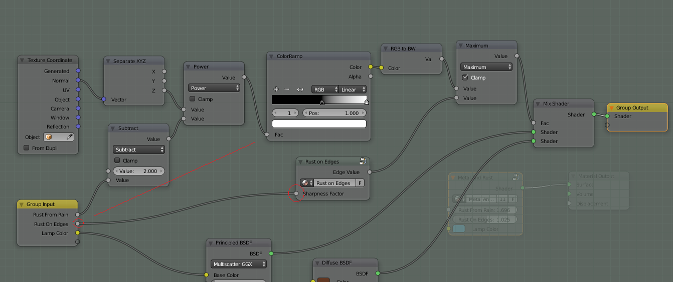
First I did the “slider” trick by connecting the empty circle on “Group Input” to the Fac (Red line above). Then I unconnected it and reconnected the old connection.
After that I connected the “Sharpness Factor” to the new “Fac”. Finally I changed name on “Fac” to “Rust on Edges” and rearranged the nodes orders (and added min, max and default):
So, if you have done everything correct and press “Tab” again you are now out from the Node Group:
This “advanced” material may now be fine tuned on every part of the lamp until it’s ok.
Random wear rust
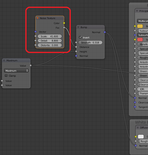
So far we have done the basic Color/Rust thing… but the lamp still looks very, very clean. It’s time to add some Musgrave/Noise to it!
Select “Metal And Rust” again and press “Tab”. You are now inside the node group again.
Here we just add a musgrave and connect that on the same way, using maximum math node. I will also put an input “Texture Coordinate” node with object attached to it. It will look like this:
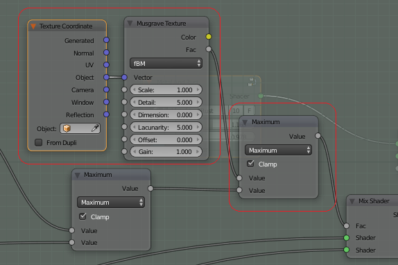
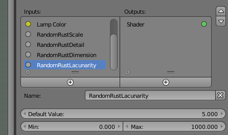
After that it’s just to connect the Musgrave parameters to the “Group Input”
Default values should be as I have put them above and no need to take “Offset” and “Gain” in to it, just the other four. Call them RandomRust(name of the parameter). E.g. “RandomRustScale”
A little more Blue
With all that rust we must also have a possibility to dampen the values a bit. That I will easily do by adding a minimum node that “strangles” some of the first amounts of rust coming from the system.
That’s all. It will look like this:
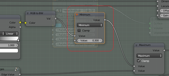
Connect the value above (the one with 0.300) to the “Group Input”. Call the Value name for “Amount Rust”, min value = 0, Max = 1 and default value =0.7. You can also move it to the top:
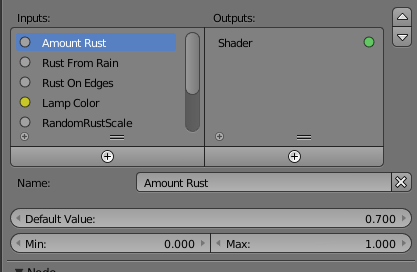
Total “Metal And Rust” now looks like this:
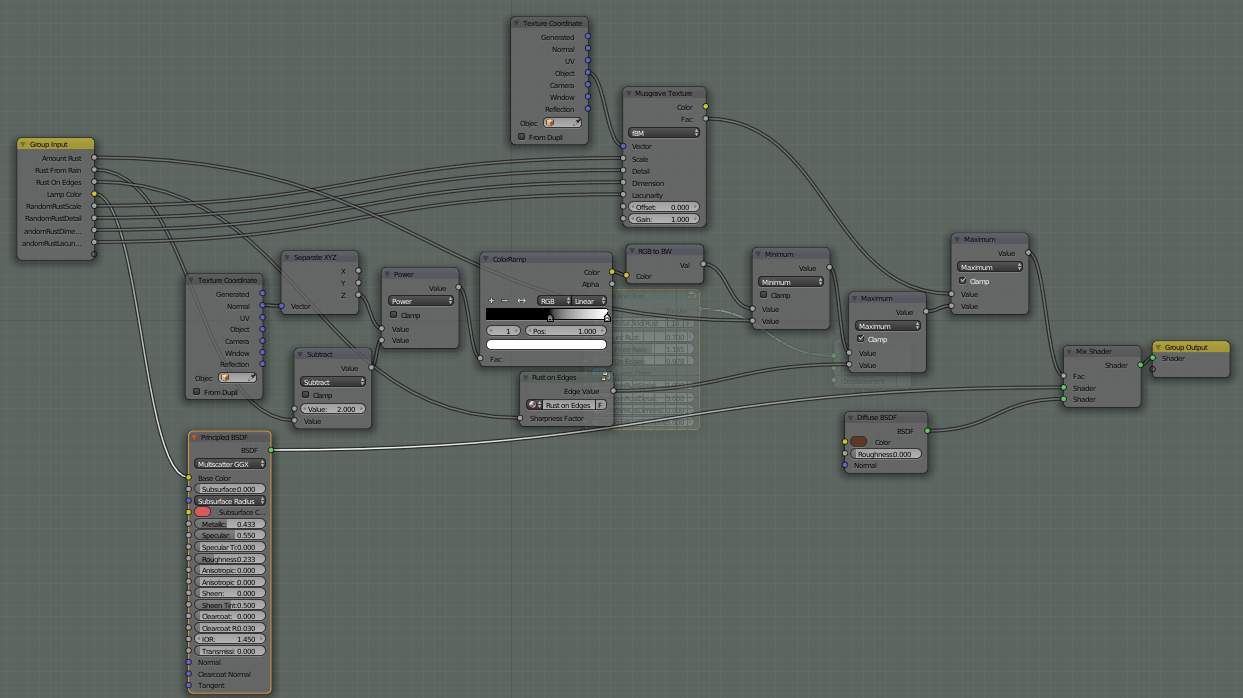
It’s not gigantic, but I will clean it a bit more. Right now we can just hit “Tab” again and go back and try to change all our parts on the lamp to fit the ref image as good as possible.
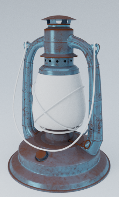
Time to fix that rust color
Right now the “rust” is just brown paint. We need to fix it. I have a feeling that we will use rust on all places, so I will create a separate Group Node that could be used both inside and outside of the “Metal and Rust” node.
First of all… how does rust look?
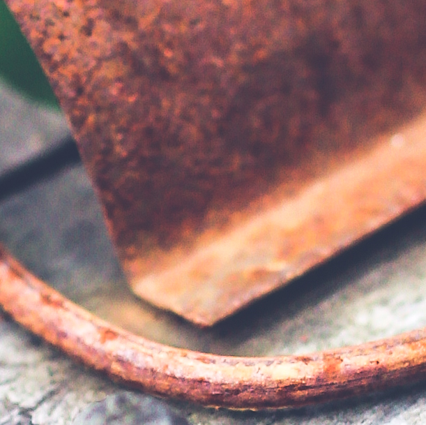
Look at the picture above and try to find things that “is” rust.
For me rust is:
- Bumpy
- Darkest spots on top
- Mix of red tones, brown and the original paint color
- Sharp edges between paint and rust.
- Works in layers where paint comes first, then light brown and the darker brown.
- Could be holes at the darkest spots as well.
This means we have to do a lot on the rust part.
I’ll start with the basic rust color. Musgrave will work great. This simple setup would do the trick:
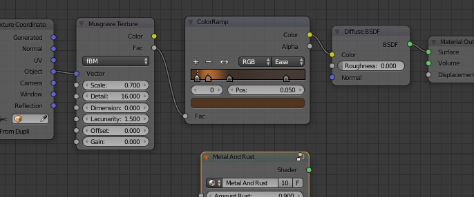
(You’ll have to play with the colors a bit until you get it right)
The result then looks like this:
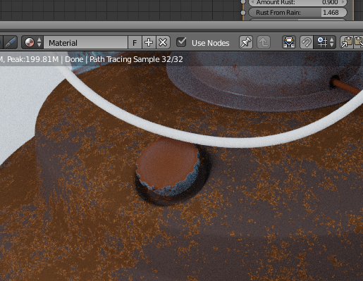
Which is a good start. Now I’ll mix it with the input color we use for the lantern.
In this setup I’ll just put in a color. I will remove that later on because then we get the color from the outside.
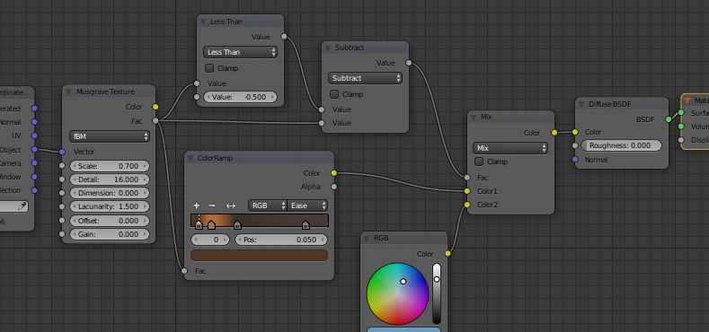
The result now looks like this:
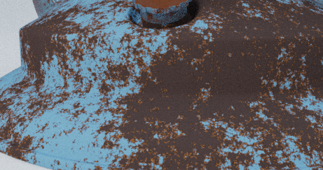
We are almost there, but we need to mix the color more. It’s to flat.
Once again we take the power of musgrave out to spread chaos on our material 🙂
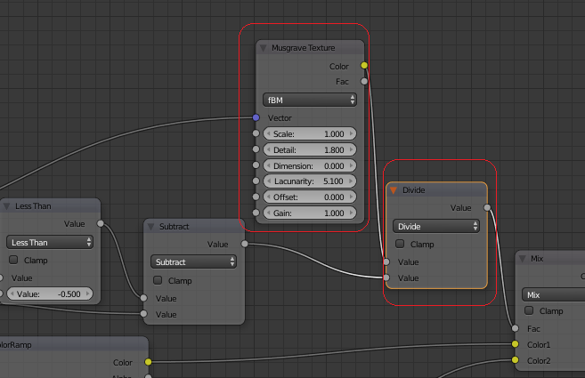
I’ll place The musgrave so it is divided by the calculated color factor.
The result now look likes this:
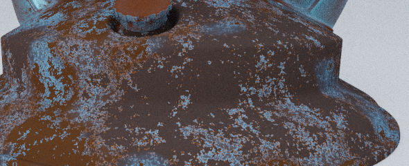
The only thing that remain now is some bumps as well.
Just to put it in:
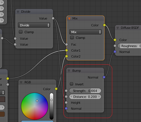
Result:
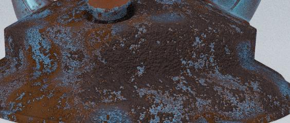
Total Node tree for rust:
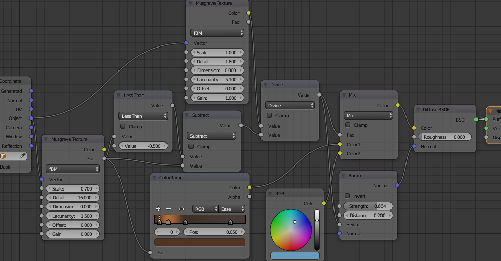
Create a Group Node for Rust
Now when we have created some good rust, we make a Group Node out of it. Select everything EXCEPT the Input Node RGB and the Material Output. Now press Ctrl+G
We get Color as an input automatically. I’ll just change the name to “Base Color”
..and press “Tab” to go back.
Now I change the name “Node Group” to “Rust Material” and we have a new node group finished.
It could be that I’ll change this later on… but right I’ll keep it as this.
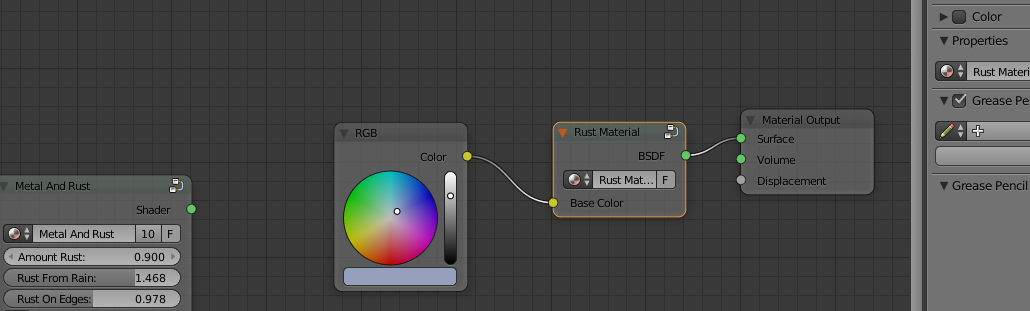
Add “Rust Material” inside “Metal And Rust”
Now select “Metal And Rust” and press “Tab”. In the node group again. Find the brown diffuse, delete it and exchange it with our new rust material:
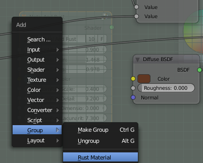
..and then connect the “Base Color” with the “Group Input” node “Lamp Color”:
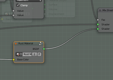
Now… to get out from it select the “Group Input” Node before pressing “Tab” (or else you will just go round and round) and you will then be out again from the node beginning.
Here you rearrange so it again is the “Metal and rust” that is connected to the material output.
On that node level you can erase the rust for now, so it just is the “Metal and rust” visible like this:
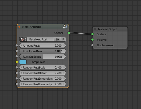
Then it’s again to adjust all parts so that they look good.
When everything is looking okey, we add an extra touch… a bump vector in the “Metal and Rust” as well.
It will be just at the end like this:
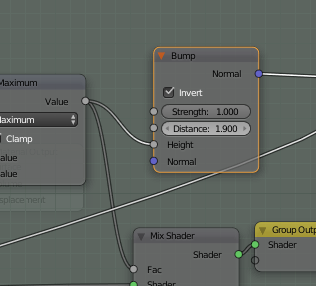
And the “Normal” output we connect at the bottom of the “Principled” shader where it says “Normal”.
Now the result will be something like this:
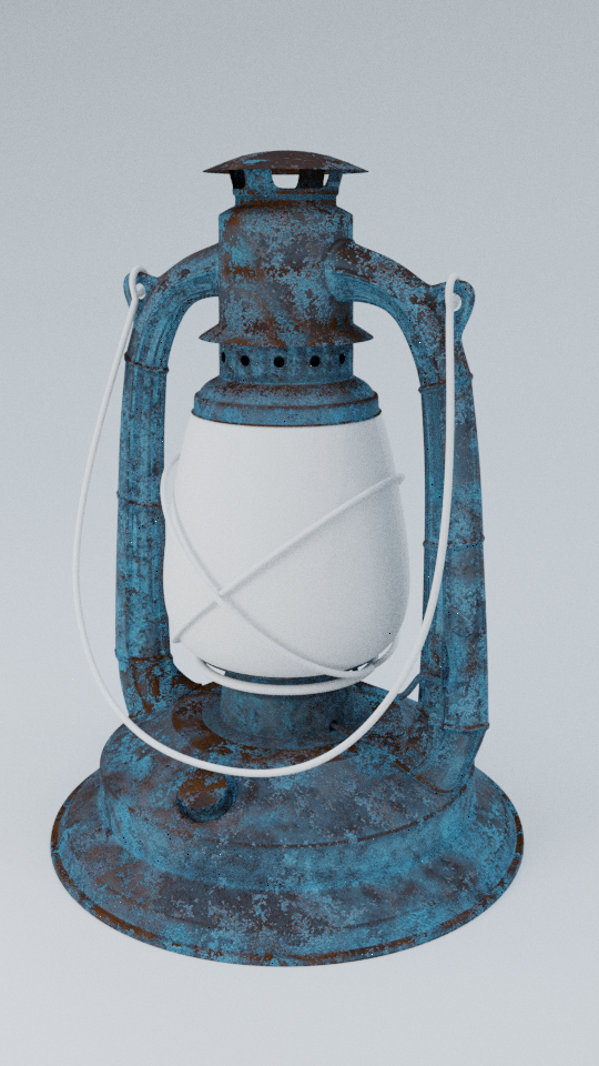
Now we are getting somewhere :). We are not finished with the “metal and rust” part yet, but I’ll leave it for now going forward with the next hing. I’ll come back on each part later on and make it even “nicer”.
Step 9) Involve the other metallic parts.
Now it’s time to involve the handle and keeper of glass as well. These are also metallic, and in the reference image actually the same material… but to get some variations I’ll keep them just unpainted.
Select them one by one and other that existing “Metal And Rust” Material to them… using the same naming convention (just put “Mat_” before the object name) as before when it comes to the material.
When you are finished, just change the blue input color to totally white on these parts. It will now look something like:
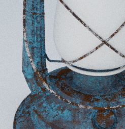
It looks okay, but I did not want them to be just white. The handle should be more metallic. This is very easily fixed :). All I have to do is enter the “Group Input” for “Metal And Rust” and connect the “Metallic” value in the “Principled” to my “Group Input Node”.
Thus, select a “Metal and Rust” node and press “Tab” so that you now are inside the node Group again. Then just connect and change name to “Metallic Look” instead of just “Metallic”;
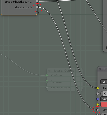
Then just press “Tab” and you can come back again. Now You can change the metallic look and it will change some… but not the complete way. This is because of the rust layer that also uses this color.
So, what we need to do is exchange that diffuse we used in the rust material with a principled. To od that we need to ender the rust material. We can do that by first got to “Metal and rust”, press “Tab” and then in the “Metal And Rust” find “Rust Material” select it and click “Tab”.
Now you should be on the correct place and do this exchange:
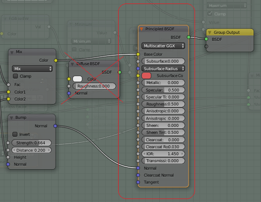
The Diffuse, you can just delete.
Not very much difference, but now we of course need to use the metallic on this “Principled” as well, so Connect “Metallic” on “Principled” to the “Group Input” and change the name to “Metallic Look”.
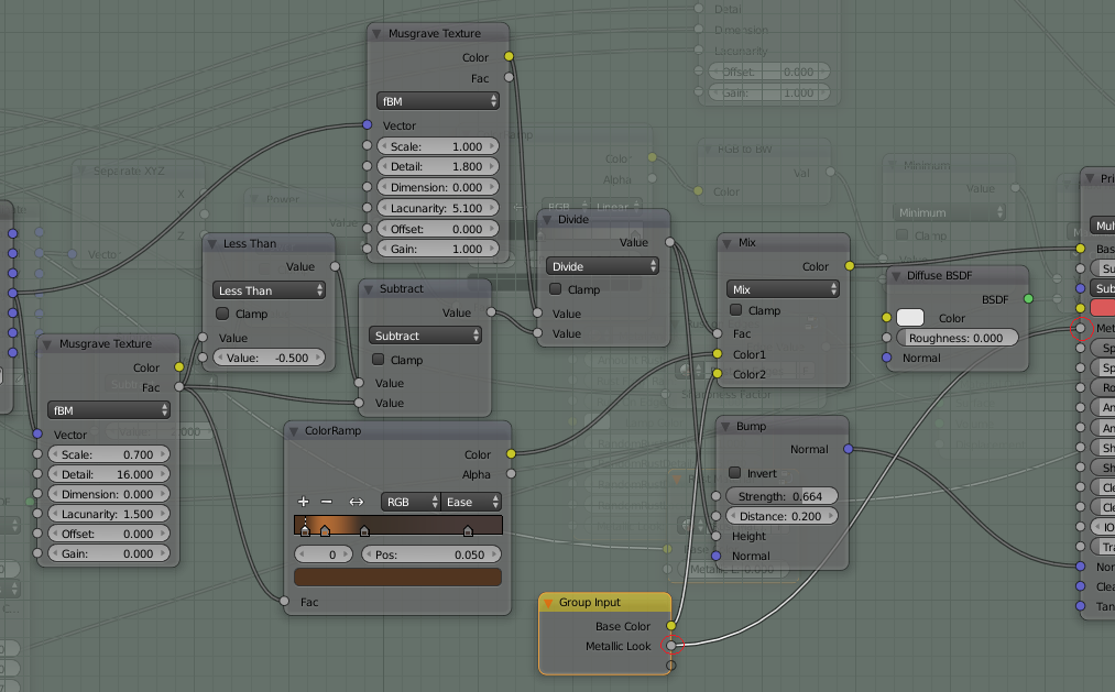
Now select the “Group Input” and press “Tab” so you are back to “Material And Rust”, Here you connect the “Group Input” “Metallic Look” to each other.
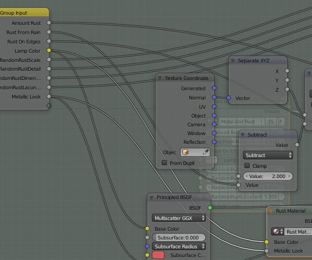
Next, just select the main (“Metal And Rust”) Group Input, press Tab and you are back to the main place where you now can add some metal in to your different parts as well.
This will not remove the white color, but will make it more as it belongs there in a natural way.
Will come back for more changes here as well, but leave the handles for now.
Step 10) Adding the glass
I will now add the glass as well. Select the glass object, create a new material and name it “Mat_Lámpara-Cristalt”. I will not use the glass shader. The Principled will be better, so a first simple setup on the glass:
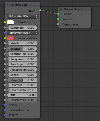
As you can see I have put “Roughness” to 0 and transmission to 1. This will produce a clear glass as long as we keep the IOR at 1.450. My goal is not to make clear glass, but it’s a start.
Creating the black, burned top on glass
Since the ref image has such a clean glass, I will not use that. Instead I will use and older look. I will combine the white old glass look white a darker top, using ref images like these:
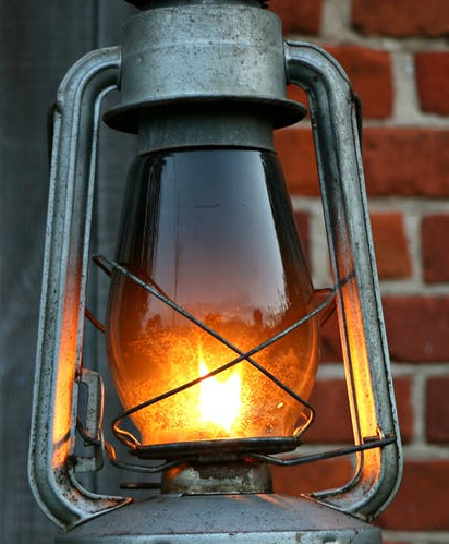

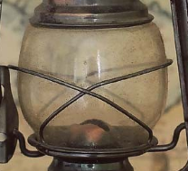
..and a few more.
What I can see is that the glass of a lantern seems to:
- Be rather white after years of use.
- Have speckles scattered in black after coal particles
- May be black at the top from coal.
The whiteness we can fix rather quick. It’s just to change the roughness a bit. Put in like 0.150 or something like that.
I would also like to have that black on the top I think so I’ll add a colorramp and connect that to the input node “Texture Coordinate” where I take out the Z-axis.
Need smaller variations on the black as well, so I’ll add a musgrave here.
Setup:
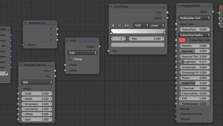
Here I have changed the “white” on colorramp to go slightly towards yellow and the black top does not have to be that black… it is more a gently gray tone.
To use Musgrave here I’m after its soft waves so I’ll use a very low detail together with a high Dimension.
Result:
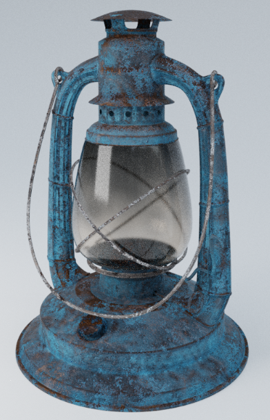
Not totally bad, but the glass needs the black stains as well, so we will add them. As you can see of the lower ref image the stains are not all black. They are more like brown/Yellow for most part and rather small. Then there are some black of darker kind.
Brown/yellow spots on glass.
The spots has to come after the “ColorRamp” for the burned glass…and I will use a… Musgrave!
When I’m finished I just add those colors together.
Setup:
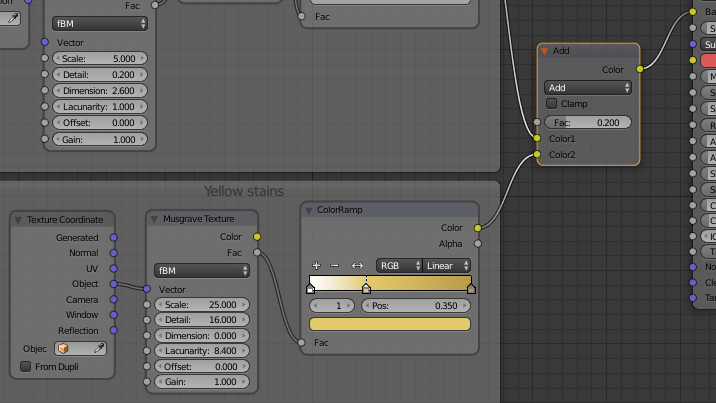
As you can see I use Musgrave totally different now. I have a huge scale, max detail, no dimension and a high Lacunarity… this together is better than noise :).
I use “Add” to the MixRGB node to combine the base glass with these stains. It will give a brighter end result on the glass. I also still uses the base glass color the most so I put the factor to 0.2.
Result:
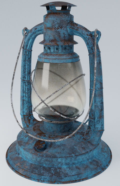
Looks good. We will do things there as well later on, but now we have the basics covered. Time to do the next thing with it.
Step 11) Time to add dust
Dust works much as in the same way that we built our on, meaning that it slowly feels the flat areas that are towards the top.
So, for dust it’s using “normal” again.
Dust will be a layer on top of everything else, so I add that after the “Metal And Rust”.
First things first. How do dust look like?
- Dust is very subtle. You should not hide things behind it, unless it’s totally covered (like on some edges)
- Dust is not totally evenly spread. You have small variations to take care of.
- Dust is mainly following the “normal” output, except that it also fills edges.
Let’s start! Disconnect the “Metal and Rust” from one object while we start creating our “Dust Node”.
I create a total node setup like this:
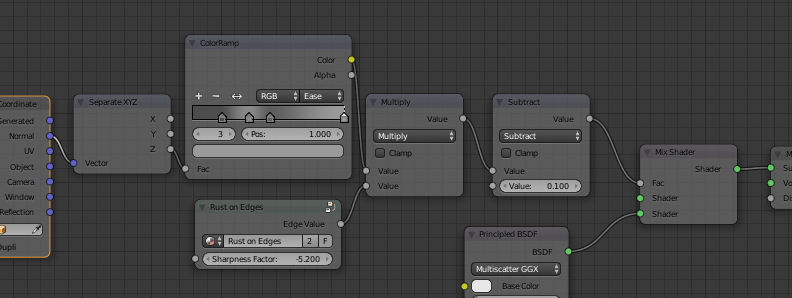
This is dust, when it’s evenly spread. I will connect noise and so on once you have got an understanding of the above.
First I take the “Normal” output from the Input node “Texture Coordinate”. This I do to get some dust on those planes that are towards the sky/top. Since I’m only interested in the Z-axis, I’ll use that one and put it in to a “ColorRamp”. Here I go from dark to light, but have some deviations since there often are bumps and other things that caught the dust and by this I get some of those things.
Under the “ColorRamp” I also connect our earlier built “Rust On Edges”. I set this to a rather high negative number. This will do so that there will be collection of dust in the edges near the lamps center. I multiply these values two get a final value, but since dust is so subtle I also subtract that end value with 0.1. In the Mix shader, I connect the dust at the lower node.
Result:
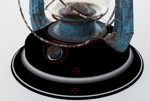
Now we only have dust combined with nothing. The white areas are the places where dust will be collected mostly and as you can see… since I now use a negative value on our “Rust On Edges” (should in this case be could dust on edges…but things happens when we reuse) we get a good collection of dust in all those edges and places where dust wants to stay. What looks black on the image are not totally black as you will see later on when we connect to our previous material as well.
Since dust is a bit uneven collected we need to scramble the edges a bit and the same goes for the flat areas as well.
Setup will look like this:
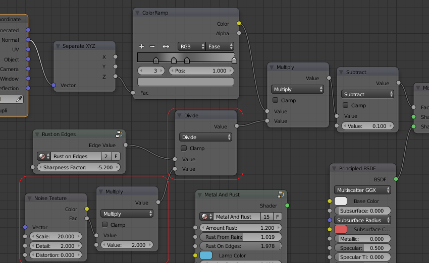
I added a noise texture that I did some math on (just playing around until I found something that worked) and mixed this with the outcome from the “Rust on Edges”. The result is this:
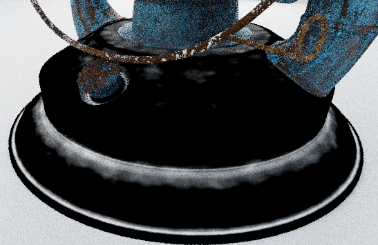
Now you can see that it’s more uneven spread, which works fine for us.
The almost final touch is to see so that we get some uneven color as well on the dust. I will use some “Musgrave” together with a “ColorRamp” and plug that into the Base color of the dust.
Like this:
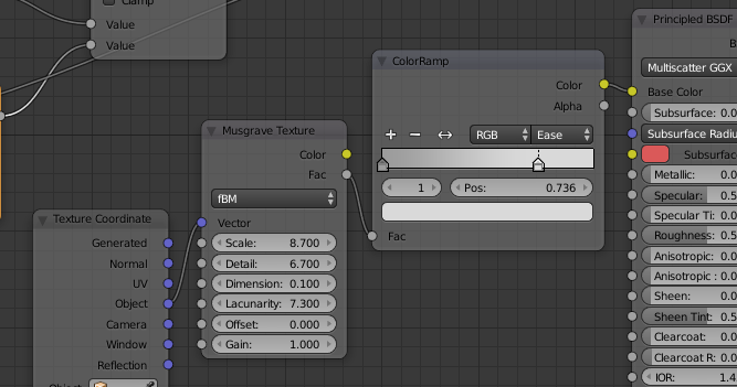
I connect the “Metal And Rust” and it looks good. However, since we now have so much variations of things the first “ColorRamp” we added, could perhaps be taken away.
I tried and it worked. Some minor adjustments and I found that the following setup worked for dust:
(The amount of dust)
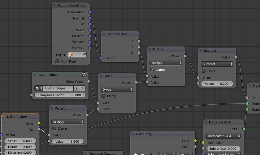
(The Color of Dust)
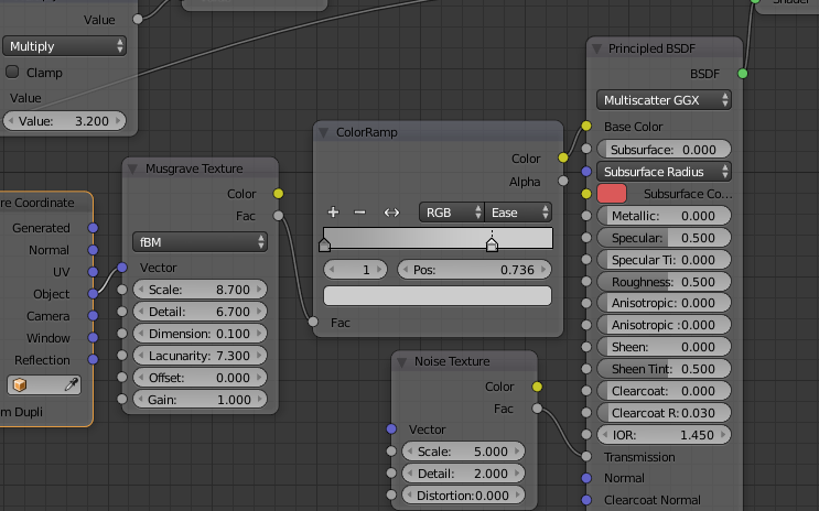
Working together it gave this result:
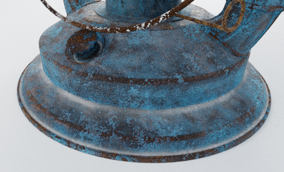
Now we need to put this into a node group as well, so that we can use it for the other part as well.
In this case I would like to divide it, so we create one node group for the “Dust Factor” and one for the “Dust Color”.
Starting with “Dust Factor”, I select everything for the Factor:
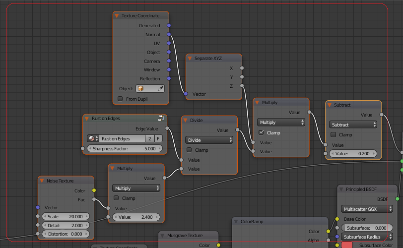
Then I’ll press Ctrl+G.
I get the node Group layout, but now it’s time to think about what parameters we have.
I see three:
- Sharpness Factor
- The “Multiply” (2.4). This will be “Noise Reduction” (higher number, less uneven)
- The “Subtract” (0.2). This will be the “Dust Amount”
We just connect these three to the “Group Input” and name them as I did above.
Result:
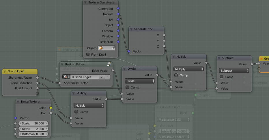
Then just go back with “Tab” again and change the “NodeGroup” name to “Dust Factor”.
When finished, we create our “Dust Color”. Select and press Ctrl +G.
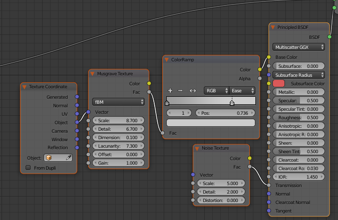
Now you probably notice that we don’t have any natural input to use for the “Group Input”. Well I’d like to have the possibility to add some moss, rust or whatever to the dust, so I add a MixRGB node and connect that to our “Group Input”.
This is the result:
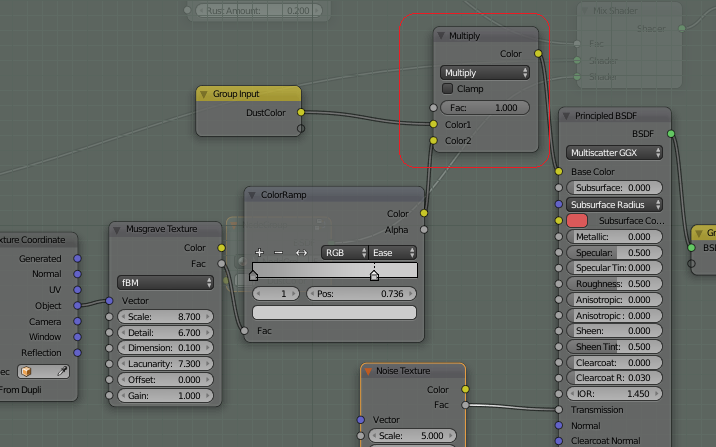
Now I’ll just press Tab and go back. I rename the new Node Group to “Rust Color (Lower)”. Then I’ll know that we always should use bottom shader input.
Result:
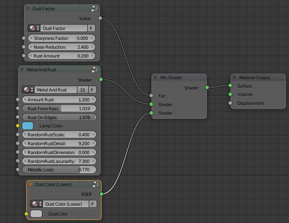
Now it is just to place these two new groups on the lamp parts that need some extra dust. I would think that except the base it is only the two top objects as well.
Finished result
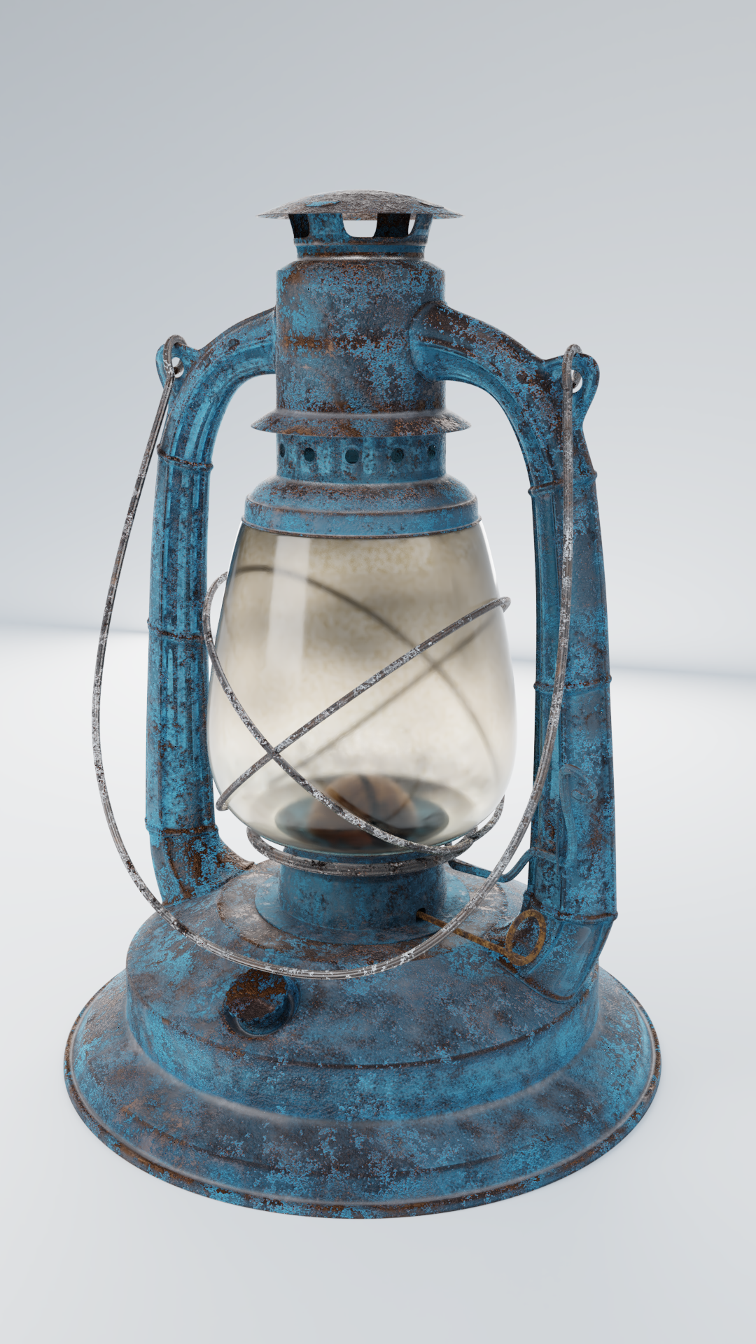
Overview of what we have accomplished
This is the total node groups that this exercise has given. It was a few nodes in there, but it could have been much worse :).
The nodes
Main Node Control (Top layer)
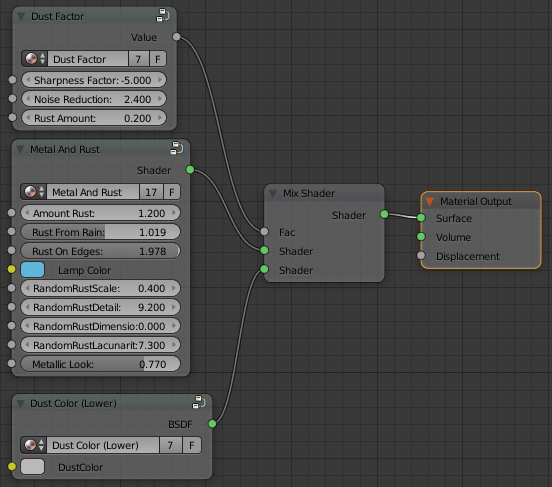
Metal And Rust
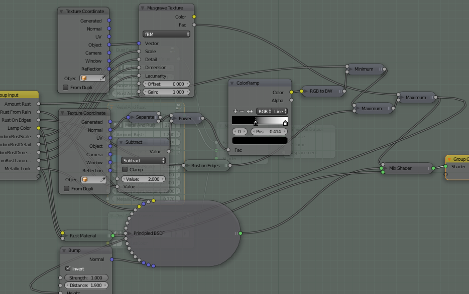
Rust on Edges
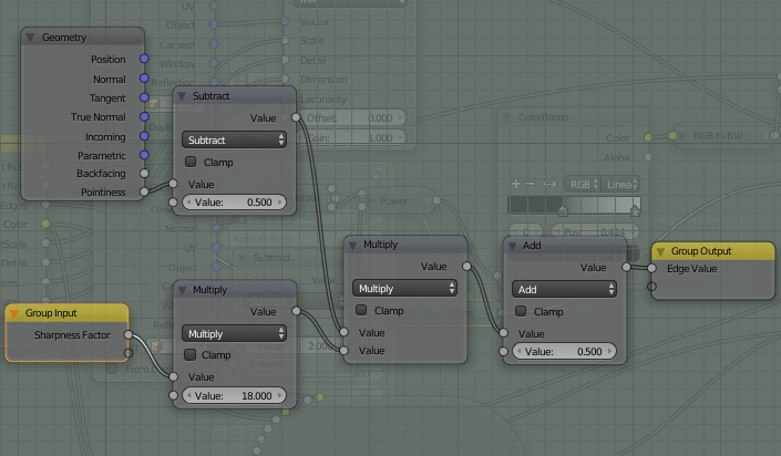
Rust Material
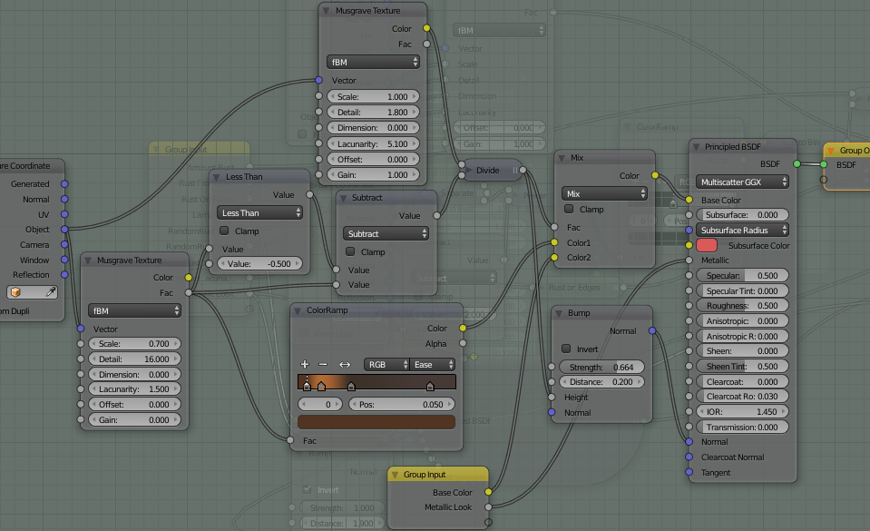
Dust Color (Lower)
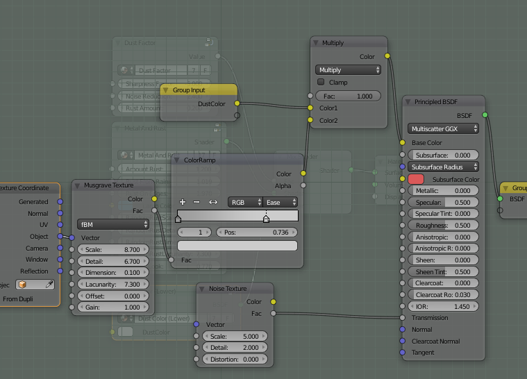
Dust Factor
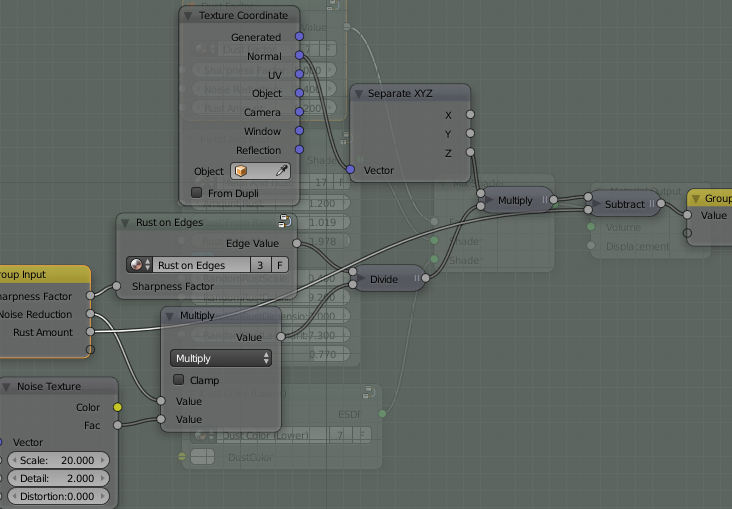
Can we do more?
You will after a while get used to that there are always more to do when it comes to procedural textures. You have infinite options with all these parameters and to copy the real world using math is always a challenge.
In the case of the lantern, I could write a complete book on what I could have done more to make it look real. The question is… will the viewer notice it?
There must always be a decision that enough is enough. In case of this lantern I had could done these steps as well:
- Created some holes in parts of the rust.
- Added some scratches.
- Added some imperfections on the glass itself. Right now it’s so clear (even if we have some color changes)
- Made some of the real metal visible behind the blue paint, where the paint had been scratched away.
- Made some displacement to bump the complete lantern a bit. The shape is still perfect after years of use. This is not believable.
- Added paint stains or oil stains. It would enhance the effect of a realistic lamp.
- UV Unwrapped around the holes above the glass to control the rust there since it often is more active around little holes in the construction.
I will not go through how to do these bullets point as well on the lantern, but the way to do it is already shown, so you are welcome to make the most fantastic, realistic lantern there ever was using only procedural texture.
Be prepared for the next project!
As you noticed, I work a lot with node groups in this exercise. One very big advantage of that is that you can reuse that node group in other projects as well. No reason to reinvent the wheel:).
So, you have now a start with some metal, rust and dust. Fine tune, save and reuse.
Before you know it, you’ll have a library with all those things that can make wonders in just a couple of minutes and then you can put your time on that little “extra” that makes your texture shine above all others!
Enjoy and good luck in your future procedural texturing!