Beginners guide to cycles nodes, the procedural way.
Using Separate RGB, Math and Combine RGB
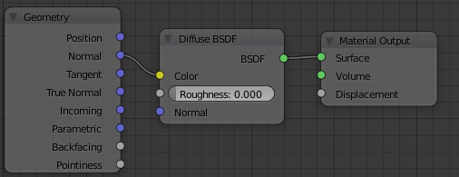
The basic input node points in a shader
The “real” node start… Vectors!
Object (with no reference object)
Object (With reference object)
The world of vectors, math and textures.
Using math for vector manipulation.
“Greater Than” and “Less Than”
Texture as coordinate for vector
Displacement (The “Supported version”)
Displacement (“The experimental version”)
Creating Node Groups (avoid getting lost in too large node trees.)
The five pieces on each square
Color every second piece darker.
Make the floor outside group node.
Introduction
After I’d written the documentation about “wear and tear”, I found out that there also was a need for some documentation about the first baby steps concerning nodes in cycles.
This will be it. No fancy “Wow!”… just basic “this is how you do it…and why.”
If you find anything that you would like to change or have ideas on subjects around nodes that I might have missed, just visit https://www.facebook.com/blenderinsight/ where you can send me a mail or two :).
You can also download the document in the File menu section as PDF. Just select “Download as…” and select format you want for a local copy of it. If you don’t reach it or have any other trouble getting it as PDF, you can also download it from my FB group at:
https://www.facebook.com/groups/388923314889254/files/
Before you travel along with me and my documentation it’s good to have some encyclopedia stuff as well, so I will refer to these two places written by Andrew Price “Blender Guru” where you can see the meaning of each shader and input node:
Shaders:
https://www.blenderguru.com/articles/cycles-shader-encyclopedia
Input Nodes:
https://www.blenderguru.com/articles/cycles-input-encyclopedia
My old “wear and tear” documentation:
Procedural wear from A to Z in Blender
I also talk a lot about nodes on my YouTube tutorials, which you can find on:
https://www.youtube.com/c/jtornhill
So, let’s go :)!
Material, Nodes, Shaders, textures and the rest.
When starting to work with nodes it’s good if you know the meaning of the actual words that are used within this field. I will describe them in lightweight way.
Material and its components
Material is for me the finished result of your composition of nodes. However, in some cases the final result is a mix of material. The same node tree can produce, as an example, both metal and the rust on the metal. In those cases I prefer to use material both on the metal and on the rust.
Node and trees
A node is every building block you are using to create the material. It could be both the surface, the structure or the color of the material… but it could also be things that you normally don’t think on as material stuff like pure math, vectors and other coordinate systems.
These nodes are possible to connect to each other and when you are doing that you are working from left to right, creating your node tree that finally will be you finished material.
Nodes comes in different flavors and they have a set of rules. To ease things up for you as a user, the connection points on each node has different colors. These colors are your guidance. Always (or in 90% of the cases) connect the input and outputs that have the same color.
The colors can be described like this
Yellow is color, that simple.
Green is connected to Shaders. I will come back to what shaders is later on.
Blue is Vector or Normals. It’s always about coordinate systems.
Grey is the rest. Normally connected to math or converting from one type to another.
Shaders
Shaders is the final stop for a material before it leaves through the material output node.
A shader is technically how the light bounces or interact with the material. More practically it can be described as type of material. If you want to use Metal, plastic, water, wood, organic, shiny things or something transparent like glass, shader is the king.
It will not tell how the wood should look like, it will not tell if it’s stained or colored glass and it will not tell the type of metal like if it should be brass or iron… it will simply tell that the material will consist of metal (some kind) or glass (some kind) and the structure of that glass or metal… nothing more.
Textures
Shaders is a must as we now understand, but what is a texture? Do we need it to create a material? The short answer if we need it is “no”. You don’t need a texture to create a material, but it would be rather boring if we didn’t use it.
A texture is simply put the pattern on the material. If you do wood, you have annual rings in it, which is a pattern, thus a texture. The same goes for scratches in the metal, the shape of smoke, the iris in the eyes, the small variations on fruit peels, cracks in a stone…everything we look at have smaller or bigger patterns.
When creating material I would say that using textures is where we create the magic of the material. Your skill in making a good texture is what decides if a material looks authentic or not.
Go out in the nature or go to the junkyard. Look closely at things and you will see that almost no material is completely flat. Even your window at home have small scratches, bird droppings or small particles of dirt.
Color
Everyone knows what color is, so why bring it up? Well, we have interesting things in the color node department as well. One thing is that we often can convert colors to a grayscale and when we are doing that we transform colors to be part of mathematical calculations.
Suddenly that black are a number 0 and that white a number 1.
A zero often means that we filter off something, while a number 1 means that we let anything through.
Above that, the color itself is mathematic. You have Red, Green and Blue and the combinations of these creates your final color. All those three colors also consist of a full value (1) or a zero value (0) if not using it at all. Since we can mix and blend colors for every vertex of our object/model with some help of the textures we can create completely new patterns.
In the section for Color Nodes there is a MixRGB node with a lot of rules and possibilities to mix both colors and grayscales which gives you tremendous power to fine tune and altering your texture and pattern.
Vector
I think vector could be the most complicated thing to understand in this node puzzle, but if we take it step by step it should be okay.
You have built your material. Now we need to know where to put it. Yes, you select your object of course, but that is not enough. If creating “eye material” on your character you would like it to be applied above the nose on the eyeballs and not on the foot. A material often has different parts and patterns and just smashing it on the object equally without any rules on how to apply it would be totally ridiculous. The material need some type of guidance on where it should be.
When creating anything in the world of 3D, we are using the axis X, Y and Z.
If you point at a specific point in your object you are using all these three. A single word to express this is “vector”. In a node the output is however not just a “vector”. It is a vector matrix.
So what you get as output is a long range of vectors that covers the complete object according to some specific rules depending on what type of matrix you have decided on to use.
When you are using a texture in your node tree, it always has a vector input. If you are not using that input, Blender has a default setting for each texture. Almost every texture goes after the “Generic output rule”, which is the simplest form of matrix. I will go through them later on. The only exception from this rule is the “Image texture” that uses “the UV rule” instead.
Our first step
Our first material
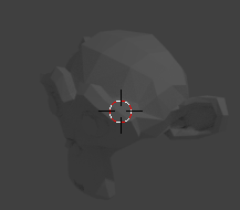
In almost all of my exercises I will use Blenders Suzanne (the monkey). Since we are working with the Cycles node I will also use the “Cycles render”, so be sure that you have selected that in the top menu.
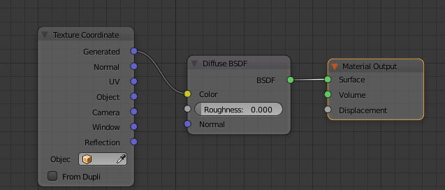
Okay, to create or use the nodes you have to select the object you would like to put that material on first, so start by selecting Suzanne. Now if you go to the material slot, shown in the picture below, you will see the following.
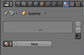
Here you just press “New”. It will automatically create your first material with this appearance:
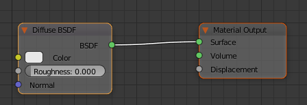
As you can see it’s a shader node that is connected to the material output node. It’s a valid, but very simple material. To see how it looks just zoom in on Suzanne and put yourself in “Rendered”.
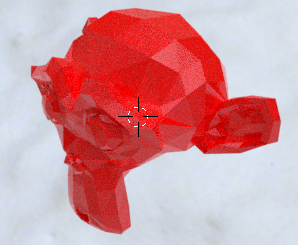
Suzanne looks rather boring, doesn’t she?
Here is the first thing about material. They need a surrounding. They need light, other objects and materials to thrive. Material is not a loner. It likes company :).
Why is that? Well, if you go in to a dark room, you will not see much. You’ll need to turn the lamp on. Right? What about the other objects then, why do we need them? Well, if you go close to a christmas tree decoration with all the lamp and stuff there it looks beautiful and sparkles a lot, but can you see why? Yes, other things is reflecting in all those items and more items gives more wonderful reflections. So, for a mirror to function properly, you’ll need something in front of that mirror.
That is why most people uses HDRI. These images has both light and items to reflect on. To work with light is a long chapter of its own. I will not go into it here, but there are certain rules or guidelines for that as well where a three spot light is the most basic setup of them. You can break the rules of course, but then it’s good to have a purpose behind why you do it in that case.
HDRI
HDRI (High Dynamic Range Imaging) , is a fast and good way to give your material the light and objects it needs to be visually correct. Since the image contains light that is connected to that specific image you will get different lights depending on what image you select.
The quality of the HDRI also decides how well that light behaves. In an HDRI it’s not just one light source, but the complete image is a lightsource with a broad spectrum of colors and directions. If selecting a bad HDRI, this will be reflected on your material which makes it look wrong or unnatural.
I tend to use a “basic” HDRI with a lot of pure white light when I create the first phase of my material, then when I fine tune the material I change to an HDRI that resembles the surrounding I want to place my final object in.
That “basic” HDRI is what we also is going to use thorough this complete documentation. You will find it in http://www.hdrlabs.com/sibl/archive.html
There (could take a minute or so before that web page is loaded) you scroll down until you find “Winter Forest” and download that package. It will give a good white light with a lot of trees that is reflected in your material.
My favourite spot for finding HDRIs is really at:
It’s of good quality and totally free to use (but you can sponsor it if you want them to create even more stuff.).
Anyway, now when we have that HDRI, we need to put it in as well. These are the steps (know where you have your winter forest collection):
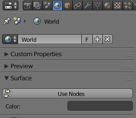
Press “Use Nodes”
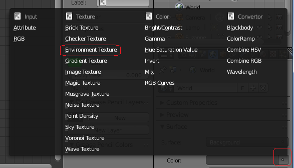
Now click on that little dot on color and select “environment texture”
Perfect :)! Then just press open and select “WinterForest_Ref.hdr”
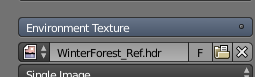
Done!!! Now Suzanne has come into the light:
Understanding the node tree
Before we run of to the next thing, it will be easier if you understand how a node tree is built. It always follows the same pattern, even if the pattern can be very complex. This is how it looks:
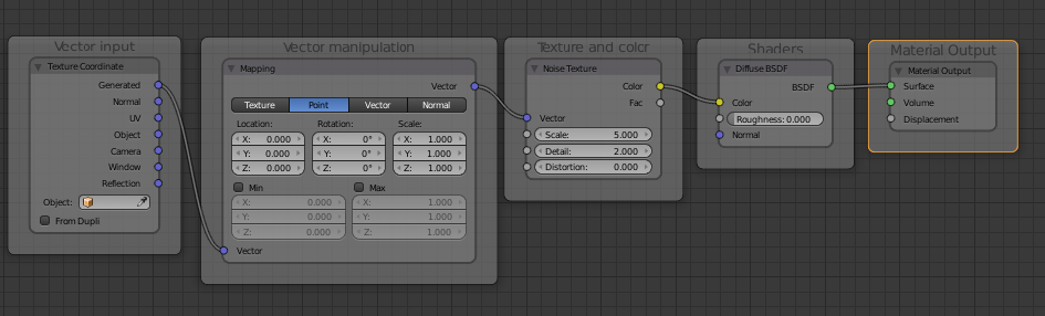
- Vector input. You always start with a vector input. This is the map on where to place things. There are a lot of different systems and formats on how you do it and I will go through them later on.
- Vector manipulation. To get away from just the standard pattern, you often manipulate the vector matrix that you started with. Here you add math, vector curves and sometimes even other textures. It’s all about changing the map to distort the output in some way. This is the place where you can do the most, but it also demands the longest practise.
- Texture and Color. When you know where you will put things, you here decide how it should be presented. Which color or pattern should be used and how to mix those things together is what you do here.
- Shaders. Finally you connect it with the Shaders to get correct structure on you material. It can be one lonely shader or many different mixed together.
- Material Output. One last decision to take before showing it on the object. Will it be about the surface or is it about the volume?
The node tree can be really, really, really complex and each of these groups can grow in to something that is really, really, really big :). Regardless, it always follow these steps. In some cases you can exclude one or two of these groups, like vector manipulation… but as soon as you doing anything slightly complex all of them will be present.
On to the next step
Creating some colors
Well, Suzanne has come into the light, but she is all white as snow. We need to put some colors on her.
There are several of ways doing this. The most simple is just to change that white square on the shader node to something else. It’s so easy that I’ll just give you that explanation.
Here are some others:
Using Input RGB
It will not be a big advantage of using the Input RGB right into this shader as we have now. In fact I think it’s easier just to change the color in the shader itself, but there will be occasions where we need to put in a color a few steps before we reach the shader. However I will just show you the basic setup here, which is this:
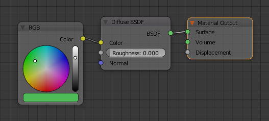
You just set the color as you want and connect the yellow output dot to a yellow input dot, in this case the diffuse shader. The Input RGB is exactly that… an input node. This means that it is a starting point. Nothing can be put in to an input node, so if you want to change or mix the color you’ll have to do that after and I will show later how it works.
Using Textures
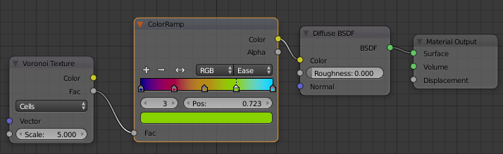
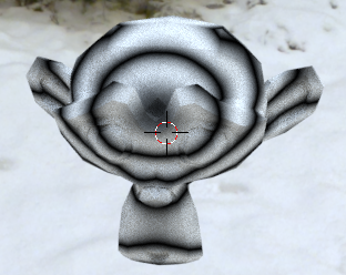
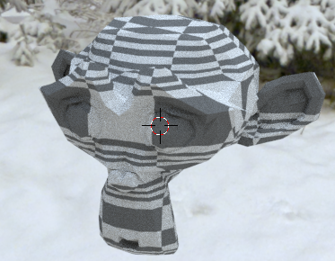
Some of our textures are also filled with colors. It’s mainly the “noise”, “Magic” and “Voronoi (cell mode)” that has it. Let’s try for instance the voronoi cells. The setup will then look like this:
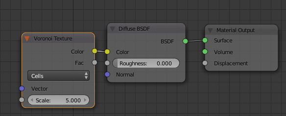
Suzanne will now look like this:
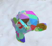
Very colorful! If we look more closely to the Voronoi texture, we see that it has two inputs. One is vector input and another is the scale. That means that we can change the appearance of the Voronoi a bit.
Vector has with where to place something and scale is about how big something should be. Both of these inputs are about how to place something on Suzanne and none is about color. We can’t change the color output from the Voronoi. That is fixed. We can however, exactly as the Input RGB, change and affect the colors after they have left the Voronoi texture node.
Using “ColorRamp”
The “ColorRamp”, you will find among the Converter Nodes. It’s a little more complicated since you can use it to produce many different colors. The trick is how to make them come out from the “ColorRamp” and on to the shader on the correct place and with the correct color.
“ColorRamp” only have one input “Fac” (Factor). This is what we need to change to get some colors out. Try this setup:
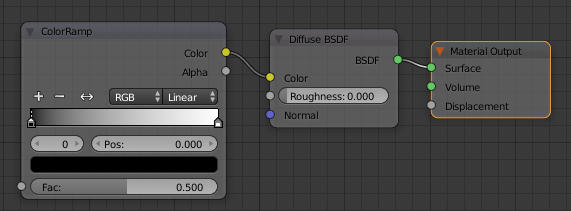
This will generate just a boring grey Suzanne, because the factor is a constant 0.5 all over.
Now add the cell Voronoi again, so it looks like this:
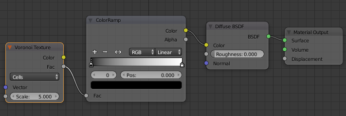
Notice that I’ll use “Fac to Fac” and not “Color to Fac”. The output will be slightly different compared to if you use the color and as I wrote before, always try to use the same colors when connecting output with input. Suzanne now looks like this:
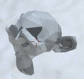
She still hasn’t got any colors, but that is easily arranged. Just select one of the marker in the “ColorRamp” and then you can change the color:
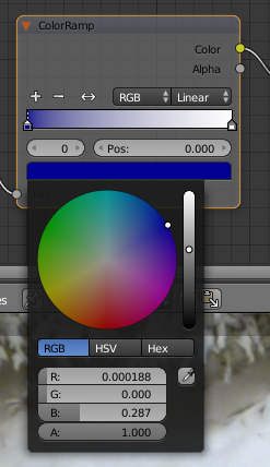
If you want more markers you just use the “+” sign on the “ColorRamp”. Now we will add a few more so it looks like this:
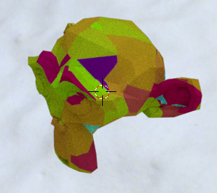
Suddenly Suzanne got some colors in her face:
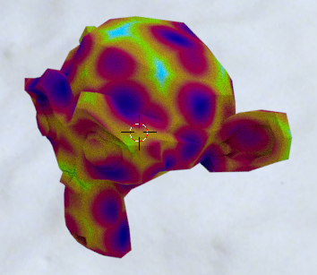
Now change the mode from “Cells” to “Intensity” instead. Suddenly Suzanne got this appearance:
So, let’s discuss the different types of looks.
In the first, where we had the mode “Cells”, every face on the polygons was clearly displayed. On the other hand there was no change at all of colors inside those faces.
When we changed to “Intensity” that drastically changed. Now we have like a soft change between blue, red, orange, green and blue.
The reason for this is how the texture is built. The pattern decides the input factor. For the mode “Cells” there is a new factor for each face or cell, but inside that cell nothing changes, so if a cell is described as Factor 0.3 it keeps that value for the complete cell.
When we uses the mode “Intensity” every cell (but now it’s not exactly cells), has the same factors between each other. They start with 0 in the center and then it goes up until it reaches 1 in the edges.
Since both resides in the “Voronoi” pattern one could believe that it still uses the ngon shaped cell for the “Intensity” mode as well, but this isn’t the case. Instead “Intensity” is always shaped as a circle. We can easily see that if we change the parameter on “ColorRamp” to “Constant” instead of ease:
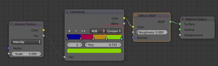
Which gives this Suzanne:
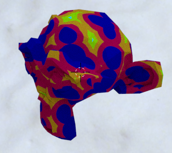
As you can see, the parameter “Constant” uses well defined borders which can’t blur into each other.
Also the light blue disappeared. This is because that marker was too close to the end to be used. Just move it a little to the left and that light blue color will be there again.
If you want more colors on Suzanne, just add more markers. Where the colors appear is decided of the position of the marker. If the marker has the same value (position) as the input “Fac”, the monkey will get that color. In this case it will be thinner circles of different colors.
Keyword is always to “experiment” to learn exactly how the nodes work :).
Using “WaveLength”
This must be the most scientific way of creating colors in Blender. I think in most cases you will not use it, but there are a few exceptions where it might work very well, mostly when it comes to rainbows, prism and such.
The Wavelength node you will find among the converter nodes group.
All colors are in the real life a wavelength. A human can see between (around… it differs slightly) 400 nm to 700 nm. The “strongest” color for us is green, which is around 500 nm.
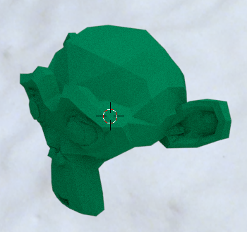
So, to show it, we do this simple setup:
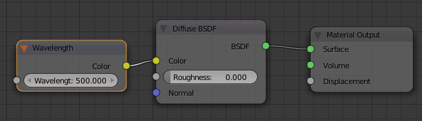
This give a green Suzanne:
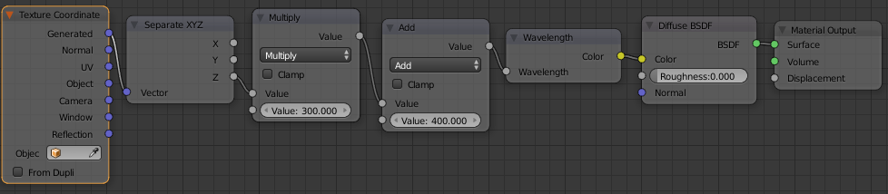
To show the complete spectrum of colors, I need to create a slightly more complicated node setup. I will use the output vector “Generated”. This will create number 0 to 1 in every Axis. I will separate the Z-axis from this vector.
This Z-axis I will multiply with 300, which will be a value between 0 to 300 depending on what we get from the vector (starting at 0… ending at 300). Then I’ll add the result with 400 and now we have a visible range 400 – 700! The math and separate node you will find in the “Converter group”. Total setup will in the end look like this:
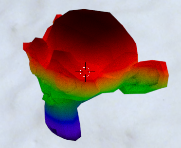
…and Suzanne will look like this:
Nice… isn’t she :)?
We start from the bottom and goes up to the top, so the lowest values (around 400) give like a purple color and the highest values (around 700) give Suzanne a dark red color.
I will go through exactly how the vector puts out the values later on, but now you can see how we can use the wavelength anyway.
Mix the colors
Then we have managed to paint Suzanne using different approaches and next step is to learn how to mix the colors before they reach her. This is really not that easy. A lot of practise is needed to naturally understand and use those things I will show below.
Using MixRGB
MixRGB is the natural node for mixing colors. You will find it in the “Color node group”. However, this is not “just a node”. It’s very flexible and have lot of methods on how you should mix the colors.
I suggest that you also read the manual about the mix node. You have the link here:
https://docs.blender.org/manual/en/dev/compositing/types/color/mix.html
Since it’s so flexible and have so much options, even the manual only takes up a portion of what it can do, so it’s a real bunch of “secret” options in here :). I will not repeat the manual, but explain things that you will not see in the manual.
Most of them are however equivalent with what the software “PhotoShop” uses. For those that really want to go into depth I can thus recommend the URL:
https://photoblogstop.com/photoshop/photoshop-blend-modes-explained
It goes through every blend mode in Photoshop and then you get a good hint how they will be used in Blender as well.
Well, here comes my explanation of those that you can’t find in the manual:
Screen
Screen is to lighten things a bit. Yes, it’s almost the same as using “Lighten”, but if you use “Screen” against a bit darker color in the bottom the top color tend to take over while “Lighten” let them remain as they are.
Best effect you will get if you have one input using some “real” color and one that is a “B & W” color. Those areas that is White will remain white, while the black will be replaced by the input color. Maximum white will erase the underlying color totally. Look at this setup:
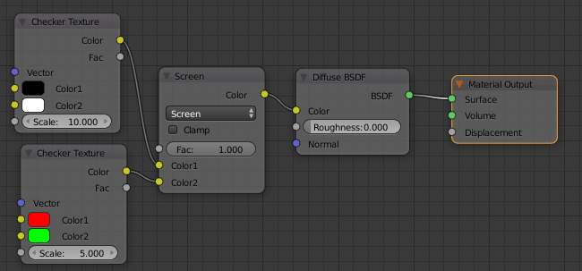
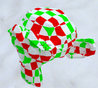
Suzanne will now only show Red and Green instead of Black. It has totally replaced the black… while the white still is white.
If you use it with noise or similar, you can get an easy “wear and tear” on your original color.
Look at this (Change the parameters on musgrave according to setup):
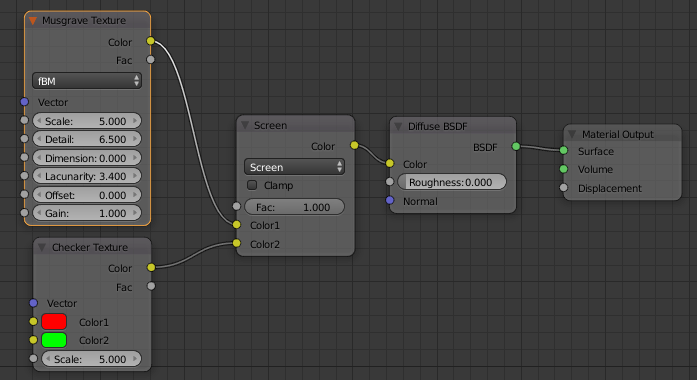
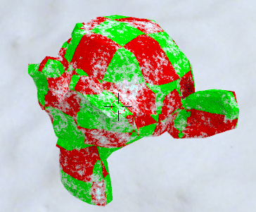
Musgrave only has greyscale. The setup above will make a total color loss on those areas where the musgrave “rules” and Suzanne will now look like this:
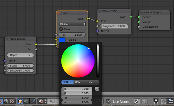
Divide
“Divide” belongs to the group that “washes” a color away. Top color is the “deciding” color and then you divide that with the bottom color. Since you divide it, the result will tend to go to the opposite, so if you add blue at the bottom the result will go towards yellow and if you go dark the result will be bright.
You will also notice when you play with “Divide”, the colors that only are pure, like full Red, Green or Blue will not react that much because of the math behind, so use this when you have more mixed colors like purple, pink or something like that.
You can get rather nice results using it properly. Try this (NB…not pure blue):
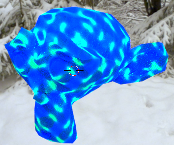
…this will get a Suzanne like this:
Overlay
Overlay is a combination of “Screen” and “Multiply”. This means that on the lighter pixels it uses “Screen” (making the white “win”) and on the darker pixels it uses “Multiply” (making the “black” win). If using something between it will be transparent.
The best way to show it is following setup:
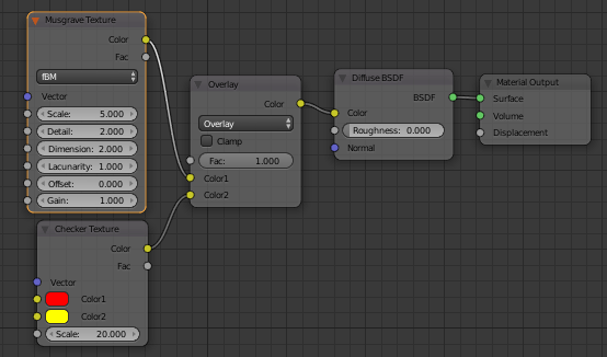
Which makes Suzanne look like this:
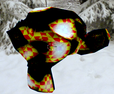
Here you can clearly see that if there is coming black from the musgrave, it will also be black on Suzanne, while if musgrave gives completely white… it will be white. The grey scale in between is transparent meaning that you can see the checker here.
Overlay is good for masking things away and can be used in a lot of ways, often in combination with other RGB-Mixes as well.
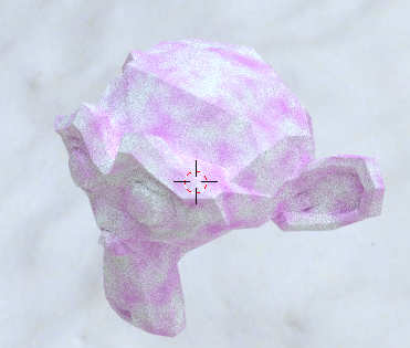
Dodge
Dodges bleaches all colors except its own. Look at the following setup:
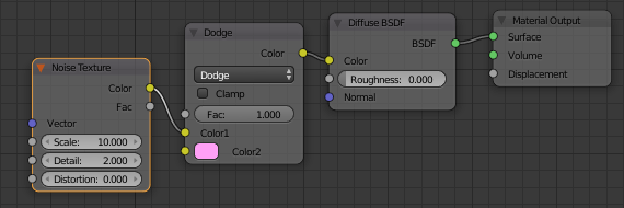
Here I kept a light pink. The noise will go in and by dodge it will be bleached just leaving traces of the pink. Lighter colors bleaches more than dark colors. Result of the above:
Burn
If we look at “Burn” just briefly you may think it works like the “Multiply”, meaning that it will be used to darken a color. That part is correct. It’s for darken a color. Normally you put the Color you will darken in the bottom and the amount you will darken you control by a grey scale at the top color.
“Multiply” is just like turning down the light a bit. White equals full amount and Black.. Then it’s black… but all the way to that black you can see the type of color you are darkening. Say that you would use pink as bottom color, then it will be pink all the way to the bottom using “Multiply”.
“Burn” turns down each R G and B separately, meaning that one of the basic RGB colors can end before another. Let’s say that I have this color :
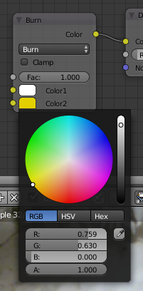
In this I have more Red than Green. When using “Burn” it will burn (lower) the value for both, but the green will hit 0 first, leaving the red visible longer. The yellow will turn red, which is something that wouldn’t happen with “Multiply”.
The colors will also go to black before “Multiply” in most cases, since the math behind is different. Easily explained… when an R,G or B on the top color reaches the same amount or lower value then bottom Color, that part will be black and not active.
So, If the top Color is just “Red” and you have the described Yellow above, the result will be red until R reaches 1-0.759 = 0.241 or lower, where it will be black.
Saturation
Saturation is more like a curve here. If you have a color in the top, that color will be totally saturated (keep full color) if the bottom color also is fully saturated. However, if the bottom color moves toward the center of the colorring, the top color will loose the same amount of saturation.
The color of the bottom color is of no importance, only how close to the center it is. See this setup:
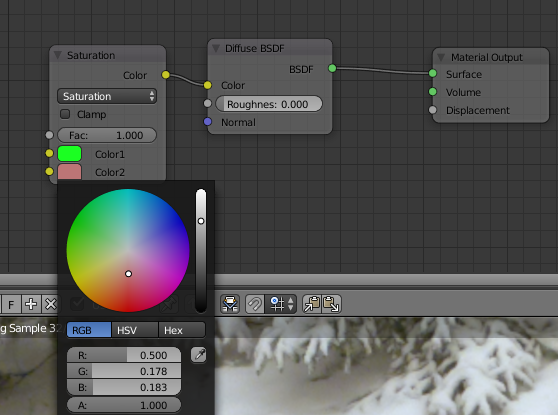
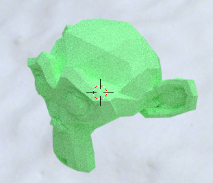
Now, it doesn’t matter that the lower color is sort of reddish, but it matter that it’s rather close to the center. That means that Suzanne is going to drop some of her green color and then gets this result:
Value
Just as “Saturation”, this is one of the components in “HSV” color (Hue, Saturation, Value). The bottom color will decide how bright the top color should be. What type of color you are using at the bottom (if it’s red, blue or something else) doesn’t matter. It’s only how bright it is.
If you make a very dark blue at the top and then change the bottom color to white, the blue will then be just pure blue (raising the light to maximum) and vice versa.
See setup:
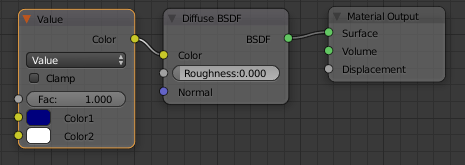
This should normally generate a very dark blue Suzanne, but since we are using “Value”, the top blue color will take the brightness of the white in the bottom and suddenly Suzanne looks like this:
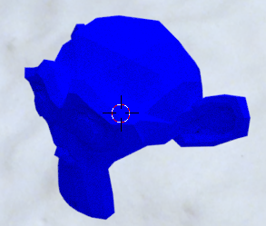
Soft Light
In “Soft Light” the top color is like a thin layer on the bottom colors and decides the main color that will come out. It’s easy to see in the following setup:
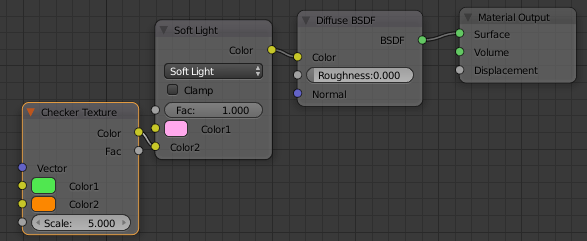
Here the pink decides, but it mixes gently with the bottom colors and Suzanne gets this appearance:
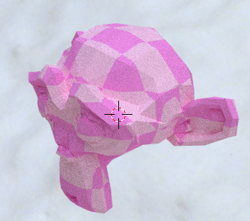
“Soft Light” and “Overlay” are really similar in appearance and logic.
Linear Light
This one is the best, but perhaps also hardest to explain :). Visually it’s like the colors attract each other. If both the top and bottom color is darker or more colorful the result will be a lot of colors in that spot and vice versa. It’s very good to use if you want one texture to control the other.
Look at this setup:
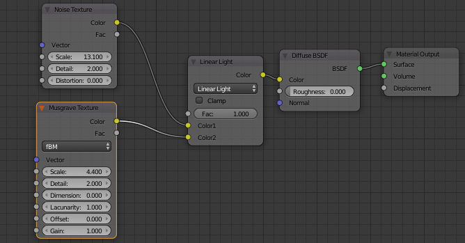
In the above setup, the musgrave will attract the noise, so that the noise is only collected on the edges around the musgrave. This makes Suzanne look like this:
Not the nicest picture of her, but what you can see is that there is white in the middle. Only the part that touches musgrave has noise.
Using Separate RGB, Math and Combine RGB
Now when we have seen what we can do with MixRGB you may wonder if there really is a need for more. Yes, it is :)! When creating things procedural all is about fine tuning, fine tuning and fine tuning.
I have showed you the “ColorRamp” before, but the most powerful node is the math node. I will go through that node on several places since it has many areas where it works well, not just for color.
When you use math together with color, you’ll start by separate the RGB color , then you manipulate it in the way that you like using math, textures or both, and in the end you combine the RGB Colors again.
In the Converter Node group you’ll will find the “Separate RGB” node. There are also a “Separate HSV” that you could use in the same way if you prefer to use the HSV format of color instead of RGB. Since both Hue, Saturation and Value exists in the MixRGB node I will not go through the “Separate HSV” node, but as I wrote above… it works in a similar way as the “Separate RGB” node.
Basic standard setup:
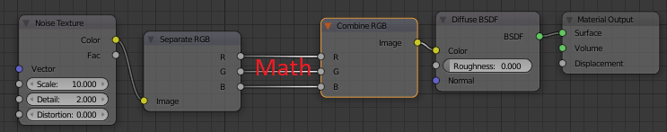
You get some colors in. In this case I use the “noise” texture, then you separate the colors using Separate RGB. After that you put in math nodes (where I have written “Math”) or new texture nodes, combine it again and send it out.
I will just do some simple examples, since the variations are infinitive and we have a lot more than this in our bag to show.
Simplest way:
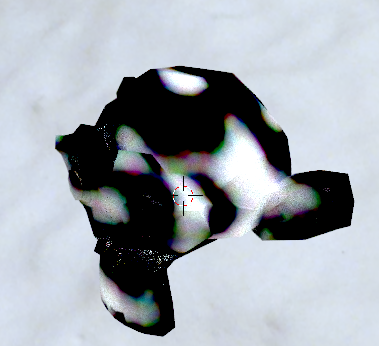
By just disconnecting some of the connections, you’ll stop them from being used by the source. The default value for unconnected input is 0, so in the case above only the red will go through and Suzanne now looks like this:
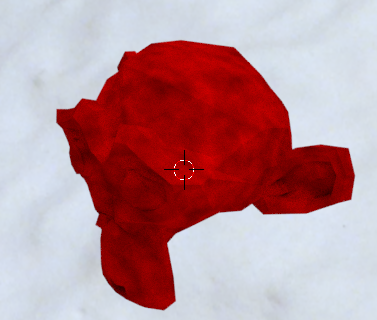
She is red, but you could also see that we have some variations because the amount of red is not the same but a value between 0 and 1.
Let’s add a math node (you’ll find the math node in the converter group) to this:
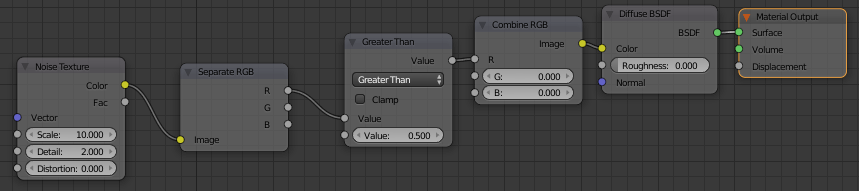
Here I have selected a “Greater Than” on my math node. Since the value is 0.5 it means that I will not any red pass to Suzanne unless the amount of red is greater than 0.5. The result now looks like this:
As you can see the red color is coming through… but it’s also even. Why is that? Well, the “Greater Than” always give a 1 if it’s true (in this case that we had a value greater than 0.5) or 0 if it’s false, thus it will always show full red value on Suzanne here or totally black.
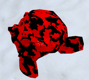
If we would like to have the original red passing through we would need to multiply that 1 with the original value like this:
As you can see of the picture above, I’ll just put a “Multiply” (also a math node) after the “Greater Than” and connect both of them to the same source (in this case the red output).
This will give the effect that if something is true, we get 1 x original value = original value and if it’s false then we get 0 x original value = 0. This is one of the most common combinations when using the math nodes.
We can do some math for the green and blue as well and it doesn’t have to be much, but the node tree is fast getting bigger and bigger. This is nothing to be alarmed over and if you just take one thing at the time and don’t forget to describe in the node tree (will show that later) what you are doing, it will be fine.
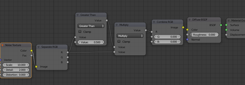
Now I will add some texture as well:
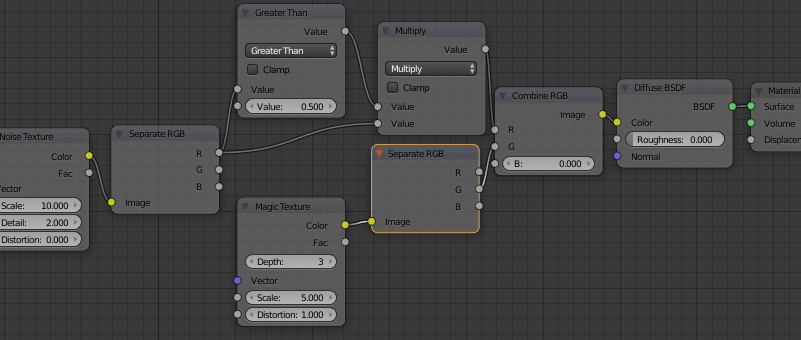
I add in a “Magic” Texture. I here also need to separate the RGB, so I do that and then I take the Green from the Magic texture in to the Combine RGB, which means that we now get the red (if it’s above 0.5) from the noise and the green from the magic texture. The Blue is still 0, which leaves Suzanne with this look:
The Yellow comes of the reason that combining Red + Green = Yellow. The Black spots are the blue that have not gone through yet since we keep it at 0.
I will not go any deeper than this at this moment, but you now have a clue on how to mix different textures with each other and here you must try and practise a lot to get a good grip of what you really can do with this, but when you do…. A whole new world is at your feet :).
Time to introduce the Shaders
If you haven’t studied the Shaders Encyclopedia that Blender Guru wrote yet, I’d suggest you do that before continuing so you get a basic understanding of what different shaders do.
I also bet you have heard, “Just use the principled shader”. Well, it’s a good shader but it will not solve everything and before using it that there are many steps to go. However if you want to know how the principled shader works I’d suggest you read the Blender manual at:
https://docs.blender.org/manual/en/dev/render/cycles/nodes/types/shaders/principled.html
The three major groups
All shaders are in the same group node, the “Shader” group. However in that group they belong to three different categories. Number one is those that you connect to the “Surface” of “Material output”, then there are those that you connect to the “Volume” of “Material Output” and finally you have a few to mix the shaders with each other.
I will exclude the volume shaders from this chapter about shaders and concentrate only on the surface shaders and how you mix them.
However, it could be good just to know what is what, so here is the list
Mix shaders:
- Add Shader
- Mix Shader
Volume Shaders:
- Emission (this is a shader that can be used both on volume and surface)
- Volume Absorption
- Volume Scatter
Surface shaders:
- All except those I mentioned above.
As I wrote in the beginning of this chapter, read Blender guru’s Shader encyclopedia if you want to know more about each. I will not go through them here. I will instead concentrate on how you mix them and use them together with other stuff.
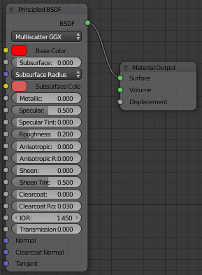
The basic input node points in a shader
The amount of possible input nodes can of course differ slightly depending on shader, but most uses at least these three:
- Color
- Roughness
- Normal
Color
If you have read through this document this far, I am sure you know how to use the color by now. Anyway Color AND patterns from textures finds its ways to a shader through this yellow input dot.
The default rule when using colors is to put the most colors and patterns on those shaders that shines the least, like “Diffuse shader”, while a glossy or reflective shader normally just have a white color input. Of course there are exceptions, but this is at least how you should think in most cases.
Roughness
Roughness is how rough a surface is. Higher value is a rougher surface. In some shaders you see a huge difference between high or low roughness and on others you can hardly notice the difference.
If using a glossy shader it reflects a lot of light. If the Roughness is 0 on a glossy shader the light bounces back 100% as it should and you get a perfect mirror, but even the smallest value, like 0.08 or similar, on roughness will make the mirror look go away and you get something less shiny.
Roughness = 0
Roughness = 0.08
On a diffuse shader you will hardly see any difference at all. There it’s just a “feeling” . Glass on the other hand is sensitive as Glossy. In short; those shaders that reflects a lot of light back are also more sensitive to roughness, but roughness counts… even if it is a less shiny structure on your material.
Normal
In the “beginners phase”, you might not use this much… but when you grow in to using the nodes, creating materials and you want to get really close to how things actually look in the real life, you will use it almost constantly.
It adds that little extra to the material. It adds some height, depth and structure that could be hard to achieve in any other way.
What the normal input does, is that it, by using some kind of a normal map, simulates cracks, edges, joints, dents and bumps… without actually physically change the model the material is placed on. It just bounces back the light or add shadows in such a way that the user thinks the material has these things.
With it you can do amazing things.
The easiest map to use procedurally is the “Bump map”, which tells the shader to simulate different heights on the object. It’s just a grayscale image and you could easily use the textures to create it.
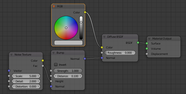
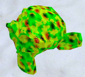
Just to see it effects you can try the setup below (You’ll find the bump node in the vector group):
(NB! See that I use the Fac from the noise… not the Color. Color is not of interest when working with a bump map.)
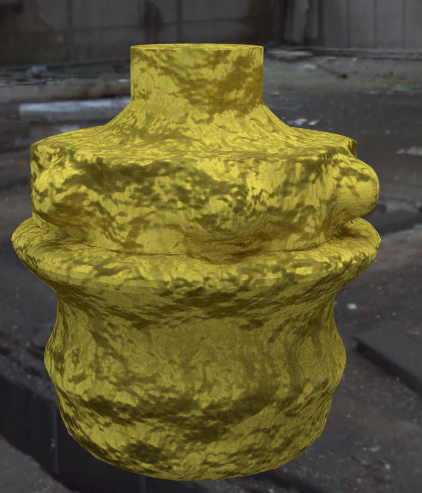
The result:
As you can see on Suzanne, it clearly looks as she has her head full of dents and bumps. This is just an illusion created by the normal input and the pattern is created by the noise we put in.
When combining different shaders, like both glossy and diffuse (or using the principled), the result could be even more convincing.
The best result you get with a “real” normal map, which is an image in different blue/red tones. That type of image does not just tell the height of something, but also the direction of the light and you can define almost anything on a model when it comes to the small details using normal maps. One very popular way of using normal maps is to create a lot of technical small details on a larger image and then just smash them on the material almost at random to get a future looking appearance, so called “Kitbashing”.
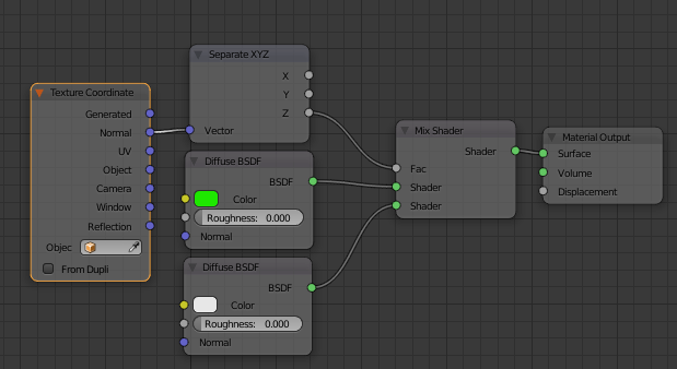
Time to mix shaders
Introduction
When mixing shaders we have two options to use. One is the “Add Shader” and the other is “Mix Shader”. I will not use the “Add Shader” at all since this is only an “emergency exit”. What “Add Shader” does is that it takes all that light and energy from one shader and adds that to another shaders light and energy. This is nothing that happens in the real world since light scatters and fades off… it never builds stronger during it path if not crossing another light source like a lamp or similar.
The “Mix shader” however is something that we will use all the time. One of the main thing in handling the nodes is to know how to mix two or more shaders together.
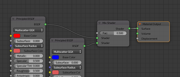
Let’s take an easy task as to add some glossy on a diffuse material, like porcelain. Porcelain have some amount of diffuse and some amount of glossiness, so mixing these two shader nodes together would work perfectly.
We create a basic setup. In most cases the least glossy shaders will be on top and the most glossy at the bottom. In the end it’s just a matter of taste.
Basic setup, not using the principled:
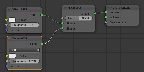
This gives us equal amount of diffuse and glossiness since the “Fac” is on 0.5. To give some more glossiness we just raise the value. The lowest input node (in this case Glossy) is getting full attention if putting the “Fac” to 1 and the top shader (in this case “Diffuse”) is getting full attention if setting the “Fac” of the Mix shader to 0.
Now we add some color to the diffuse:
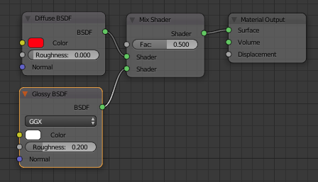
Suzanne then looks like this:
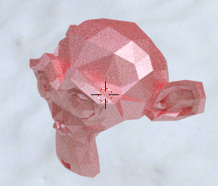
Now you can see that she reflects a little and have a pink tone since red and white will be mixed.
However, it’s not that natural looking. The reflection is too even.
In the “old” days you then changed the “Fac” to get a realistic material using input nodes like “Fresnel” and “Layer Weight”, but now most people uses the “Principled” shader instead. The older nodes still exists and can be used, but since this shader also is more standardized comparing with other 3D softwares it should be your first choice.
We can’t avoid using the “Mix shader” just because we are changing to the principled shader, but when mixing diffuse and glossiness together it’s now not needed.
Look at this setup. It’s the same as before meaning I have the roughness to 0.2 and a red Suzanne:
Except those two things (color and roughness), I have not changed anything. Suzanne looks like this:
She is now reflecting more natural than in our previous example. There is no thin white layer above her, but we still get a good reflection on the correct places.
This is possible to achieve as well by mixing the Diffuse and Glossy as I did, but you also have to put in correct value in the “Fac” and it could take time before you find a material that you are satisfied with. Here it’s almost automatic and how you should change the parameters, you could see in the Blender manual, that I linked to before, rather good
So, the mixing between shaders has more become the main thing when changing between two different materials on the same object like going from metal to rust or from open water to frozen ice.
Mixing shaders using texture
Mixing a shader is almost like mixing a color. You use a “Mix shader” and connect two shaders in it. The top shader has the low value of the “Fac” and the bottom the high maximal value of 1.
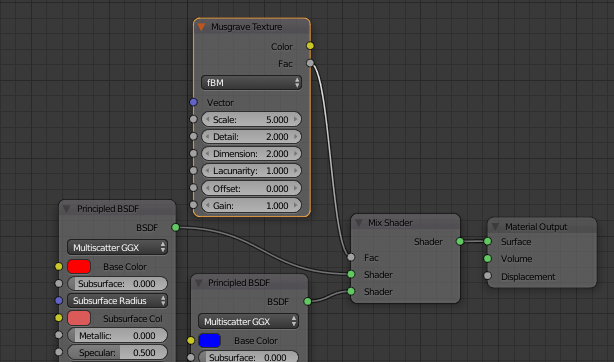
When working with principled, you will see that it can’t handle values above 1, but before continuing just make one red and one blue principled shader and connect them with a “Mix shader” like this:
(I have not changed anything, but the “Base Color” so no need to show all of it)
Now we add a noise texture in to the “Fac” of the “Mix Shader”. As you can see the “Mix Shader” uses a grey input, so use the grey output “Fac” as well from the noise.
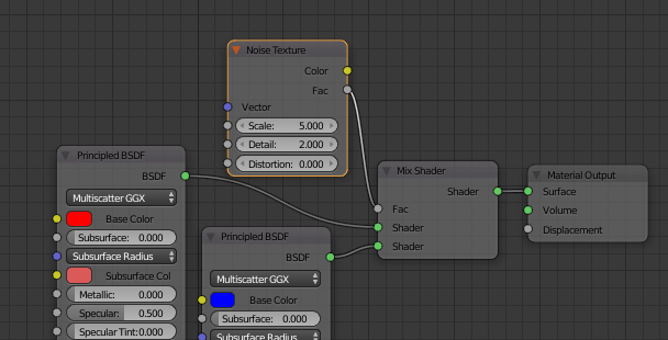
Suzanne now look like this:
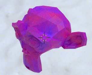
She is a mix of Red and blue and amount is controlled by the noise texture. Now exchange the noise with musgrave.
Look at Suzanne:
As you can see she has red, purple and blue as well… but also large black areas!
This is because “Musgrave” as a texture goes way beyond 1 in the center of each pattern.
So how to avoid it?
One is not to use the “principled”, since the old shaders handles this better, but I don’t think that is what you should do.
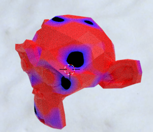
Instead you could “clamp” the value. If using a “math” node there is a checkbox where it says “Clamp”. If using this you take away everything that is outside of the 0 to 1 area.
So, look at this solution:
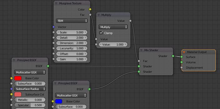
I have now added a math node where I use “Multiply”. I multiply the input value with 1, which should give the same output as input, but I have also checked the value “clamp”, thus restricting the value from reaching higher than 1. Now Suzanne looks like this:
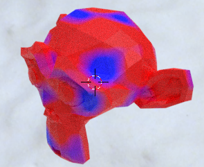
No more black holes :)!
Another solution to the problem is to use a “ColorRamp” between the texture and the “Fac”. Just remember to put in a converter node that changes from RGB to BW as well.
The ColorRamp has the advantage that it both restricts the output value to be somewhere in the 0 to 1 interval, but it also gives you the possibility to change the output from the texture in the same way as we earlier did with the color.
Such a solution looks like this:
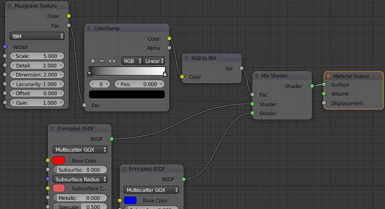
It will give exactly the same result as previous solution, but as I wrote… now you can change the ColorRamp and then filter and change a lot of the texture output. More black in the ColorRamp will give more Red in our solution above and more white will give more Blue since the value then will be closer to 1.
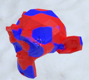
Example:
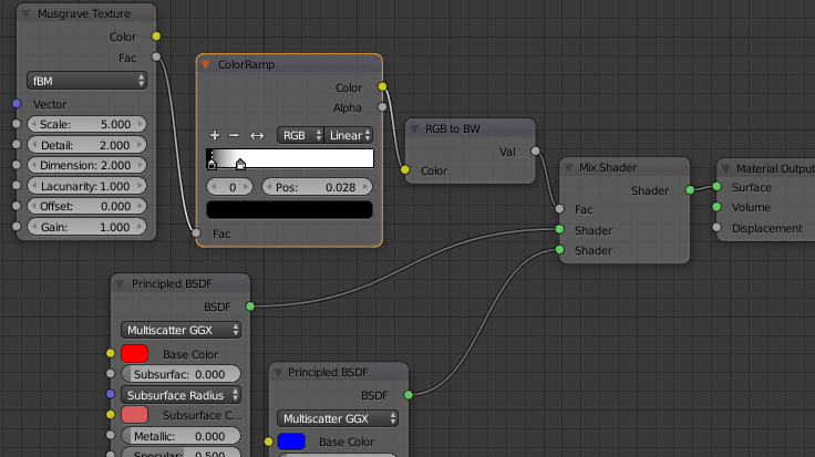
Will give:
Natural mixing way of shaders
When mixing colors we have a lot of things we can do, so it would be easy to think there should be a “Mix Shader with a hell of a lot of options”. There is not! We only have “Mix Shader without options”.
Why is that?
Well, because a shader is really the end point. We have already told cycles how thing should look and now we only need to tell cycles how the light should be reflected on the surface.
What we do need the mix shader to is when we would like to go from one material to another. If we stay in the same node tree and have several materials, the movement from one material to another is often caused by that the material has been aging in one or another way.
Regardless if the object is a man made thing like a car or a natural object like an old tree, things do change over the years. The car loses paint and get rust and the tree gets moss and dirt. Those changes shows different materials and where the changes between every material occur is what we have to catch and then put in to the “Fac” of the “Mix Shader” node.
The trick here is to find the vulnerable spots. These are often edges, corners or surfaces that is open to be hit by rain or snow.
How that is done, I have described in an earlier document I wrote, so I will not go in to it here… but I suggest you read my “Wear and tear” on
https://docs.google.com/document/d/1fWaorEppgDpnP08XbTKipR7S0JdARZgoMI9ApmCmBa4/edit?usp=sharing
It explains everything you’ll need to know in that area.
Since you have that documentation above and also the “Blender Guru shader encyclopedia” I see no reason to explain more around shaders right now. My suggestion is only to read al the stuff that I point at. It fills the gaps I’m leaving in this document.
Let’s move on 🙂
The “real” node start… Vectors!
For those that have read my earlier document about “Wear and tear”, this will be a rerun. However, it’s so important that I can’t leave it outside and rewriting the same thing earlier described in another way is not of use I think… so you might have seen the text below earlier.
Vector output
Blender needs some type of coordinate system to be able to put any textures or material at all on the object. To make it easy for us that uses Blender, the textures in the nodes (including images) has default coordinate systems.
Generated
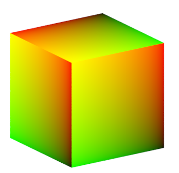
All the internal textures like noise and voronoi, uses “Generated”. This is what you get when using the input node “Texture Coordinates” and selects the output “Generated”.
Generated works like a bounding box around your object where all directions (X, Y and Z) starts at 0 and then goes to 1.
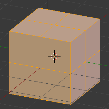
Let’s try an example:
Use this setup on an ordinary box:
Yes, I know. I have put the blue dot to the yellow…hmm..is that OK? Don’t bother…just look at the result ;).
Ok, so do you know your color scheme?
If you do, then you know that a black RGB is (0,0,0), which means that all coordinates are zero. That you can see in the bottom left corner. This is where generated starts.
On the right top corner (left on the picture since I turned the box to take the image), the color is white. White is the maximum of all colors and in RGB for Blender node tree this is expressed as (1,1,1).
So, we have now proven that Generated starts at the left bottom and then goes to the far top right!
What about the other coordinate systems?
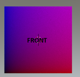
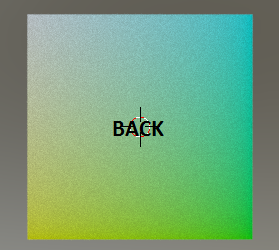
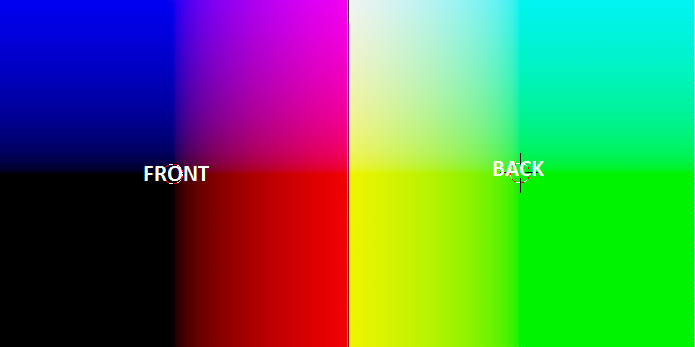
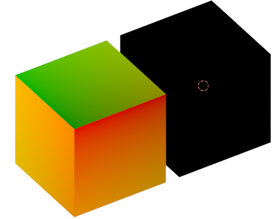
Object (with no reference object)
For fun, we do the same setup for output object.
This will give you:
(Nicer cut & paste, compared to the previous one 🙂 )
Ok, how do we explain this?
It’s rather simple… but can’t be shown 100% in these colors. Object (if having the text field empty) always have 0 at origo. It starts at -1 and ends at 1. That is why the colors look solid black at start. Negative numbers don’t produce any color. So at the lower left we have -1,-1,-1 and in the top right we have 1,1,1.
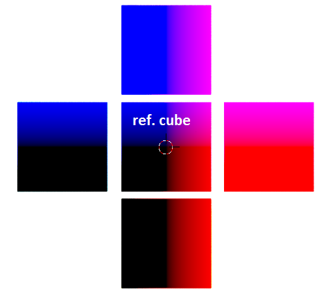
Object (With reference object)
Armed with knowledge from previous chapter, I think it will be rather easy to explain this thing as well. You have perhaps seen this field in the texture coordinate?
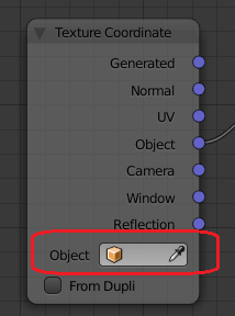
This is connected to the “object” output. What it does is set the origo to use for the object output.
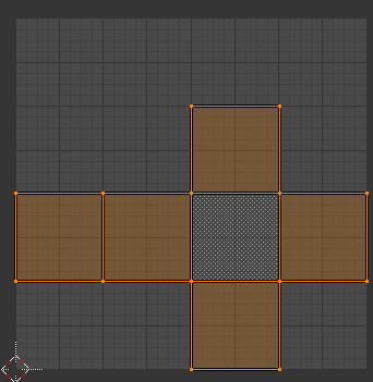
Let me show you. I will create FIVE boxes now. One will be reference object and the others will be using the reference.
Ok, below I have the following setup. “Reference” is the name of the cube that I will use as a reference object. All cubes will use the same material
The result:

This picture clearly shows how the origin from the reference cube is used for the other cubes as well. This is a way to create a coordinate system and relations between different objects when it comes to material and could be very useful and effective.
Position
We also have other output nodes as well to use when placing out texture. One is in the input node “Geometry”. I will now use the five cubes I did in previous chapter.
I will change the setup to this:
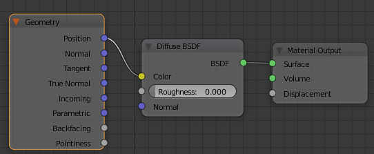
If I now render I will get this:
The same image!
However, there is a difference. I will now move all my cubes to another position by dragging them in the X-direction. Then the result will look like this:
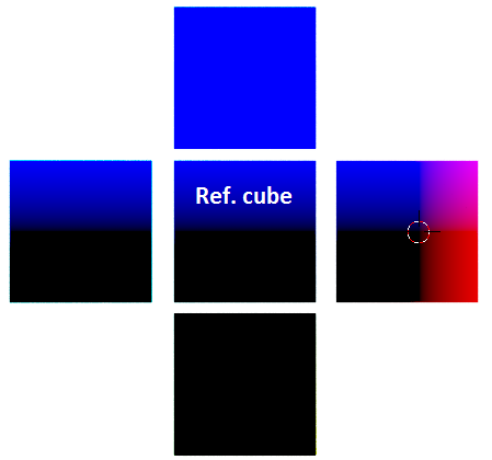
Now it’s changed!
What we see is that “position” works as the object using a reference. The difference is that “position” always use the center of the world as origo.
Both the “Object with reference” and “position” is great for texturing “randomize” patterns. The placement of the objects can change the input for everything and by that creating different result using the same material on different objects.
UV
Most of you that have worked with images knows that you need to UV unwrap the object to place the image on it.
The UV output is default on the image texture node, but can be reached from the input node “Texture coordinate” as well using the output “UV”.
Setup is simple:
I do two boxes. One I UV Unwrap using the pattern below and one I don’t UV unwrap.
How will this look? Result:
As you have guessed, the cube that I didn’t unwrap is black. This means that we have no coordinate system that is guiding anything and no material will be visible regardless if it’s an image texture or an internal texture like voronoi.
The other cube has colors. Since it’s the UV that decides the coordinate system it will not go straight from 0 to 1. I will show more clearly how it works.
I reset my UV unwrap, so I get this UV:
The cube then looks like this:
Every side had got the equal amount of colors. Now you perhaps wonder why we lacks white and black?
Well, that is because we are not working with X, Y and Z anymore. Right now we are working with U and V… only two dimensions instead of three.
We are placing a two dimensional texture on a three dimensional object and all Blender wants to know is what pixel or dot on that texture should I use on a specific place on the faces.
Parametric
When I’m talking about “Faces” and “UV”, I must also write about the “mysterious” “Parametric” output. You will find it in the input node “Geometry”. What it does (in a more non technical and understandable way) is that it finds every face on your object and create a coordinate system in that area. The coordinate system is tris, meaning that if you have quads or ngons it will divide that face in to tris (triangles).
With this setup:
..and using a cube subdivided once so it looks like this:
I get this result:
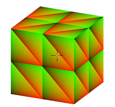
With fantasy and imagination you could use this output to get small textures all over.
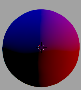
Normal & True Normal
You can reach the “Normal” output from two places. Both the “Geometry” input and the “Texture Coordinate” input has it.
If we look at this setup:
It will look like this on an icosphere:
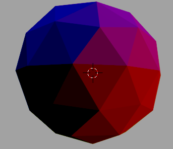
So, what we can see here is that this coordinate system looks like its faced based, just as the parametric input. That is however not a correct conclusion. The normal is instead build on angles and that’s why all faces has different colors.
The colors are connected to what the 3D world calls normals. I will explain a little more after a few more experiments. Now subdivide this 2 times using the subdivider modifier and add “smooth” on it. Check it using the same setup as before:
Change the setup from “Normal” to “True Normal”
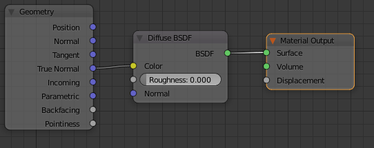
Now check the result:
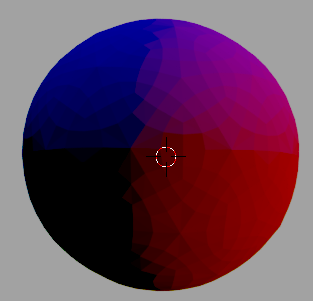
Did you notice the difference? Yes, the “normal” considers smooth and also things like Bump maps and such while “True Normal” still shows the original faces. Good to know if doing procedural math :).
Other than that, they are similar.
So, what is normals and how do I know the value of the angles?
If we again look at the sphere, but now from top,
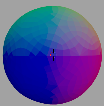
You might recognize the colors?
Seen a “normal map”?
Yes, it’s the same :). So while the vector bump map using grey scale to describe height only, the normal map describes the angles and can then have a more intricate pattern.
When talking about normal, it’s better to think of it in colors, but the mapping between axis and colors are like this:
X: -1 to +1 : Red: 0 to 255
Y: -1 to +1 : Green: 0 to 255
Z: 0 to -1 : Blue: 128 to 255
(Yes, it’s a bit strange that Z is 0 to -1 and colors 128 to 255)
You should look at it from top. I will now take the wikipedia information right of:
- A normal pointing directly towards the viewer (0,0,-1) is mapped to (128,128,255). Hence the parts of object directly facing the viewer are light blue. The most common color in a normal map. (In Blender that means the color in Input RGB Node is R=0.5, G=0.5, B=1)
- A normal pointing to top right corner of the texture (1,1,0) is mapped to (255,255,128). Hence the top-right corner of an object is usually light yellow. The brightest part of a color map.
- A normal pointing to right of the texture (1,0,0) is mapped to (255,128,128). Hence the right edge of an object is usually light red.
- A normal pointing to top of the texture (0,1,0) is mapped to (128,255,128). Hence the top edge of an object is usually light green.
- A normal pointing to left of the texture (-1,0,0) is mapped to (0,128,128). Hence the left edge of an object is usually dark cyan.
- A normal pointing to bottom of the texture (0,-1,0) is mapped to (128,0,128). Hence the bottom edge of an object is usually dark magenta.
- A normal pointing to bottom left corner of the texture (-1,-1,0) is mapped to (0,0,128). Hence the bottom-left corner of an object is usually dark blue. The darkest part of a color map.
In procedural texturing we can use this information in many ways. One of the most common is to concentrate on just the Z-axis on the normal. If it’s a flat area (on Z-axis) the value will be 1 in Blender and if it’s 90 degrees or more it will be 0 and then we have everything between.
This means that things like dust, rain, snow or in some cases rust (depending on environment) is perfectly adapted for normals. Look at this simple setup:
If using that on a torus it will look like this:
Snow at the top and grass below :).
More advanced is to use all directions of course, like snow on top of trees, moss only on one side of the trees and so on… or use it as a base for creating procedural height maps.
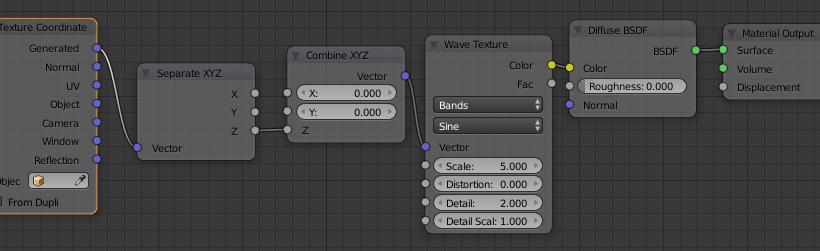
Separate XYZ
Now when we know about the coordinate system, we can continue by learning how to change them a little.
The first thing we should learn is how to separate a vector into it separate parts. This we do by the convert node “Separate XYZ”. Sooner or later the texture probably wants its vector back, so we also have a corresponding “Combine XYZ”. Between those two we can create magic.
Let’s look at this setup:

(You remember? The same as I used to explain “generated” earlier)
This is exactly the same as:
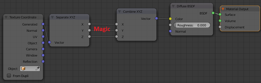
The difference is that we now can make some magic on the coordinates in that “magic space” by using things like math nodes and colorramps.
I will not go through all those things you can do in that “magic space” right now, but one thing worth mention is that you don’t need to create an end vector all the time. In some cases you may just want the Z-axis for instance to separate two different shaders.
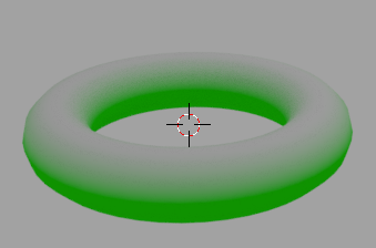
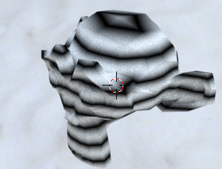
Look at this:
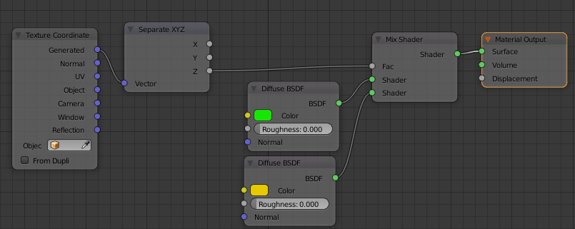
Here I’ll just take the Z axis directly to the Fac and it works like wonder. The result will be:
The Fac magically knows that we are using the Z-axis, and changes the color accordingly.
It’s very useful for many, many, many things :). One example would be a snowy mountain, where you have grass and trees at ground level, then mostly stone and at the top snow. If we are talking about wear and tear, it’s often rust at the bottom of things (since the water stays on the bottom edges longer) and then it gets better and better higher up.
Between the Separate XYZ and the Fac you could as usual put in colorRamps, math nodes or curves to change the outcome.
This:
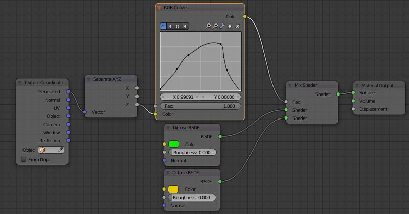
Will for instance give this:
The world of vectors, math and textures.
Now I have explained about colors, shaders and vectors. When I have done that I have touched textures and math as well, but now when you have the basic overall knowledge is the time to take a more deep dive in that area.
Using math for vector manipulation.
To do anything advanced, you need to use math in the nodes. I have used some in earlier examples in this documentation, but it’s vital that you really know how it works.
The Math node is a converter node with a lot of options. It has two inputs, but in some cases the second value is of no importance. Here is the complete list where Value1 is the Top value and Value2 is the bottom value
- Add: Out = Value1 + Value2.
- Subtract: Out = Value1 – Value2.
- Multiply: Out = Value1 * Value2.
- Divide: Out = Value1 / Value2.
- Sine: Out = Sin(Value1).†
- Cosine: Out = Cos(Value1).†
- Tangent: Out = Tan(Value1).†
- Arcsin: Out = Sin⁻¹(Value1).†
- Arccosine: Out = Cos⁻¹(Value1).†
- Arctangent: Out = Tan⁻¹(Value1).†
- Power: Out = Value1 ^ Value2.
- Logarithm: Out = log(Value2, Value1).††
- Minimum: Out = Smaller Value of (Value1, Value2).
- Maximum: Out = larger value of (Value1, Value2).
- Round: Out = Value1 rounded to nearest integer.
- Less Than: Out = 1 if Value1 < Value2, else 0′
- Greater Than: Out = 1 if Value1 > Value2, else 0′
- Modulo: Out = Value1 (mod Value2).‡
Note that some operations use only the first input, in such cases the second input is ignored completely.
†. All trigonometric functions use radians.
††. log(x, y) = the logarithm of x to the base y.
‡. x mod y = the remainder when x is divided by y.
This will be a small math lesson as well, but there are some useful things that you perhaps is not using in your daily life.
Little about “Mod”
The “mod” operator is one special and very useful operator. What it does is that it divides value1 with value2 and the result is the reminder of that. It’s easier to see in a table. I will now divide with 5. Then it looks like this:
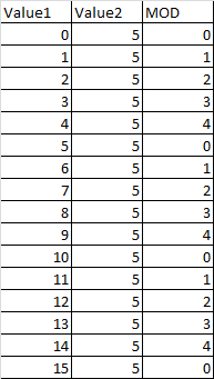
Do you see it? The result is repeating it self, thus this is perfect to use if you want to have a repeating pattern even if the input always is going to get bigger.
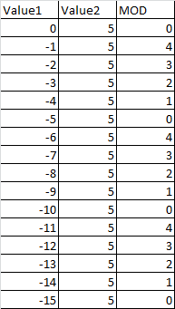
With a minus sign in front of Value1 it will just go the other way around like this:
As I have described earlier the “Generated” vector goes from 0 to 1 in an ascending way, so these two components work fine together. I’ll do a little test below where I multiply the output with 100, so the the output value will be 0 to 100 instead and then I divide it in mod by 10. Giving us a wave of 10 repeats. It could look like this (starts with a Texture coordinate input:
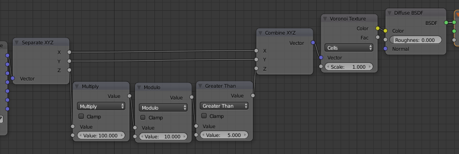
The “Greater Than” above will give number 1 for Z axis as long as it is true that the output from the modulo is greater than 5 or else the output from “Greater Than” will be 0. Since we repeat from 1 to 10 ten times using the modulo it will be that the numbers 6 to 10 will be true ten times and the number 0 to 4 will be false ten times.
Result is clearly visible on Suzanne:
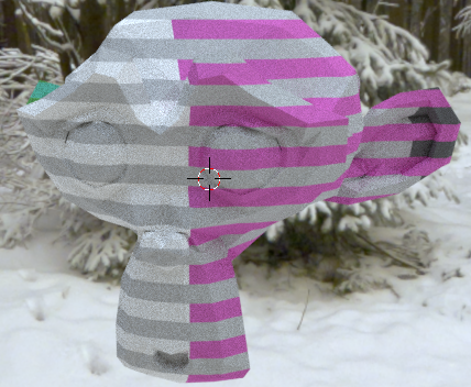
It starts with true at the bottom, gives her some color, then false and she gets grey… and so on. Ten times :).
You can do so much more with this and of course in all direction. This is just an intro.
“Greater Than” and “Less Than”
I suppose you by now have grasped these two since I have used them a lot already.
The basic for them is this:
- You send in a value at the top.
- This value will be compared with the value at the bottom.
- If the value is true, the output will be 1.
- If the value is false, the output will be 0.
Try to solve this question. If I use the input “value” node I can write whatever value I want. If I write 1 I would like Suzanne to get Green, if I write 2 I would like her to get Yellow and if I write 3 I would like her to get red. All other higher values (only use non decimal in this example) and she gets black.
How should you solve it using “Greater than” and/or “Less than” (NB! This could be solved a lot easier using other methods, but now we are concentrating on learning this.)?
Things easily get complicated :).
I will do one solution below:
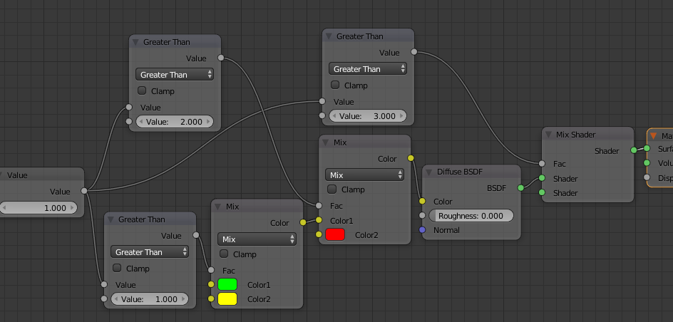
So, how does it work?
Well, you input a value and that value compares with if it’s greater than 1. If it is, the result will be 1 and thus the complete Yellow color will be picked in the green/Yellow mixed since bottom is 1. If it’s less or equal to 1 it will be green, since we then get the result false (0) . Ok, so now we either has green or Yellow. That will be the input to the next Mix.
Here I then compare if the value is greater than 2.
If it is we get the bottom color since output will be true (1) and hence red continues. If not (value is not greater than 2), we get false (0) and the old value (green or Yellow) will continue.
Finally I put all in a shader. To make the black I check if the value is greater than 3 as well. If it is, I pick the bottom color on the mix shader. Since I have not given that anything, the default is nothing (which is black).
As you can see we are forced to check with the source value all the time, so it easily gets a lot of lines in the node tree. However, the logic behind is powerful and you can now see how you can control different colors and shaders from showing or hiding.
Since this chapter is about using it to manipulate the vectors, I will take in another example.
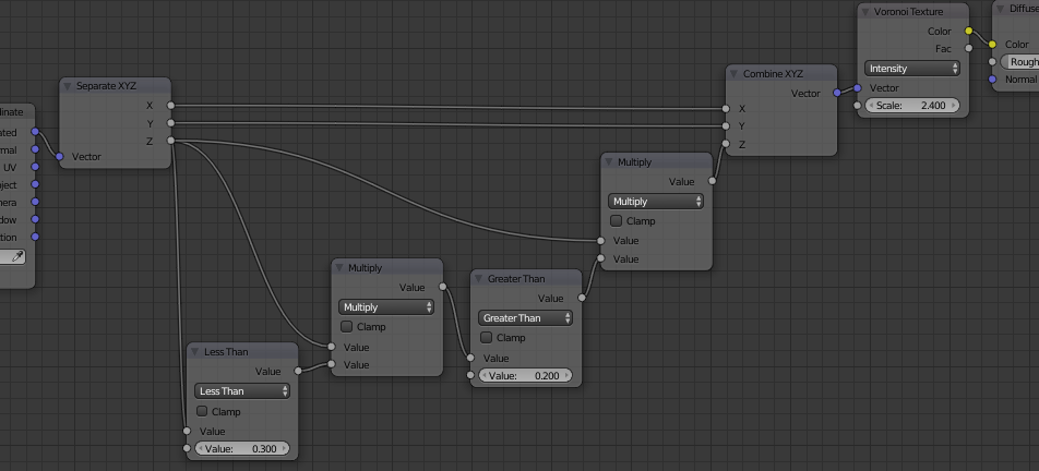
In this I will control the area in Z-axis (height), that is between 0.2 to 0.3. First I check if it’s below 0.3. If it is I get the output 1. Now, I can not check if the output value is greater than 0.2, since it will always be just 0 or 1. I need the source and in the same time know that it was true earlier. Thus I do a multiply after the “Less Than”. This gives me either 0 (the last result was false) or the original value (last value was true and it was multiplied with source value).
Now I can test if the value also is greater than 0.2. If both are true then the output will be 1, so I do the multiply again together with the source value. Now you get either 0 (not in the interval 0.2 to 0.3) or you get the correct Z value. On Suzanne you can clearly see how it affect the visual appearance:
Then I hope you have a basic understanding of these things as well.
Draw a circle
You could use textures and many other methods to draw a circle, but this time I will do it using the Cos and Sin function. We would like to use pure math here to change the output, right?
Solution:
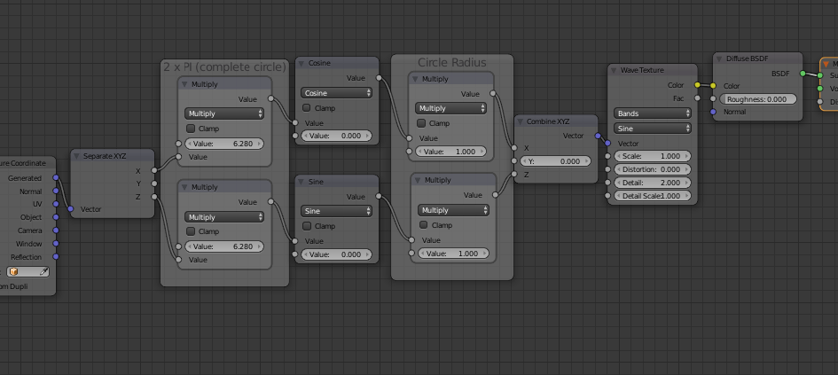
To understand the first multiply, you must know that we use radians and that 2 x PI is the value we need to cover a complete circle, thus 6.280. To make a bigger a or smaller circle I have also added the possibility to multiply a length to it (The circle radius).
Result:
So, now the “wave” texture is completely changed from those straight lines in to perfect circles.
As you might imagine, it’s only your own knowledge in math and the imagination that is stopping you from create whatever pattern you want.
The vector mapping
The mapping node for vector is the fast change on scale and direction when it comes to the vector output.
We use our beloved Suzanne again and add some wave texture on her like this:
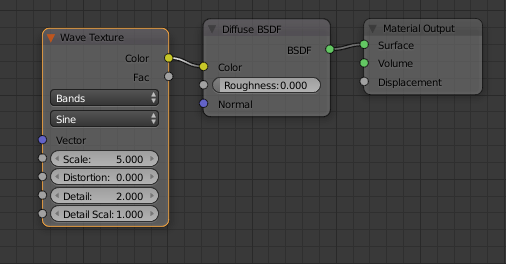
This will give a Suzanne that looks like this:
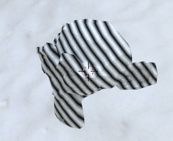
So simple :). If I now want the lines to go just horisontal… what should I do?
There is of course several of ways to do the changes. Using the Mapping node (Vector group), you do like this:
What I did was that I changed the scale of X and Y to zero. This means that they will not be used at all.
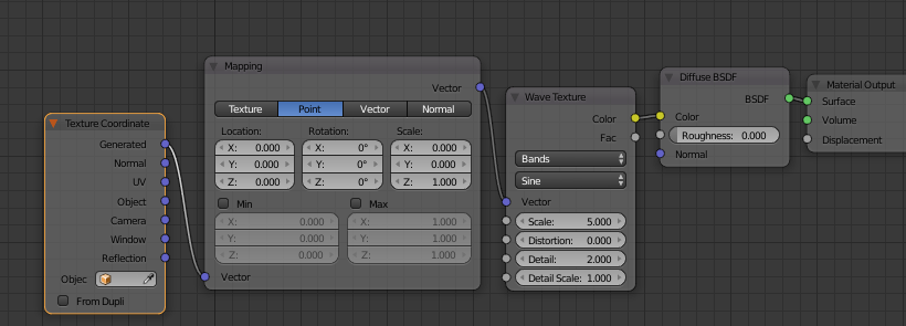
Mapping has the ability to change scale, rotation and location of the vector input. In the case above I removed X and Y as I wrote. This will give horizontal lines on Suzanne. Another way would be to do the same thing would be:
Functionality is exactly the same, but here I needed to use more nodes. In both solutions we get this result:
Problem solved.
In this last case we took the vector, separated it to XYZ, did “our” thing and then combined it again. We didn’t use any math between or other textures. Using Z may feel strange, but if you remember “Generated” it goes from 0 to 1 from bottom to top and since the wave texture goes the other way, starting from top and goes to bottom, the average will be a plain horizontal line.
Let’s play a little more with the mapping node.
Can you do this with Suzanne (I have now added a subdivision surface modifier at strength 2)?
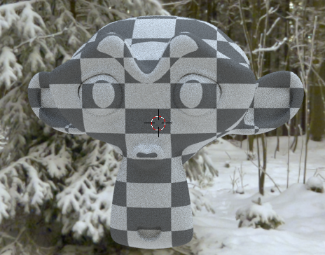
Hmm.. how do you get round eyes and a little nose?
What I did was that I rotated the checker pattern just a little in the X- axis, which then makes it “bend forward” a small amount and then the colors will cut through depending on the object shape. I also changed scale and moved the pattern to center the eyes.
Answer:
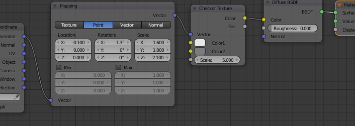
As so many other things in the cycles nodes… all is about playing around and changing things. When using “Point” the scale gets smaller with higher number. If you use “Texture” its the other way around. Just as a little note.
Using Vector curves
In many cases it can be a little hard to solve it all using only the math node. Then we have the vector node to use. The vector node has some graphical curves connected to each direction and then it’s very easy to change parts or all of the output from a vector.
We continue to play with the Z-axis since it’s so visible moving things up and down. Let’s show an easy example:
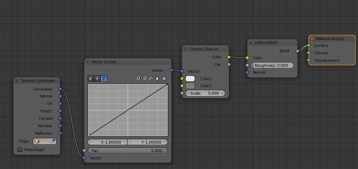
This is how it normally looks. I have not changed the curve yet, which means that you will not see any difference on Suzanne if I’m using the curve or not. X is what comes in and Y is what value that comes out from the vector. As you can see in the top I can use X, Y or Z and it’s ok to change them all.
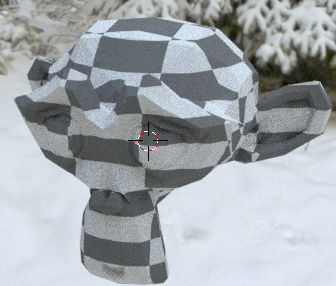
So, If I want the squares to come more often in height, I’ll just increase the angle on the Z, like this:
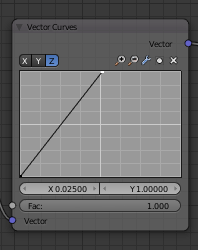
It will give an appearance of Suzanne that looks like this:
In the same way, it will be fewer in height if you lower the angle. The fun thing with curves is that you can bend them and vector curve is no exception. You can add as many point as you want to the curve and make it really complex.
Since you can see the result immediately, you can fine tune and play with it a lot and finally you may get something very weird or fantastic, like this:
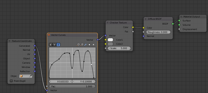
…and Suzanne:
I think you understand how it works now :).
Texture as coordinate for vector
With the mapping node you can change rather easy things. It’s scale, location and rotation… but not the actual shape of a texture. For that you use either pure math, vector curves or a base texture.
You know by now that a wave is a straight line more or less on Suzanne, but if I use Voronoi as base with type “Intensity” I can make circles out of the waves.Look at this:
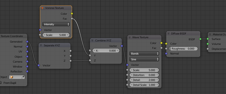
I have now connected the voronoi of type “Intensity” to our Y coordinate, which will give this result:
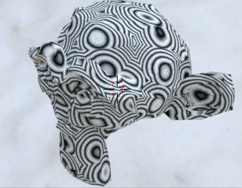
It’s still presenting the output in a “wave” style since that is the last texture used before going to the shader, but the pattern comes from strong Voronoi influence.
Since you can use whatever math you want between the “separate” and “combine” you can easily decide how much influence you want from a texture. In the case above I let Voronoi take 100% of the Y-axis, but you could just let it do a subtle change if you want to.
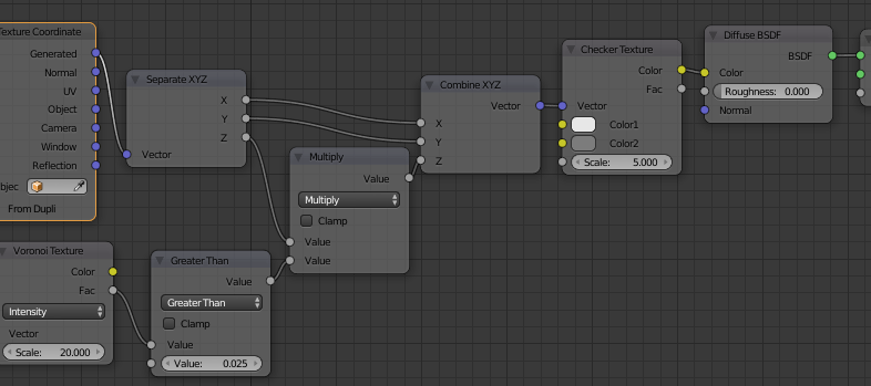
Here is one way of doing it:
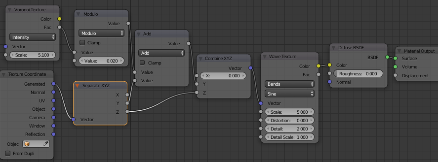
In this case I let the Y Axis get the values from Generated totally. The only thing I add to the appearance is those voronoi values that goes through the modulo operator if using a value of 0.02. The result will look like this:
Suzanne has straight lines… but also thin Voronoi patterns on some places.
Instead of just adding values from the Voronoi I could of course multiply or whatever. The variations are infinite.
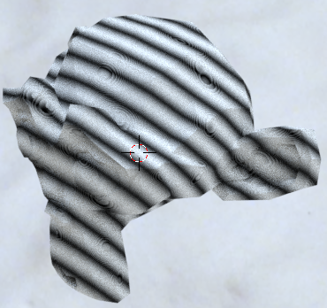
Another example:
If I would give Suzanne some freckles in her checker shaped face, I’d do like this:
That will produce this result:
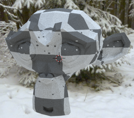
What I did here was that I added the voronoi shape on the height (Z axis), but reversed.
If the voronoi shape was greater than 0.025, which it is in most cases, I got the result true, which gives the number 1. If I take 1 x generated Z value = generated Z, which is the original value, thus the shape of the checker.
However, when it’s false (voronoi less or equal with 0.025) I get the value 0. That creates 0 x generated Z- axis value = 0. A Zero means that I don’t send anything through the Z-axis and on that spot nothing will be written… and a small voronoi spot is born :).
I give a lot of examples on how to bend the lines in my document for “Wear and tear” using textures.
Bump it up a little
Ok, so now I believe you are a bit tired of vector manipulation and want to go on, so here we go! I have quickly written above about Bumps and normal maps before, but it’s time to look a little more close on that subject as well.
However, I have already described it in my earlier documentation, so I will be as lazy as I can and just copy the part about bumps in here as well. I think it’s better to have it here then just link to the other document since it is basic stuff that you’ll need to know.
Vector bump
The most common way to create bumps is to use the vector node “Bump”. It reads a WB color scale, where white is up and black is down. The bumps can correspond with the color changes of the material, but doesn’t have to. You can have bumps wherever you’ll need them.
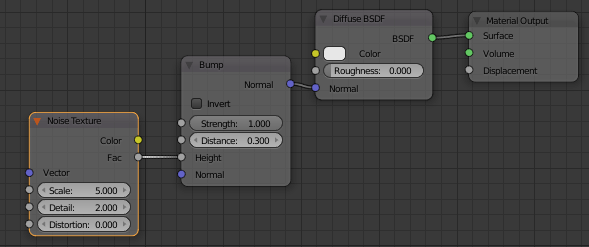
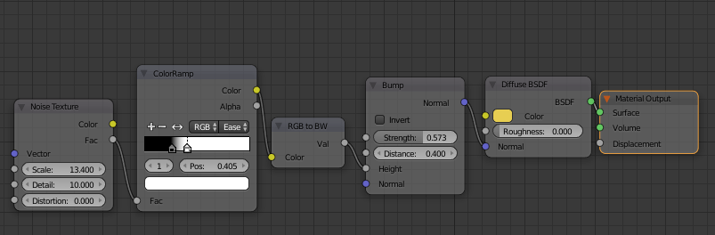
A standard setup for bumps is like this:
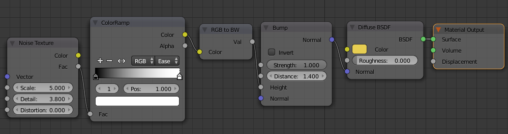
Here you get some kind of noise/texture that will generate the bump, a colorramp to filter some bumps out, a converter so that you are sure that you work with black and white.
All of this goes to the vector node “Bump”, which controls the height. As output you get a “normal” that you connect with your diffuse.
The parameter “distance” is to create a perceived distance between the bumps. Just see it as a multiplicator of the “height” parameter. The “strength” is how visible the bumps should be.
What you’ll need to know is that these bumps are “fake”. They don’t exists physically on your object. It’s just a play with shadows to make it look bumpy.
The result for the setup looks like this:
Rather bumpy, right? Well, if you look at the edges of the object you’ll see that these still are straight.
However. It could be convincing in most cases. Let’s play with the colorramp a little.
I’ll now have this setting:
Changed the noise a bit, lowered the value on the colorramp… in short smaller and fewer bumps.
This will now look like this:
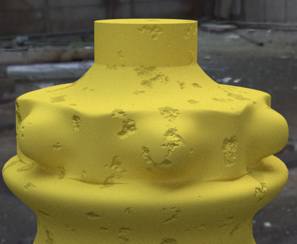
Since none of the bumps is possible to compare against the edges of the object, they now appear more real.
If you now imagine that you have some color wear here in the bumps, so you see partly white then it will be even more convincing.
So, try this:
Result:
Now you really see the bumps, but as I mentioned before… the color changes does not need to meet the bumps entirely. It makes it too clean! Let us adjust it a tiny bit.
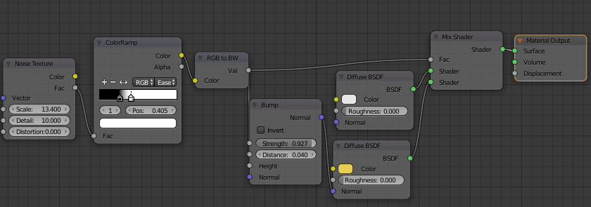
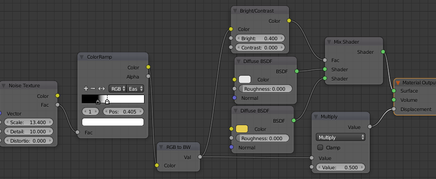
Try this:
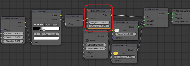
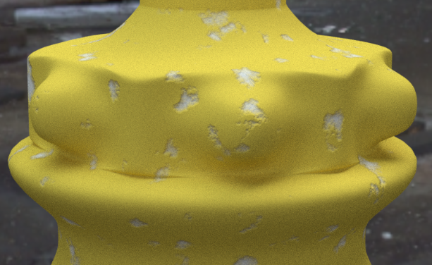
What I have done is just that I added a color node “Bright/Contrast”. This allow the factor to get little higher value and by that more yellow will be visible. The result looks like this:
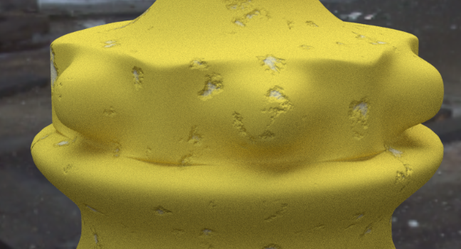
Now we don’t see white until we reach the lower parts of the bump. This is much more convincing then just following the bump exactly.
Always remember to add those tiny extra changes to get closer to a realistic end result.
Also don’t overdo the bumps. As you can see of my setup, I use a rather low value on my distance and still I get a very visible height result. Too much and you’ll notice its fake.
Some important points!
- When using a vector bump… all “normal” inputs of that material should use the output from the vector bump. This means that if you have added glossy shader for instance and a fresnel input, those two should also be connected to the vector bump. In my case above I didn’t connect the normal to the white color, but was because I didn’t want any bumps or changes on the white surface. It should be unaffected here.
- Using the “principle shader” ease the point above a little since it has all built in. Here you often just need to connect one input of the “normal”
- When adding a height parameter to the bump vector, always be sure to use black and white. If using image texture as input for height turn that to “non color data”.
- Bump Vectors, as well as normal maps, displacement input and even that thing called “micro displacement” is not affected of physical height changes in your material. Sometimes you want to control the area on where the changes should be by using the Z-axis. That will work for the original object and bumps (regardless of method to create them), will not change anything in this at all. You will understand this point more when I go through how to use the height for material changes.
- Since this is just a visual appearance, it will not affect the model and render time goes faster than using actual changes on your object. If you can handle a thing using bumps in your material instead of change things by sculpting you will save yourself a lot of problems :). (Yes, if you do characters or game assets you will start by sculpting and then reduce the model’s polygons and on the low poly add bumps… but that is another story.)
Another thing you can use to create bumps is of course “normal maps” as well, but I will not go through that in this document since I don’t consider that to be 100% procedural since you are using some kind of image to create the heights on your object.
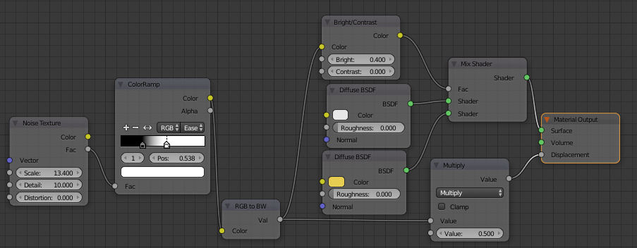
Displacement (The “Supported version”)
Instead of using the “vector bump” you could use the displacement in the material output node. The drawback of it is that it controls the complete material/node output, while you can add several “bump vectors” to control different materials in your node tree.
We now have two versions of the “displacement node”. In “supported mode” of Blender it works a little like the “bump vector”. In the “experimental mode” of Blender it is a completely different story. There it actually change the object’s surface instead of creating fake shadows.
I will go through that in the next chapter. Here I will take the “supported version”.
A standard setup for the displacement node is to add a texture that adds bumps to the output, but also to put a math node between the texture and the node output, so you have some possibility to control the height.
It looks like this:
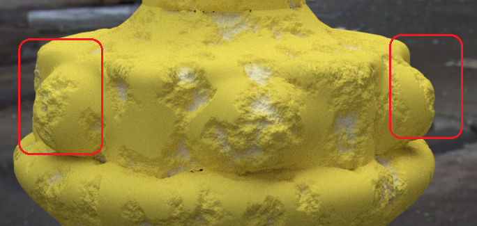
As you can see it is not that much difference from using the vector Bump. I just removed the bump vector and took the converted BW colorramp output value to a multiply and then connected in to “displacement” input. I also tooks down the value by 0.5 in the multiplayer node to not get a too strong effect. The result looks like this:
As you can see it’s almost identical. However, there is one small difference. In my “vector bump” example I did not connect the Vector bump to the white… leaving that without any “bump effect” by purpose because I did not want to have it too bumpy.
Here I’m forced to put a bump on everything since I can’t easily filter away those parts I don’t want bump on.
As a “quick and dirty” option, this works however fine in most situations.
Displacement (“The experimental version”)
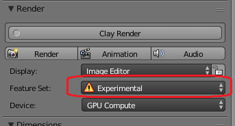
In Blender we have an “experimental mode” as most of you know. By selecting that you can get some pretty neat features, but it could also be a bit more unstable. However, I have not noticed it to be more unstable running in experimental mode… so I see no reason not to do it.
When using displacement in the “experimental” mode, you have a huge difference comparing to the other methods that I have mentioned before. It actually changes the object!!
The changes are “viewing sensitive”, so if you view the surface close, it will change a lot… but on distance it will just change a little. Convenient and it saves memory.
The setup is a little more than usual. These things need to be correct:
Render should be in “experimental” mode;
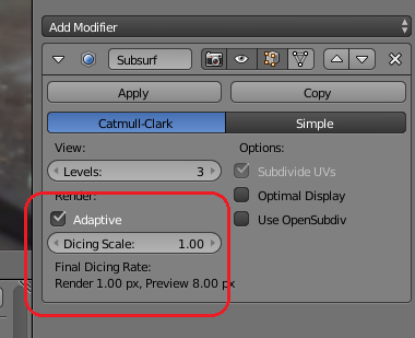
You should add a subsurface modifier and select it to be in adaptive mode;
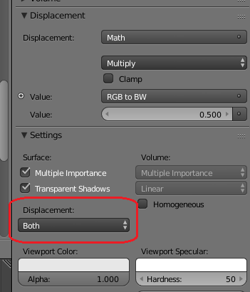
On your material, you should in the parameter setting change the displacement to “both” (if you want to use vector bump as well) or “true” (if you just want to use the displacement).
Now you are good to go.
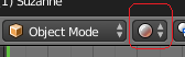
When looking at the changes that happens on your image when changing the node tree you’ll have to jump between “edit mode” and “object Mode” (using the “Tab” -key). Otherways it will not be refreshed.
The material setup is almost the same as for the “old” displacement and looks like this:
…In short no changes here (I increased the colorramp a bit to show the changes more clear) if comparing to the old setup (in the simple mode. You can add bump vectors as well together with this… but they still will work as described before).
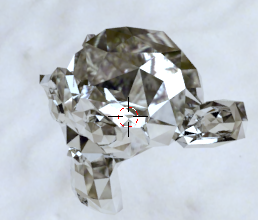
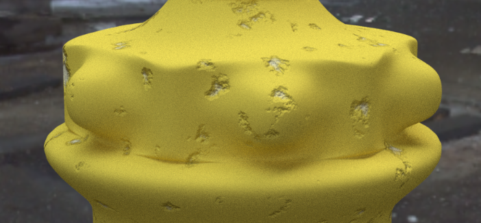
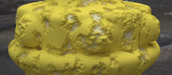
The result:
If we look on the selected edges here now, we can see that they actually have changed! They are not flat anymore. This means that if we really need something “real” then, this opportunity exists.
However it takes a lot time to render and a lot more memory when rendering.
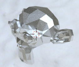
To make it less “clean” we could now add that extra vector bump as well. It’s just to combine the two settings above so we get this:
Here as just added the “bump vector” again and connected it to the yellow. The result looks like this:
Now you can see the small details of the cracks more clearly and by that we get an even more realistic image. Neat! (As usual…do not overdo it. Here is a “little” too much, but it is more to show the changes.)
Creating Node Groups (avoid getting lost in too large node trees.)
When you get a hang of how the nodes work you’ll start experiment a bit and before you know it you have created this fantastic node tree that does it all.
A few days later you go back to your project and looks at the surface of your object. You see something you want to change and enters the node tree again…and now you notice it…. Wow, that is a huge one! Did I create all that? Where should I change things, because I don’t remember.
Frames (The simple grouping)
The first thing you should know about when your tree or node forest is getting bigger is how to visually group them together using frames. This will simplify for you when revisit your project later on.
The workflow for it is very easy. Just select those nodes you want to have in one frame. Then press Ctrl + J. Now they have a frame!
You can change the size of the frame, but if you press the “Shrink” option in the “Properties” (as default it’s already on) its automatically adjusted according to the size and placement of the nodes inside the frame.
You can also change color and add explanatory names to it. Just look to the options on the right.
Here is a simple example that builds on the last “Dirt material”:
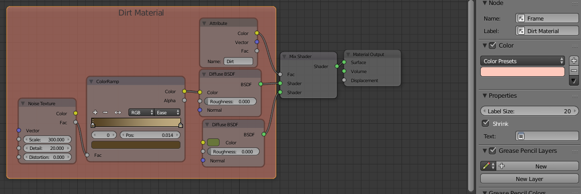
What you can see above is that I have changed the frame color to easily see it. I have also changed the label to “Dirt Material”. This will not shrink your node tree, but it will visually aid you in your efforts to find things after it has been growing.
Node Groups
To actually shrink your group tree or perhaps save a very useful combination of nodes, then you can create a “Node Group”.
“Node groups” are rather easy to work with, but there are some things to keep in mind.
- ColorRamps does not work well together with Node groups, or at least not if you want it to be dynamic. This because they can’t be reached directly from the outside.
- You should not include input nodes that you would like to be able to change in the node group.
- You should not put output nodes inside the node group.
- There are not any easy property selection for type of visible look on the input field. However it always copies the first node you connect, so if you connect a color node to a group input, it will look like a color selection… even if you then remove the connection between the color node and the group input.
Let’s start simple:
Create this setup:
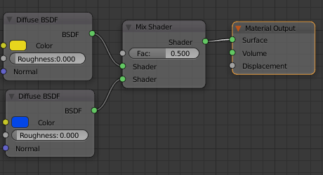
So, how would you make this a “Node group”? Easy, just select everything except the “Material Output” and press Ctrl+G. You will then get this:
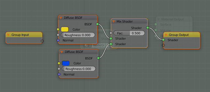
This is your group Node! You have your selection, but also a “Group Input” and a “Group Output”. In both these new nodes you have empty circles. These are there so that you can connect all the inside stuff to the outer world (Outside Node Group). Let’s start with connecting the Yellow color to the Group Input.
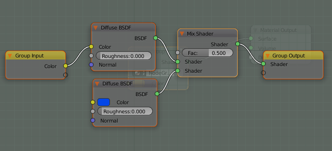
As You can see you now got it connected and a new empty circle waits for next input. We also got some changes in the right tool Window. It looks like this now:
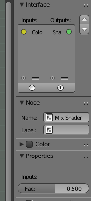
So, before adding the other color, we should change the name on out first color input. Let’s call it “Top Color” instead.
Select the “Color” in Tool Window to the right and then go in to the Name and change it to “Top Color”. Like this:
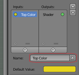
Now you can other the other color as well, so once again… drag from the diffuse shader (with blue color) to the empty circle you have on the “input group” node.
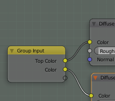
Then change the name for “Color” to “Bottom Color” exactly the same way as you did for “Top Color”. Finally add the “Fac” from the mix node as well to the “Group Input”, so that also is included.
It should like this when you are finished:
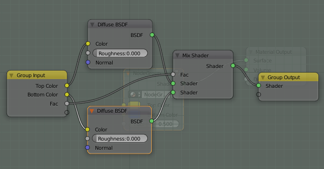
Now we should go back to the “normal” view and that you do just by pressing the “TAB” key. Just as “Object mode” and “Edit mode” you can go back and forth between “Edit Node group” and the “normal” group view using the “Tab”.
Well, if you now have pressed “Tab”, then you should see this:
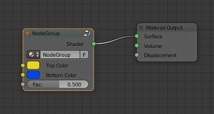
..and on the tool Window to the right you see this:
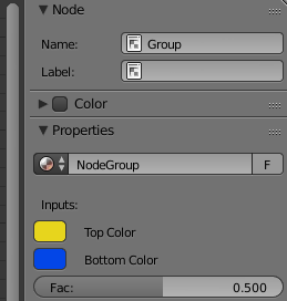
In the “Properties” panel you can change the description of the NodeGroup so its more understandable. Let’s call it “Mix Colors”. Just go the field with text “NodeGroup” and replace it:
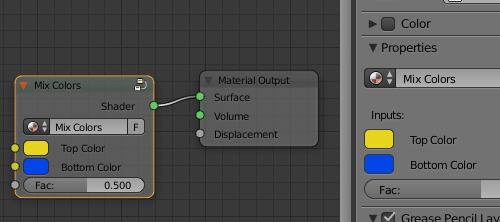
Perfect! Now this will work just as any node. You can input or change colors or slide the fac back and forth and things will change on your object.
Whenever you want to use it on any material in this project just press Shift + A and then select “Group” in the menu. There you will see “Mix Colors”:
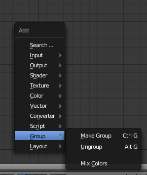
Wherever you have used this, you can always just press “Tab” and go in and edit. It will then ALTER ALL OTHER PLACES as well.
There is a lot more to talk about when it comes to best practises and so on when using the Group Nodes, but for this document I think this will be sufficient. You should at least have got the basic knowledge by now on how to use the node groups.
IOR
IOR is not something you start with I believe, when creating material, but it’s also something worth noting that it exists. I put it here in the end for those that wants to go a bit deeper in to the way of building realistic material.
IOR stands for “Index Of Refraction” and is a calculated value on how much a light ray is bent when going through a certain material. If you are going to make “real” looking material the new “Principled” shader will help you a lot since it also has IOR.
If you have a glass of water in front of you and add a straw into it you will see that it looks “broken” on the point where air becomes water since it bends in another angle in the water.
When you extract the straw from the water it is still just one straight straw.
This most of us already know and the same goes for all other materials as well.
IOR is the key to it. It will transform water to glass, to honey or to oil without changing anything else than the IOR.
The values for IOR on materials you can easily find on the internet. Personally I mostly use the site:
http://forums.cgsociety.org/archive/index.php?t-513458.html
…but as I wrote, there are a lot of web pages going through this if it should be so that you lack a value on this page.
In Blender you can use IOR on several places. You have it in the input node for “Fresnel”, in the “Glass shader” as well as in the “Principled” shader. It works in the similar way regardless where you use it.
The “Glass shader” could be used for a lot of things besides glass if just changing the IOR, but I suggest you to start using the principled shader more instead.
You will see how I‘ll use this IOR in the next chapter.
Put theory into practise
Now you know “everything” about how the cycles nodes works, but still you may have a hard time to understand it. How should I connect the pieces?
The easiest way is to see some examples, and since I believe so I’ll do just that here.
Easy as ABC.
In many cases you don’t need to do much at all. It’s just so that you’ll need to have a “feeling” of how to combine things to get a good result. So in this chapter “Easy as ABC”, I will give a lot of easy to do tricks and tip before continuing to the “real” examples.
Using Musgrave
Here are some Musgrave examples:
Blood splatter
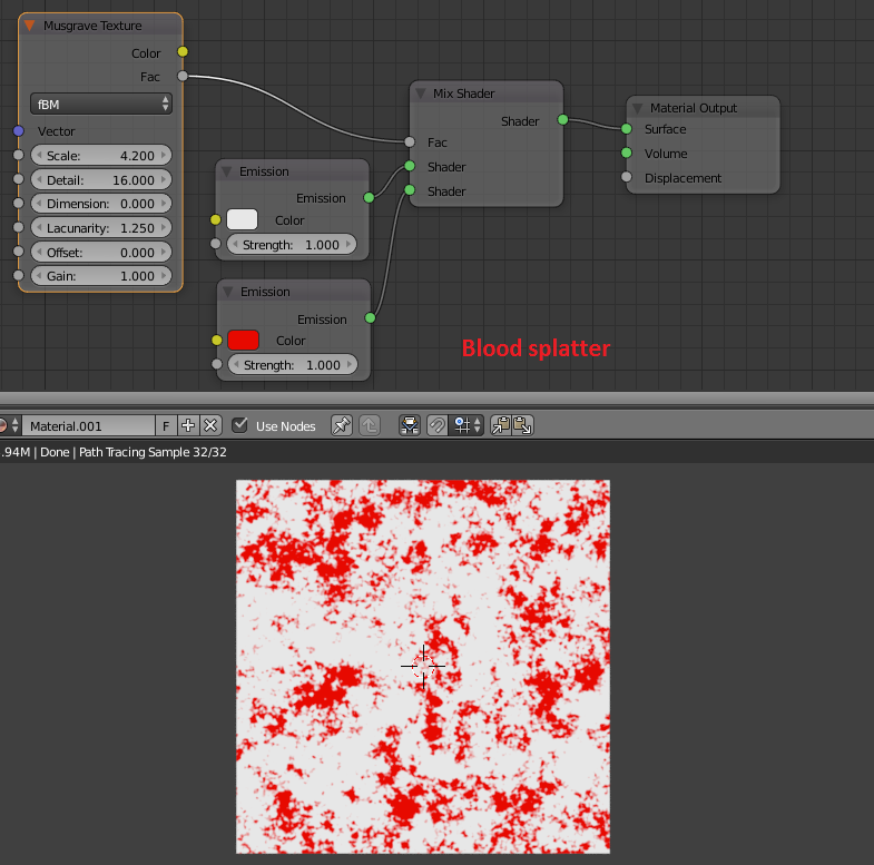
Burning
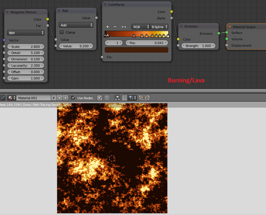
Burning with fog.
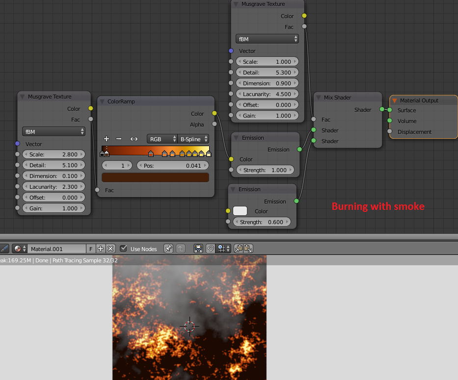
Smog only.
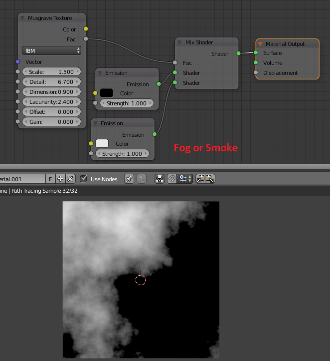
To get this to work in your images, exchange the “black emission” to a “transparent” node instead. Black emission is rather meaningless, since emission is used for light… not darkness :).
Old Paint job
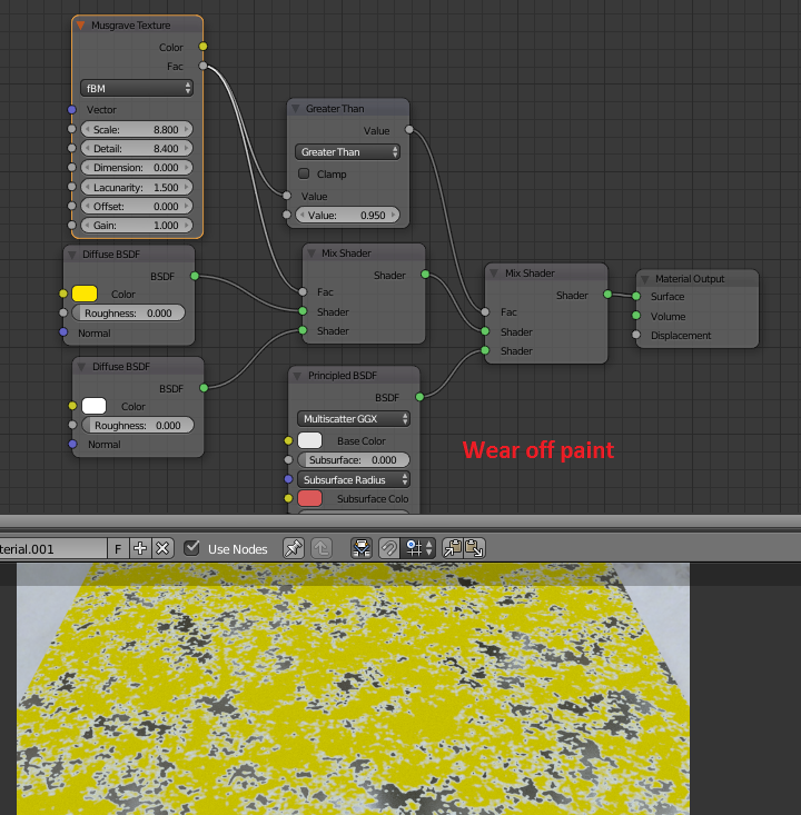
Old paper
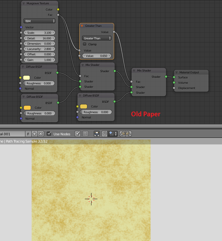
Fake reflection
Here is an example where I play with the input node “reflection” to create reflection just using two diffuse shaders. The reflection is of course not real, so you will not see anything reflecting on this object, but you get a “reflective” look.
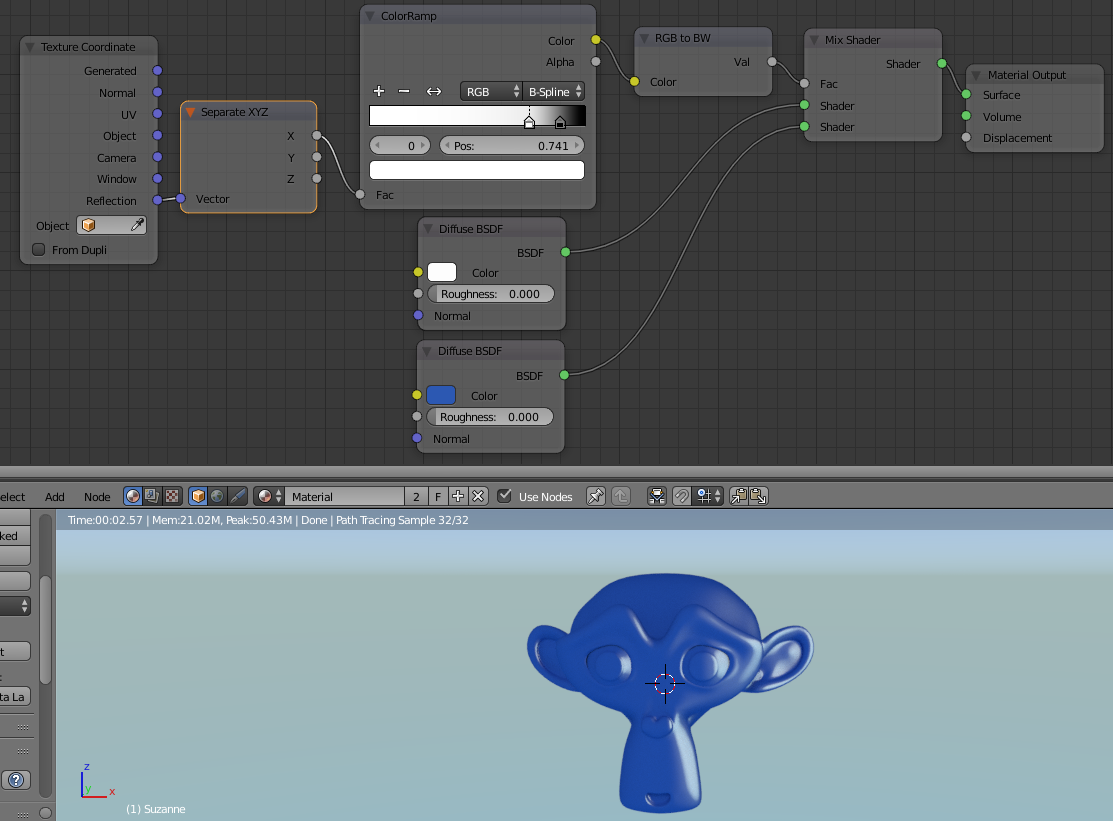
Using voronoi to create dots.
As I wrote somewhere in the beginning, the Voronoi is shaped like circles so it will be easy to use as dots in different ways. Here are two simple examples.
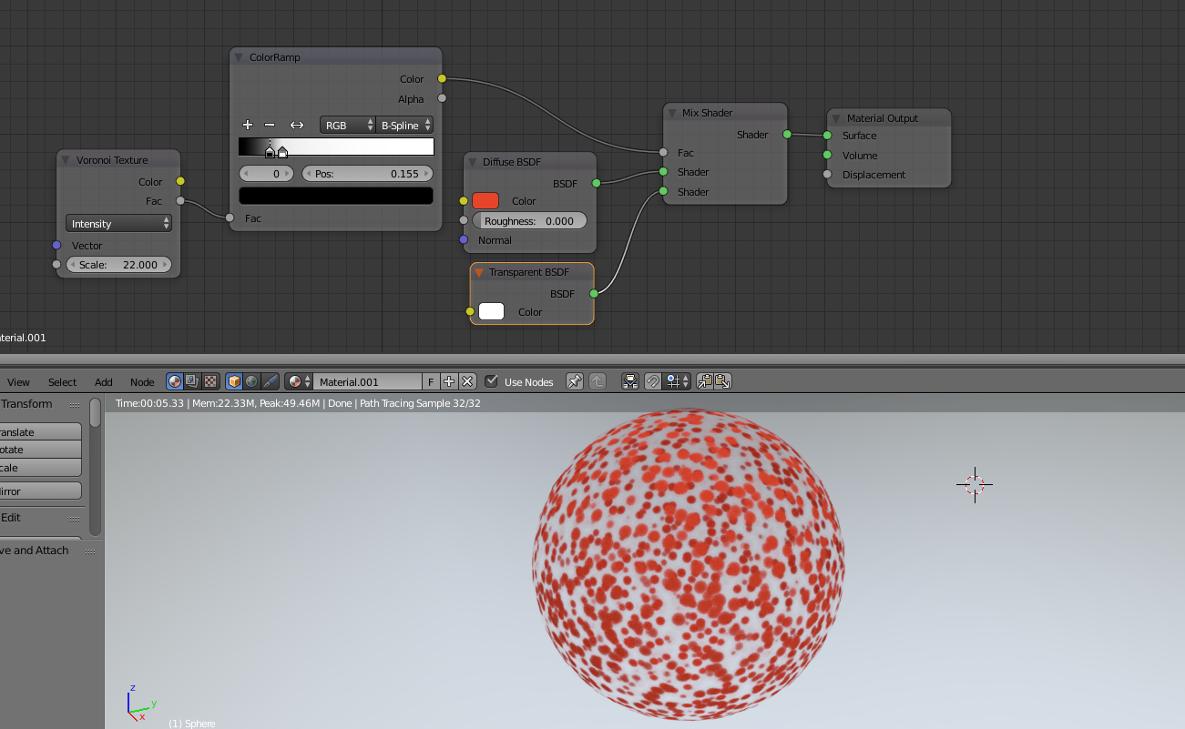
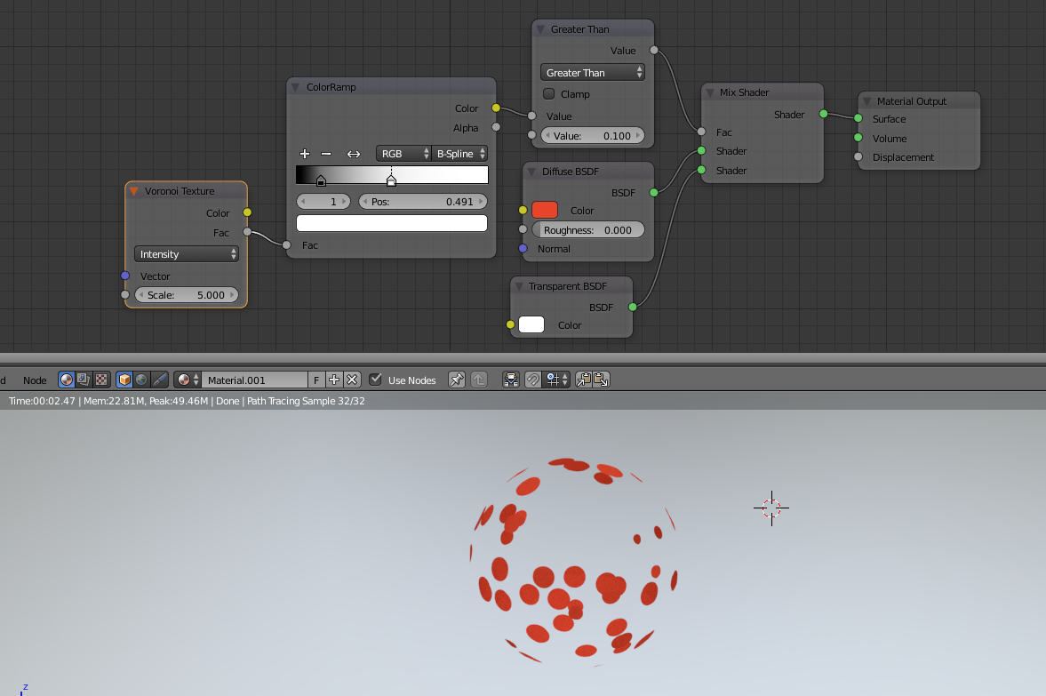
Psychedelic patterns
Don’t forget that you can have a lot of fun putting in the texture as a vector map distortion :).
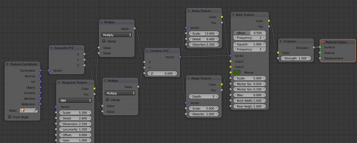
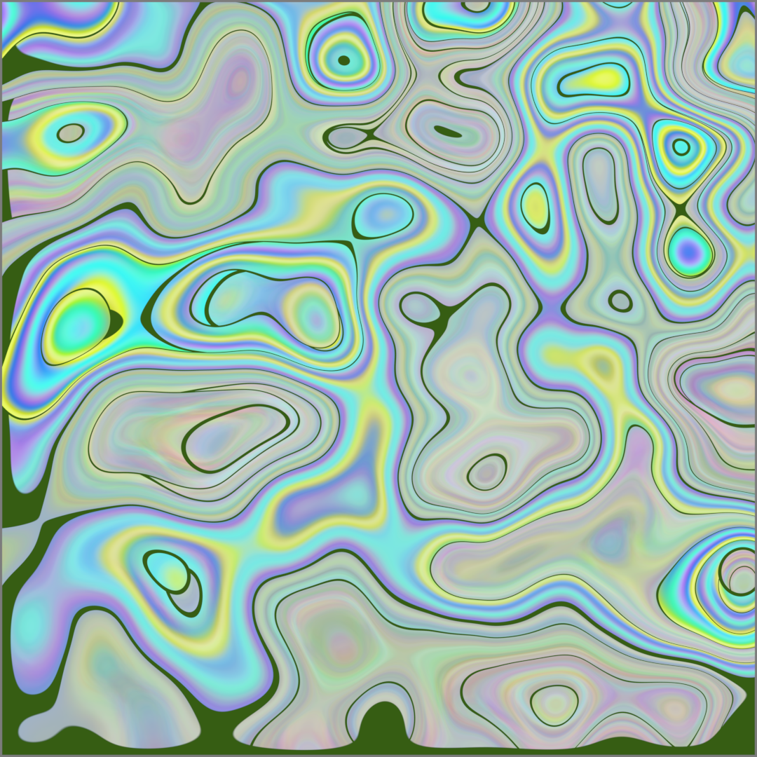
Bricks
You have probably seen this fantastic texture called “Bricks” before. It looks like this in it’s basic setup:
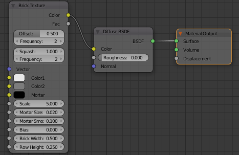
Result:
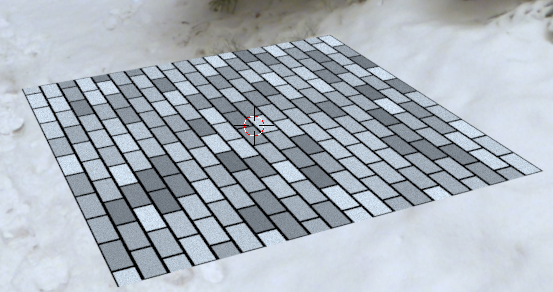
How about turning this into a “real” brick wall using the knowledge that we achieved above?
The first thing is always about trying to find reference images and gather information about the material you are going to produce.
When it comes to a brick wall, we already know a lot:
- The concrete between the bricks are always deeper in than the bricks itself.
- In most cases the concrete has a lighter, grey, tone.
- The bricks are often a variations of red/brown in color.
- The bricks are not perfect rectangles all the the time. Their edges has been worn.
- Most bricks has either small hole or bumps in them, even if they are brand new.
- Old brick walls get stains of moss, smog, dirt and all kind of things.
- Even the brick itself get stains from concrete and moss. These are like smaller dots in the brick.
Some ref images:

Ok, now I think we have what we need to get started.
Let’s start with the simple things first like coloring the stones.
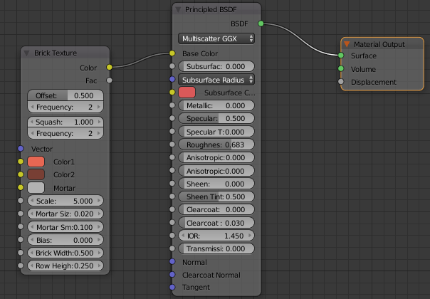
Make some close guesses of the colors and perhaps exchange the diffuse shader with the principled. You might end up with this:
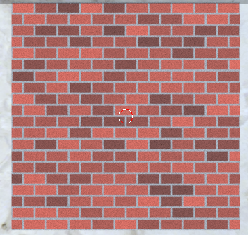
Wow… a brick wall! No, not if you want to go for a realistic one… but it’s a start :).
From here we can select what we want to continue with. There are no rules… just compare, think and act.
Should we look at the perfect stones and try to change their edges a bit?
Any guess where to do that?
My guess is that we scramble the vector output a tiny bit, then the stones will not be totally straight in line.
Look closely at this combination:
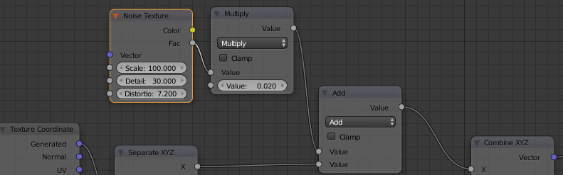
I think it works really good in many situations. You get a scramble value first. It could be like noise, musgrave or whatever. That has of course some kind of output value. If you now set a multiply after that value you can multiply that output value with a very small number getting the result to be very close to 0… which means just a subtle change of something. Then you take that very small amount and add it to original output and the original output will be distorted…. But not much and that is often the point :).
When I tried, I got these values (not using Z, since it’s only the X and Y on this plane):
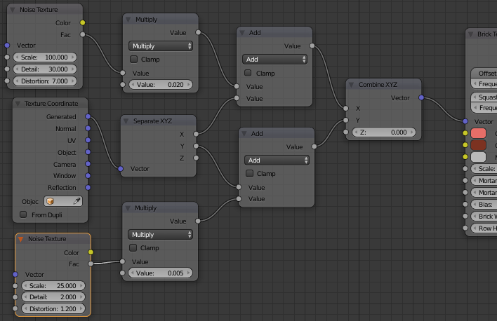
You can perhaps do other values… just play with the values until you are satisfied. Don’t forget to save in between!!! Blender crashes frequently if changing the values too quick.
My result:
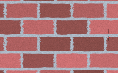
We are getting there :D.
Now, when we have the shape, it will be time to look at color distortion as well. Some noise or musgrave would do the trick.
Here is what I added:
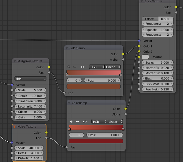
I took away the two constant colors of red and replaced them with a “ColorRamp”. On one I put Musgrave and on the other some noise. Remember to connect the textures to our changed vector output. Result:
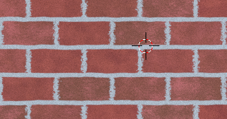
Ok, so now we have some dirt on the stones as well. Fine.
We can do the same to the concrete. This should have spots of black and green (moss and dirt) and a little more pronounced than the stones, so perhaps a “colorRamp” in the end that also filter away some of the texture? Look here:
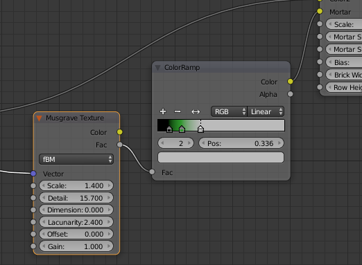
This gives the brick wall this old and dirty result:
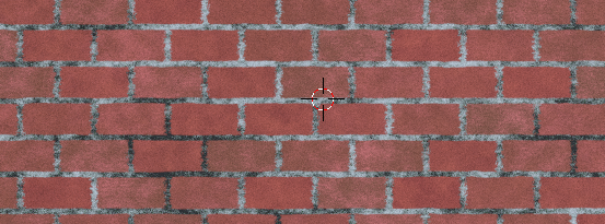
Feeling the sense of realism getting closer?
Now we really have to add some bumps in this as well.
My suggestion would be to copy the brick texture and make a greyscale out of it, but still use the vector output that we distorted as input for the texture. Since the brick should be of the same height, just use white on both of them and black on the mortar.
Setup:
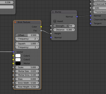
Result:
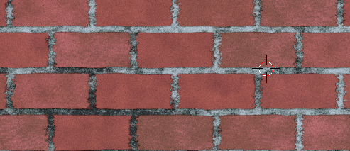
Now you see a distinct difference between the edges and the concrete.
Then we also had the bumps on the stones, but that we can fix just by using some texture. The only thing is that we also want the texture to go like vertical, because that is what most bricks has…look at the second ref image and on the internet as well. It will be better that way.
To fix it we use the “Mapping” node as well.
In total it looks like this:
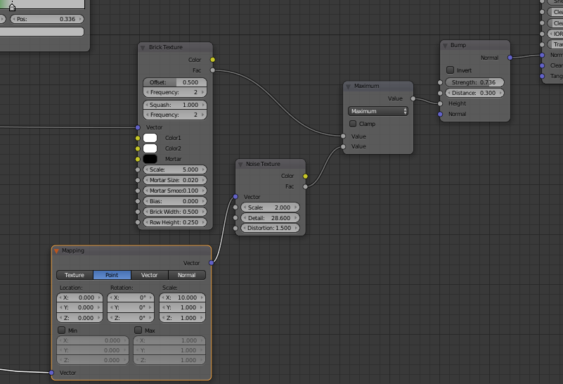
As you can see, I use the mapping vector to set the X scale to 10 and by that I distort the X scale really much. To combine the brick/concrete math with the brick distortion I use the math node “Maximum”, which takes the brightest value from the two inputs. Since concrete has totally white it will then always be maximum and never affected, so just the bricks.
Result looks like this:
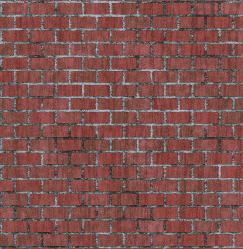
Nice!!!
You can make it even better by combining different depths on the bump vector and perhaps create two or three different brick materials instead of just using one the complete way, but since this is a “Beginners” manual I think this will be quite enough.
Glass
Glass is transparent, so much is clear ;). Glass also have some IOR…or several depending on type of glass. If looking at the link I gave you above you’ll see the following:
Glass 1.51714
Glass, Albite 1.4890
Glass, Crown 1.520
Glass, Crown, Zinc 1.517
Glass, Flint, Dense 1.66
Glass, Flint, Heaviest 1.89
Glass, Flint, Heavy 1.65548
Glass, Flint, Lanthanum 1.80
Glass, Flint, Light 1.58038
Glass, Flint, Medium 1.62725
…so things are not always simple, but options gives possibilities.
Blender says 1.450 and many places says 1.5 for standard glass. Well, let’s say that we go on Blender standard. Then we use IOR 1.450. If now using principled, we just change two things… the transmission (1) and the roughness (0). It will look like this:
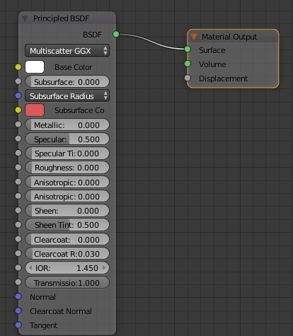
The result:
I know, hard to see, since we can see through it, but there it is :).
If we now should turn this into a leaded glass that you can’t see through like this:
How should you do it?
Let’s look at it. It has sharp borders. It’s also like checker pattern but turned like 45 degrees. If we look closely at a specific glass piece, we see that it is a smaller square inside the square.
Suddenly the easy becomes hard… right? Don’t despair. We do it together.
First of all… do we have a texture we can use without too much changes?
I see two clear options. Either the checkers texture or the brick texture. Since there are borders around each square I would go for the brick.
The height and width should be the same, so that we can change easily.
Then we had the rotation. Hmm, here we could use the “mapping vector” node. It’s just to rotate the front 45 degrees.
Ok, start with what we know. Just create a plane and then add the following setup:
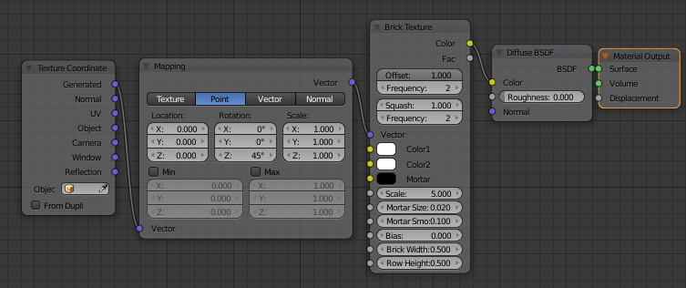
This will give us the following:
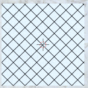
Not bad. Now we have the rotation, the borders and the squares. It worked using the “Brick” texture.
I swiftly exchange the “diffuse” shader above to the “Principled” as well (see page 136 for parameters). Now you can see through it as well.
Now we want these small boxes inside each window piece. That could be really hard, but in this case it is not. It is just to repeat that we already did, meaning that we use the brick texture again on the exact same way.
The only thing is that we make a really “fat” mortar with some smooth on.
However, we are now talking about structure… not color. The structure must also reflect in the environment to make it believable, which means that we must use real displacement.
Ok, we start creating the grayscale by copy the brick texture and then slightly change the parameters.
To make a structure that reflect most things we also add in some noise and mix that together (we can’t copy the glass actual shape in reality… it had been too complicated). It could look like this:
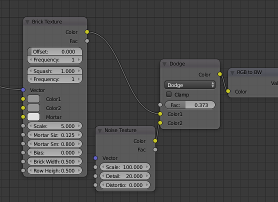
As you can see the mortar is now white while the color1 and color2 are slightly grey (use same grey on both). This works fine when mixing colors to make the mortar less changeable. I’ll mix those two with “Dodge” MixRGB node.
Since we are talking about using this as a structure, I also use a convert node “RGB to BW” in the end.
Now, before we go any further we need to make the environment work for real displacement, so do the following.
- Change render view to “experimental” instead of “Supported”.
- Our plane needs a “Subdivision surface” modifier, so add that.
- In that “Subdivision surface” modifier check “Adaptive”.
- Also press the button “Simple” in the same modifier.
- Now go back to the material slot again instead of modifier.
- Scroll down to “settings”
- Change “Displacement” to “Both”
Now, we can continue in our beloved node editor again :).
The Brick and noise texture should now be connected to the bump vector and to the displacement.
It will look like this:
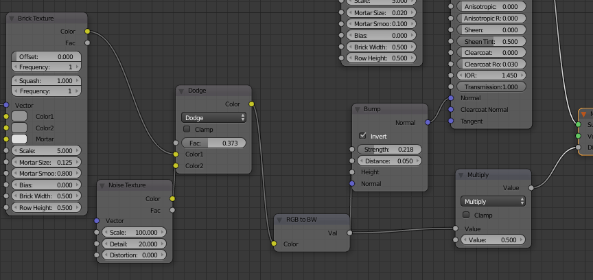
…and suddenly the result has changed from that flat boring thing we saw the last time to this:
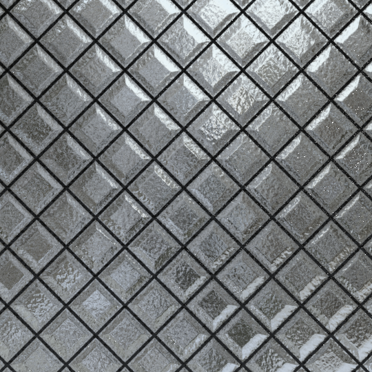
Since it’s reflective glass, the HDRI behind decides a lot about final appearance, just as a glass window in the real life.
Wooden Floor
(Advanced lesson!!)
NB!
Since this is a really advanced thing, even it looks ok in simplicity, I will provide the file (a cleaned version, but with same logic as below) in my FB group about procedural textures. Just look in the file section for the name “Beginners_Floor” on the following:
https://www.facebook.com/groups/388923314889254/
Let’s continue with another example. In this case a tiled wooden floor of this type:
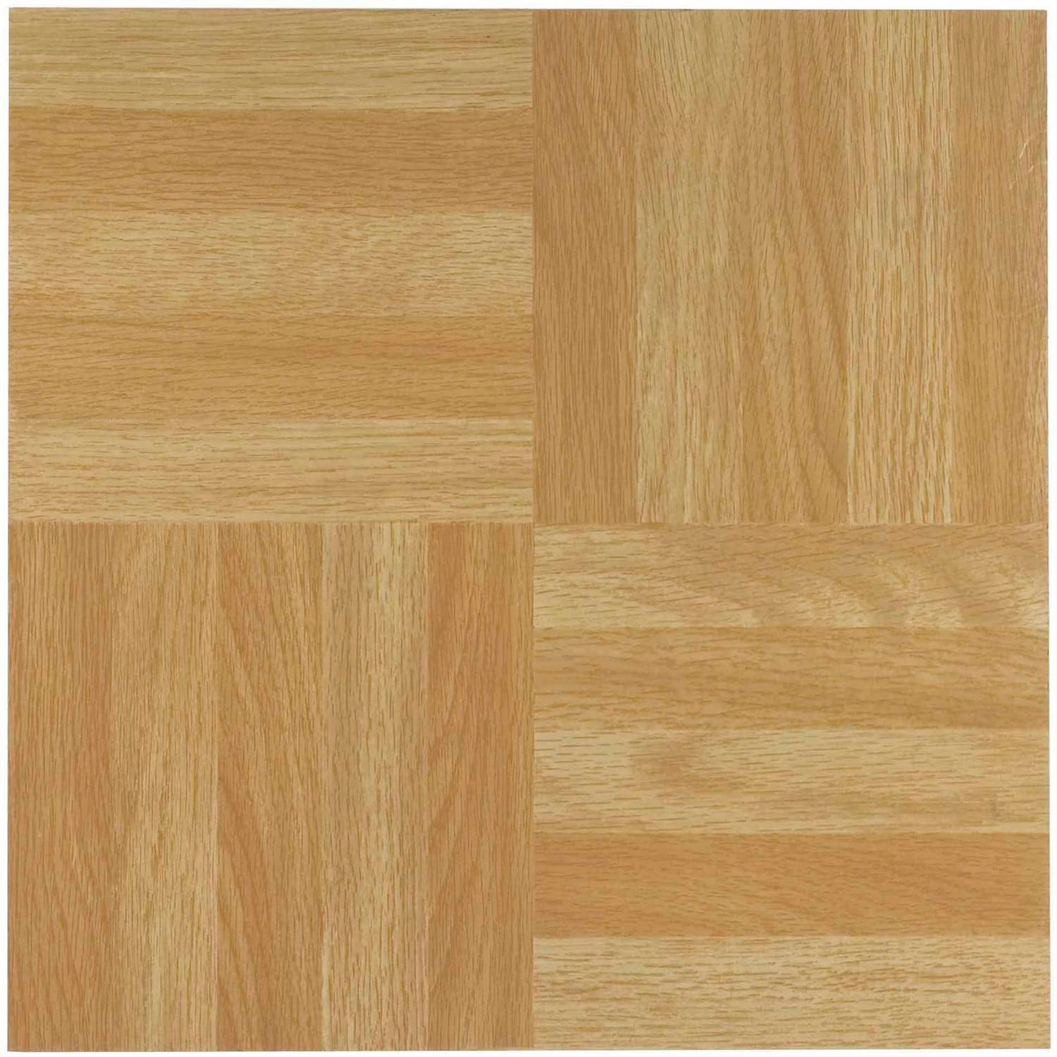
It’s just squares again :).
Analyze part
What can we say about it?
- Every tile seems to have 5 pieces of wood.
- Every tile is a perfect square.
- The wood is a combination of rings and small lines.
- It differs in colors between each of the five pieces.
- The tiles are also crossed, one going vertical, the next horizontal and so on.
So, to attack the floor I think we have two challenges. One is to create the pattern of tiles and another is to create the wooden pattern itself.
The four major tiles
I think we should start with the tiles.
If we look at the image above as one complete image and try to find a similar pattern, the checkers texture should come to mind.
A Basic checkers setup looks like this:
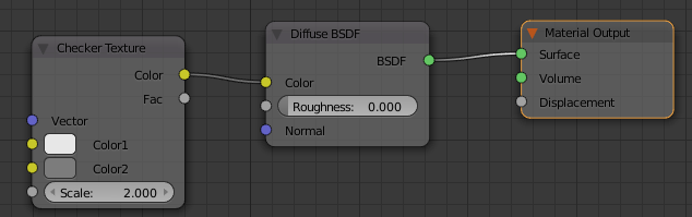
The really nice thing with the Checker texture is also the scale, that is really easy to understand. Scale of 2.000 means 2 boxes in each direction and so on.
Result:
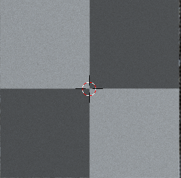
Very simple :)!
The five pieces on each square
The trouble we will have is to get those smaller parts inside. It should be five in each box.
Since we are using the “Checker texture”, we can see the dark boxes as one input and the light boxes as another input.
That means that the lighter boxes should have five horizontal pieces each.
Here is where the “modulo” math comes in handy. You might remember that I mentioned that it was good for repeating patterns? This is what we should do now five times.
If we use “generated” as output from the texture coordinate, we will get a start from 0 and it will end at 1.
My suggestion would be that we instead multiply it with 2, so we get the same scale as the object above.
Then we have to make 10 “breaks” at one direction and 2 in another (to split the square in the middle)
Try this:
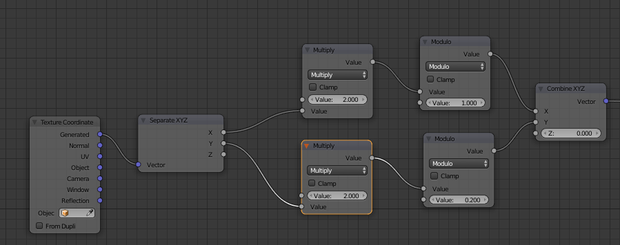
What have I done here?
X and Y is now multiplied with 2. This means that the output vector will go from 0 to 2. In the Y direction I put module 0.2! Why?
Because 2/0.2 = 10 -> 10 breaks through the complete object in the height… 10 pieces horizontal, just as we want.
In X direction I put module 1 since 2/1 = 2 breaks in total.
Z I don’t care about and now I combine it again.
Next step is to fill those pieces with a texture and place it in the checker texture for the light squares. The Texture that looks most like wood is the “wave” texture so we use that one. I will change the wave so it will be more “advanced” later on, but right now we use it “raw”.
So, from the “combine XYZ” I do like this:
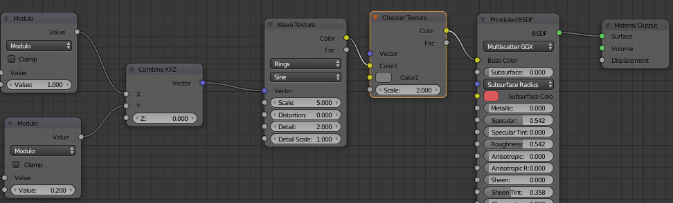
(Ok, I’ll changed the type of wave to “Rings”, but all the other settings are unchanged)
Result:
Five nice looking horizontal pieces!! We are getting there :).
Now it’s just to the same thing again. Only change is to switch on X and Y when it comes to modulo. Total setup:
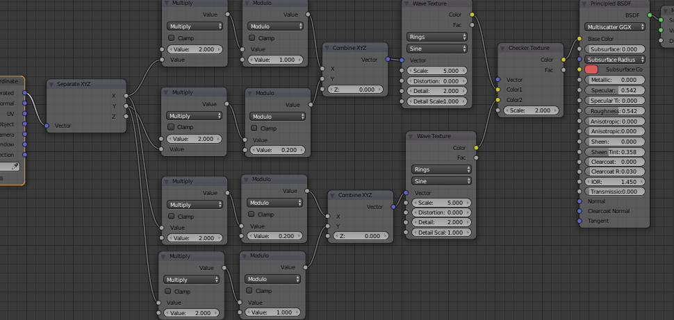
Result:
Perfect! Now we have the base there.
Color every second piece darker.
It’s time to work on the colors and the texture. One thing here is that every second wood texture row has another color. They are dark brown, light brown and so on.
Now when we have got used to that repeated pattern is equal to using “modulo”, the thought is again to use it. Instead of 10 breaks/rows in total for the object we need now five of them.
So, this will be the setup:
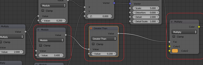
Instead of modulo 0.2, we use 0.4 to only get half of it. Then we also need a fixed value after the modulo, so I’ll put in “Greater than”, which gives 1 as long as something is true. If I had not used that we had got an increasing soft value instead of a clear break. Finally I add a MixRGB (using multiply here), so I can mix it. Result:
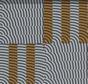
I need to the same on the other axis as well.
The node has now grown 🙂
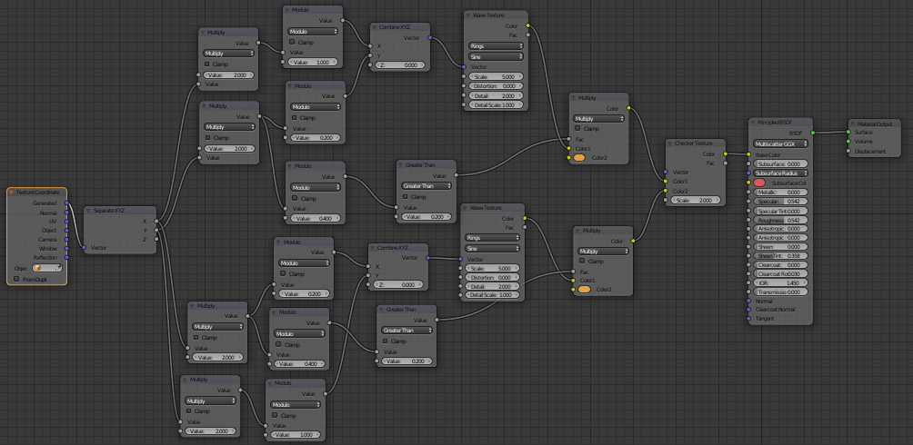
Result:
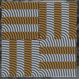
I think that now we have all parts sorted out. The “only” thing left is the pure pattern on each piece.
Start creating node groups
We could just run along and start making that pattern, but I think we should look at our node tree. First of all, it’s growing… it’s getting big and we have not started with the details yet… just the basics.
Secondly we repeat some stuff in it.
Those two things tells us that it is time that we do some node group out of it.
I think we should start with a very small node group, which is just the basic pattern.
Look at this:
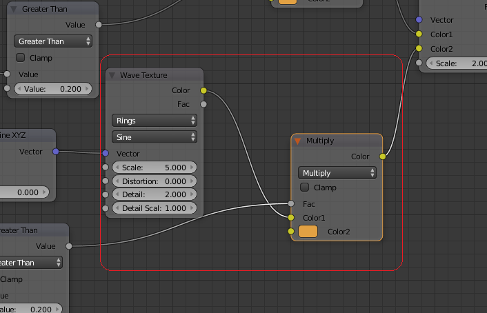
Only those two to begin with. We can add more later on, but this is the part that will grow later.
Just select them and press CTRL + G
It will give you this:
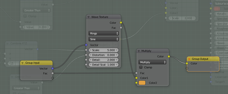
The color we will be needed to change later on, so just drag a line between the empty “Group Input” circle and the Color2 and rename Color2 on the Group Input node to “Darkness” (Look at earlier chapters if you forgot how).
Result:
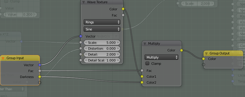
Creating the finer details.
Fine. Now it’s time to start creating the pattern. That we can do inside this group.
Since we have isolated this, we can do exactly what we want and rebuild everything to get this as close to the wood pattern as possible.
It’s time to look closely at that ref image again:
This is one square close up.
If you start counting the annual rings, you see that they are not that many…not more than 6-7 per piece. They are not that straight, have some wiggerly shape as well.
What we do have is a lot of smaller lines, though.
So, how should we think now?
Perhaps not just use the wave texture?
I think we have to do two things:
- Rotate the waves a bit so they go more parallel to that piece of wood.
- Make the wave go on different direction depending on the lighter or darker piece of wood.
- Add an additional pattern that could be those small lines.
- A lot of color adjustments.
Rather lot I would say, but one thing at the time.
If we start with the first waves, I’d suggest a vector mapping node. Then we can rotate and move the waves until they fit.
So, I play and try until I find something that looks ok:
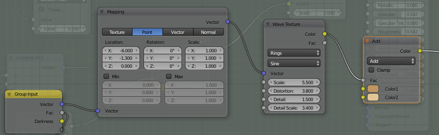
This give the following result:
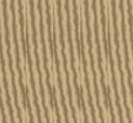
I think it’s ok so far.
The next thing will be to change the waves on every second. Fortunately we get a Fac in the Group Input, which goes between 1 and 0 every time there is a new piece, so that we could use.
Some simple math to stretch those waves a bit :).
Result:
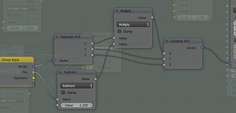
What have I now done here?!
As I said, I get a good start by having a 0 or a 1 from that Fac… nothing between. So, by separate the vector, I can find the X axis and “wiggle” that a bit. In this case just subtracting the value and multiply it with whatever comes out and then combine all again.
Just try your math and see :).
In my case the result looks like this:
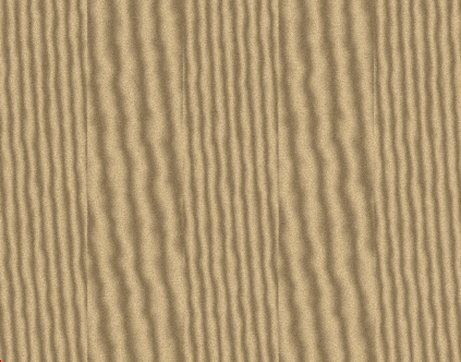
Really close. I have to do some changes on each piece later on so they don’t look exactly the same, but that will be a final touch.
Total node group looks like this so far:
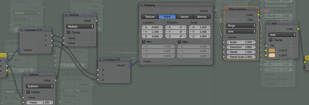
(I have disconnected that part about the color. We will take that later on.)
Now I’ll also like to add those small lines. My idea here is to use the voronoi intensity and really extend the X-scale until i gets like a long line in the Y-axis, like this:
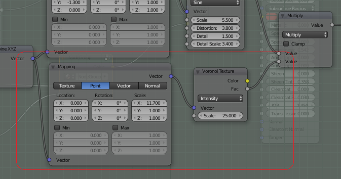
I’ll just multiply the wave pattern with the voronoi in the end and what I get is this:
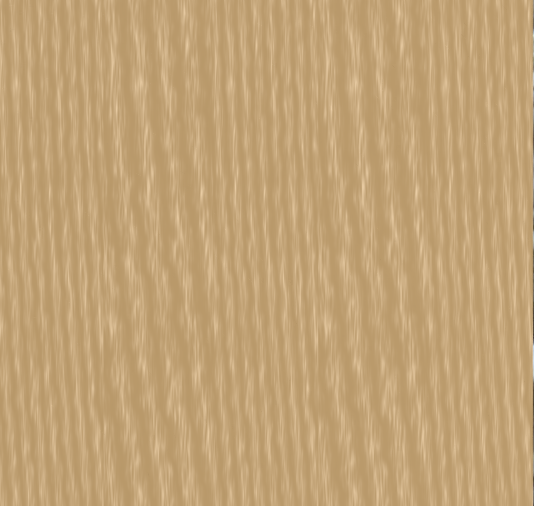
See… those small lines helped like wonder!
Now I think it’s time to connect the Fac to this pattern as well to once again mix light with dark.
The simplest way is to connect it to a Bright/Contrast controller, so got to the color group node where you will find “Bright/Contrast” and also add a math node in front of it, so that you can control the difference. It can look something like this:
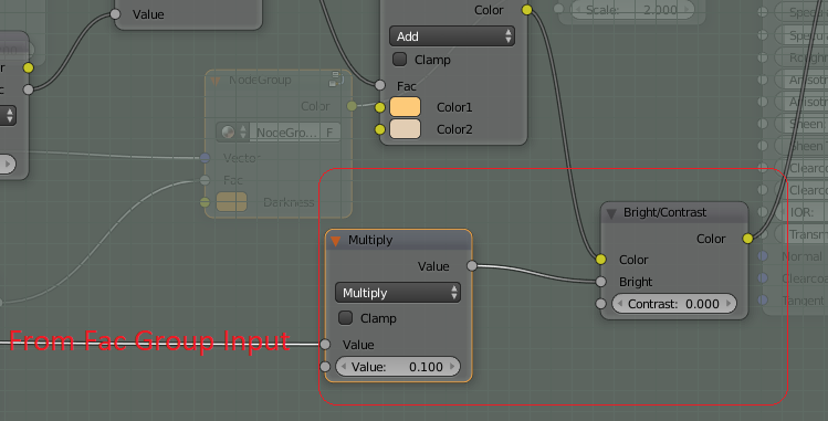
Result? Like this:
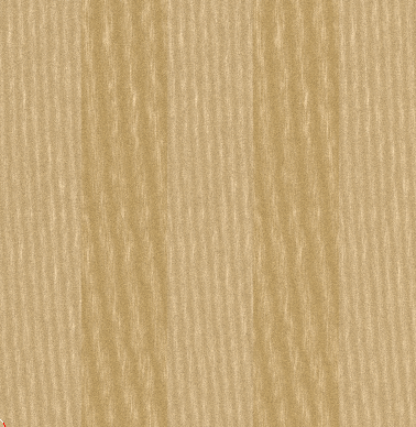
Getting there… getting there :)!
Finished? Nooo!
If you look closely to the colors, you’ll notice that they have like a red dot variations in… it is not just light and dark… there are more colors in.
We need to fix that as well to make it look real.
A “ColorRamp” with some noise takes care of it:
Like this:
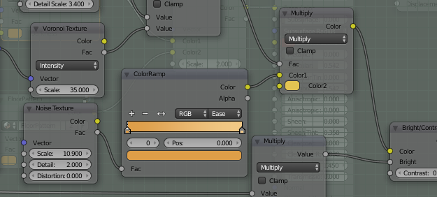
It will give this result:
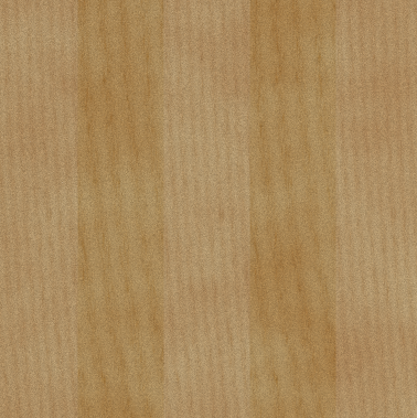
You can now see color variations on the floor.
Add randomness
Last thing is to make it more “random” in appearance.
One thing to make things make random when it comes to pattern is to use the input node “position”. Then everything will change according to where it is, which is perfect for our floor.
I am going to put in the position vector after the wave vector and still let the “voronoi” be as it is. The wave I wiggle with some noise.
It will look like this:
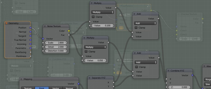
I add an input node “Geometry”. From that I get the output “Position”. That I can use as vector input on the noise. I multiply the noise with a very small number and add the result to the wave vector, which gives small but noticeable variations. The result look like this:
As you can see…. If looking closely… is that the waves are now not the same between the pieces.
This really looks like the floor tile that we want!
Make the floor outside group node.
Now we can finally leave our node group. It has grown big and looks like this:
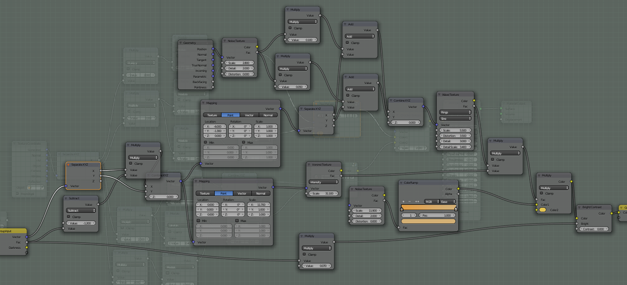
Now we just leave it by pressing “Tab”.
We rename it to “Floorpatterns” and now we just connect it with the other texture as well and remove that silly first wave texture we did.
Result:
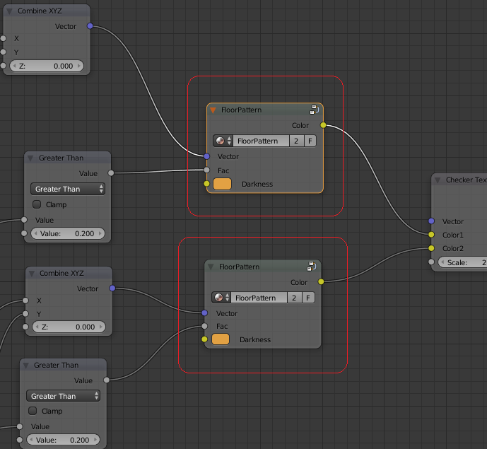
..and how does it look?
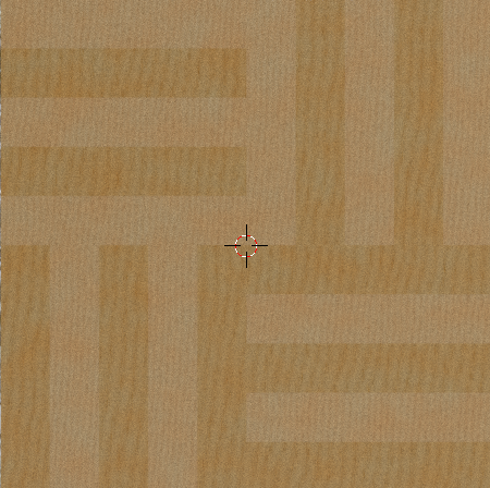
Good? Noo… something is off!
Yes, the pieces are correct still but the waves are following the same direction regardless of how the pieces are. This is incorrect and must be fixed!
Turning the waves
Here we have a real problem. The truth is that we can’t know if it is a horizontal or a vertical tile that comes in to the texture pattern.
In this case I think we must tell it manually!
We also need to get rid of the vector mapping nodes since we must be able to use X in some occasions and Y in others.
Ok… select a nodeGroup and press “Tab”, so you get in to it again.
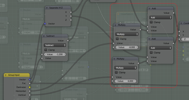
Inside we remove the top vector mapping node. This had -6 on X location, so we need to add -6 on X location. By connecting a multiply with -6 to the input group that can have either the value 0 or 1 and connect that to an add we can control so that we add 0 or -6 to X!
I’ll do the same with Y, but change -6 to 6 instead. The group Input get two new input values, which I name “Horizontal” and “Vertical”. I could do some smart math to only have one input and probably an even smarter math to have them completely needless… but this is a straightforward way.
Now, press “tab” again so you are back to the main node tree and input correct values to the input group like this:
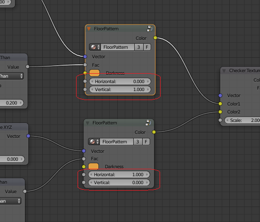
Result:
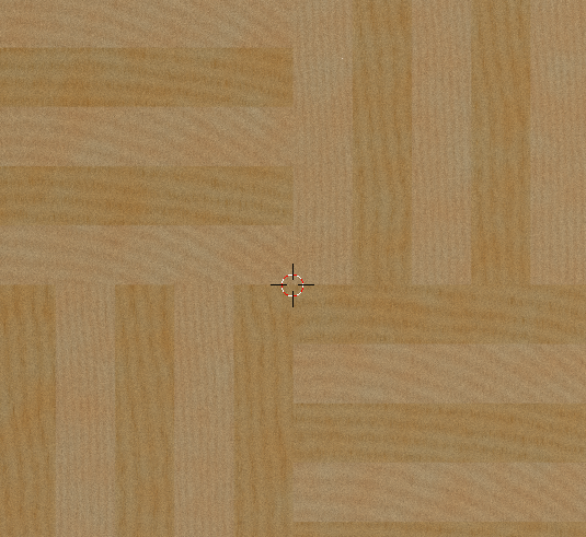
Much better, but we need to do the same thing with the “Voronoi” as well. We already have our “horizontal” and “vertical”, but we need to remove the “vector mapping” and replace it with a multiply/add math.
So, press “Tab” again, so you get in to the FloorPattern and change the “Voronoi”.
Here you will change it like this (remove lower vector mapping now as well):
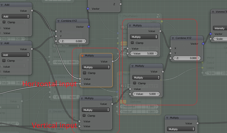
If you do, you should now have something similar to this:
Looks really, really well 🙂
Still… there is one big fault :(. Can you see it?
Try more tiles side by side. How will the pattern look?
Yes, unfortunately, this will be a very strange floor to build since the dark/light is not the same on the squares. If the one in the left bottom starts with a dark piece, the one in the right top must also do that. Now it doesn’t.
Fix the dark/light order
When we have come this far, it feels unfair to rearrange a lot, just because we found out something in the end.
Fortunately, we do not have to change inside the node group, just the “Fac” that we feed the node group with.
My idea here is to use subtract of the vector. Normally it goes from 0 to 1 in all directions, but if I take away half, it goes from -0.5 to 0.5. This gives a mirror effect, which is what we want in this case if we think about it. What is on the left side should be on the right and what is on the top, should be on the bottom… like a mirror.
I then have to add another modulo as well, that take care of the negative values.
This will not be the most efficient material that I have built, but it works.
The final will look like this:
Part 1 above. Both X and Y will be subtracted with 0.5
Then I have to enhance the modulo. First I do it on Y (bottom part in our node tree):
This means that the top “Greater than” works as before when the number that comes out from the vector is greater than 0. The “Less than” takes care of those numbers that are below zero.
I do about the same thing for X (Top part of node tree as well). The only thing is that I do an additional “Less than” just to make it reversed (should start with a bright and not a dark).
The result:
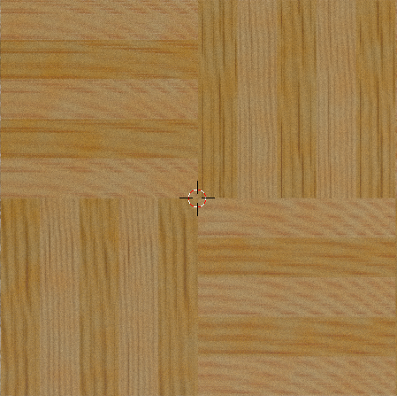
As you can see, now the pattern is just as the floor when it comes to bright/dark places.
You could say that you are finished now, but still… there are at least two things we could add.
- Would be perfect if we had flexible amount of tiles… not just two in each direction.
- If we build a large floor it will look too symmetric, we need variations in the bright/dark area.
Add more tiles
All those places we multiply with 2, we do it for the checker scale and for making this 2 x 2 tile version of a floor, but just by adding an input node “Value” where we can put in that number 2… or any number would make a great deal to the flexibility.
So add in that input node and connect it to every place it says 2 (even the checker pattern):
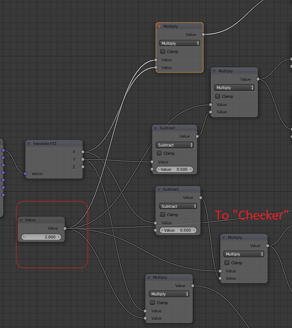
This now works fine. You can put in a value like 4, 6, 8 or whatever. Best I think it will work if it’s a multiplier of 2.
The only thing is that we also have to fix the “Subtract” part. We added 0.5 to find the middle between two tiles. This will be distorted now if we add another value than 2 and the dark/light thing will not work again.
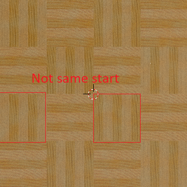
Fortunately, this too is easily fixed.
One can argue that it look ok as it is, but as a practise, we continue :).
Simple math tells us that to keep the same proportions we only need to divide the input value with 4. If we have 2 it will be 0.5, with 4 it will be 1 and so on.
Just to do it :).
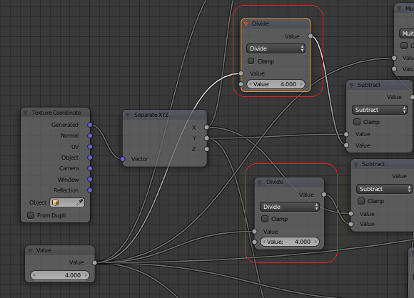
Now the result look like this:
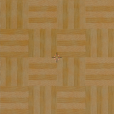
Order is restored.
Random on floor tiles
To make a big random thing out of the pieces it self, I will add a musgrave in the node group, so select a node group and press “Tab”. Then add the following:
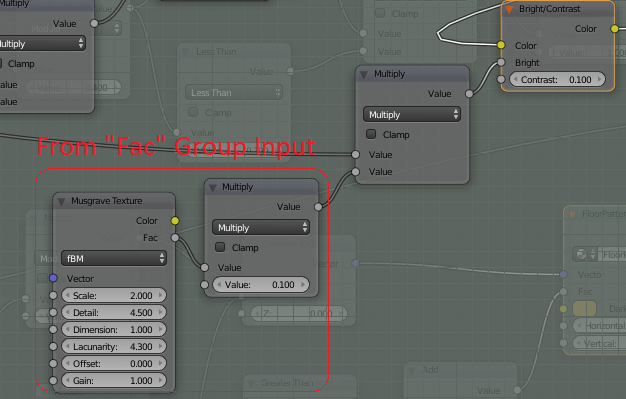
Instead of having a constant value to handle the bright/dark thing I have now added a musgrave above. Result:
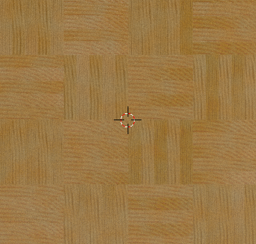
The floor now looks used and real.
Afterwork
When you have built your node from start to finish, it often looks good if you know what you are doing. However it has a tendency to grow really much and now it’s time to clean it.
Go through the nodes you have put in. Can you remove some? Is all needed? Do I have a better solution on some parts in it?
Try to move the nodes so the total package get visible for you. Then divide it into smaller node groups and see if you should add or remove things as input in your node groups.
I will do all of these things with this node as well and the main reason for it, is that if you have cleaned it very well you can reuse it over and over again in other projects and it will only take you minutes in creating a nice looking floor instead of days if you have to do it all over again.
Before cleaning, but with the result we have achieved our node tree now looks like this (I have added some bumps as well).
Main tree:
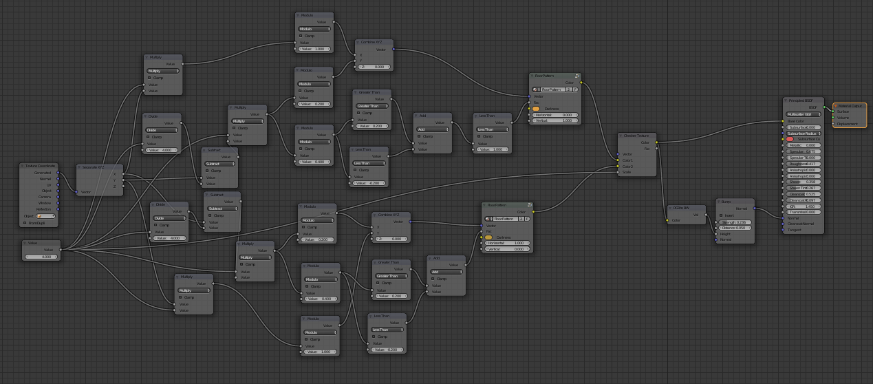
Node group:
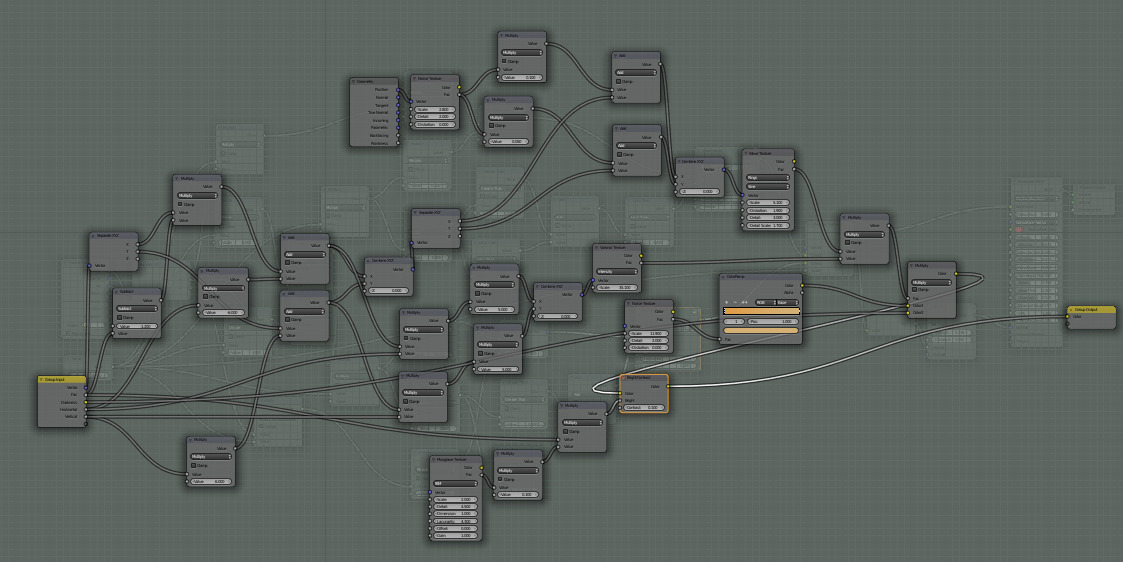
As you can see… a lot of nodes in there :).
I will clear my result and put out the file as I wrote in top of this chapter for you to use you fit. I will not go through the cleaning process here. It will take to much space.